Decoding RNA-Seq Heatmaps: A Scientist's Guide to Color Interpretation and Best Practices
This article provides a comprehensive guide for researchers and drug development professionals on interpreting colors in RNA-seq heatmaps.
Decoding RNA-Seq Heatmaps: A Scientist's Guide to Color Interpretation and Best Practices
Abstract
This article provides a comprehensive guide for researchers and drug development professionals on interpreting colors in RNA-seq heatmaps. It covers foundational principles of color encoding, methodological approaches for selecting color schemes based on data type, strategies for troubleshooting common visualization pitfalls, and techniques for validating and comparing heatmap results. By bridging the gap between computational output and biological insight, this guide empowers scientists to create accurate, informative, and publication-ready heatmaps that effectively communicate gene expression patterns in biomedical research.
Understanding the Basics: What Colors Represent in RNA-Seq Heatmaps
In the analysis of high-dimensional biological data, such as RNA sequencing (RNA-seq) results, effective visual communication is paramount. Heatmaps serve as a critical tool for summarizing complex gene expression patterns across multiple samples. This whitepaper elucidates the fundamental principles governing the use of color as a primary data encoding tool within this context. We detail how color transitions and palettes translate quantitative molecular data into actionable visual insights, frame this within rigorous experimental protocols for generating RNA-seq data, and establish essential accessibility guidelines to ensure scientific findings are communicated accurately and inclusively to all researchers, including those with color vision deficiencies.
In RNA-seq analysis, a heatmap is not merely an image but a dense, visual matrix where color systematically represents the underlying quantitative data. Each cell within the heatmap corresponds to the expression level of a specific gene in a specific sample, and its color is a direct visual encoding of that value after a series of normalization and transformation steps [1] [2]. The primary purpose of this encoding is to allow researchers to discern patterns—such as groups of co-expressed genes or clusters of similar samples—at a glance. The move from short-read to long-read RNA-seq (lrRNA-seq) technologies further underscores the need for robust visualization, as these methods capture full-length transcripts and reveal novel isoforms, increasing the complexity of the data presented [3].
The efficacy of a heatmap is entirely dependent on the judicious application of color. An appropriately chosen color palette will highlight the biological signal, while a poor one can obscure patterns or introduce visual artifacts. The interpretation is framed within the broader thesis that in RNA-seq research, colors are not decorative; they are a precise, quantitative language. The colors themselves are meaningless without the context of the experimental design, the normalized count data they represent, and the statistical thresholds applied to define biological significance [2].
Fundamental Principles of Color Encoding
The process of translating a table of normalized expression values into a colored heatmap is governed by several key principles.
Data Transformation and Scaling
Raw RNA-seq count data is not directly suitable for visualization. It undergoes preprocessing to account for technical variability, such as differences in sequencing depth and library composition between samples [1]. The resulting normalized counts are often log-transformed (e.g., log2) to stabilize the variance and make the data more symmetric. Before color application, the expression values for each gene are frequently scaled.
- Z-score Calculation: A common scaling method is the calculation of Z-scores, which involves subtracting the mean expression of the gene across all samples and dividing by the standard deviation [2]. This centers and scales the data such that for each gene, the mean expression becomes 0 and the standard deviation becomes 1. This transformation, performed on rows (genes), allows for a clear visualization of which genes are expressed above or below their average level in each sample, making patterns of up- and down-regulation immediately apparent.
Color Palette Selection and Interpretation
The choice of color palette defines the visual contrast and intuitive understanding of the data.
- Divergent Palettes: This is the most common type of palette used in gene expression heatmaps. It consists of three distinct components: one color (e.g., blue) to represent low expression values, a second color (e.g., red) to represent high expression values, and a central color (often white or black) to represent mid-range or average expression levels [2]. This design intuitively allows scientists to see which genes are upregulated (deviating in one color direction) and downregulated (deviating in the other) across sample groups.
- Sequential Palettes: These palettes use a single hue that varies in intensity or lightness from low to high values (e.g., light yellow to dark red). They are best suited for displaying data that ranges from zero or low to high, such as p-values or expression levels in a non-symmetric context.
Table 1: Characteristics of Color Palettes for Data Encoding
| Palette Type | Best Use Case | Visual Cue | Example in RNA-seq |
|---|---|---|---|
| Divergent | Showing deviation from a mean or reference point. | Two contrasting hues with a neutral center. | Visualizing up- and down-regulated genes (Z-scores). |
| Sequential | Displaying data with a direction from low to high. | Shades of a single color, from light to dark. | Displaying expression levels of a gene set from low to high. |
| Categorical | Differentiating distinct groups or categories. | Multiple, distinct hues. | Labeling sample groups or gene families on the heatmap axes. |
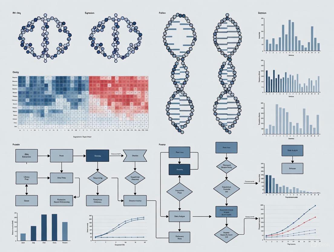
The following diagram illustrates the logical workflow and data transformations that underpin the creation of an RNA-seq heatmap, from raw data to final visual interpretation.
Experimental Protocols for RNA-seq Heatmap Generation
The creation of a reliable heatmap is predicated on a rigorous upstream bioinformatic workflow. The following methodology outlines the key steps for generating a heatmap of top differentially expressed (DE) genes, as demonstrated in a study of mammary gland cells in mice [2].
Data Preprocessing and Quality Control
The analysis begins with raw sequencing reads stored in FASTQ format.
- Quality Control (QC): Tools like FastQC or multiQC are used to assess sequence quality, base composition, and the presence of adapter contamination [1]. This step identifies potential technical errors that could compromise downstream analysis.
- Read Trimming: Based on the QC report, tools such as Trimmomatic or fastp are employed to remove low-quality bases and adapter sequences [1].
- Alignment and Quantification: The cleaned reads are aligned to a reference genome (e.g., mm10 for mouse) using aligners like STAR or HISAT2 [1]. Alternatively, faster pseudo-alignment tools like Salmon or Kallisto can be used to estimate transcript abundances [1]. The output is a raw count matrix, where each value represents the number of reads mapped to a gene in a sample.
Differential Expression and Heatmap Data Extraction
With a normalized count matrix in hand, the process of identifying genes for the heatmap begins.
- Differential Expression Analysis: A statistical tool such as DESeq2 or limma-voom is used to identify genes with significant changes in expression between conditions (e.g., luminal cells from pregnant vs. lactating mice) [1] [2]. These tools model the data and calculate p-values and log2 fold changes for each gene.
- Filtering Significant Genes: Genes are filtered based on statistical and biological significance thresholds. A common approach is to select genes with an adjusted p-value < 0.01 and an absolute log2 fold change > 0.58 (equivalent to a linear fold change of 1.5) [2].
- Selecting Top Genes: The list of significant genes is often too long for a clear heatmap. Therefore, the list is sorted by adjusted p-value (most to least significant), and the top N genes (e.g., 20) are selected for visualization [2].
- Extracting Normalized Counts: The normalized expression values (often log2-transformed) for these top genes are extracted from the full normalized count matrix across all samples to form the final input table for the heatmap.
Visualization with heatmap2
The final data table is visualized using a tool like the heatmap2 function from the R gplots package, available within platforms like Galaxy [2].
- Data Clustering: Rows (genes) and columns (samples) are typically clustered using hierarchical clustering to group similar expression profiles together.
- Color Application: A divergent color palette (e.g., blue-white-red) is applied, with the intensity of the color directly mapping to the Z-score of the normalized, scaled expression value [2].
Table 2: Essential Research Reagent Solutions for RNA-seq Heatmap Analysis
| Tool / Reagent | Category | Function in Workflow |
|---|---|---|
| Trimmomatic / fastp | Preprocessing Tool | Removes low-quality sequences and adapter contaminants from raw reads [1]. |
| STAR / HISAT2 | Alignment Tool | Aligns sequencing reads to a reference genome to determine their genomic origin [1]. |
| Salmon / Kallisto | Quantification Tool | Rapidly estimates transcript abundance using pseudo-alignment, bypassing base-by-base alignment [1]. |
| DESeq2 / edgeR | Statistical Tool | Identifies differentially expressed genes by modeling count data and normalizing for library composition [1]. |
| Normalized Count Matrix | Data Object | A table of expression values corrected for sequencing depth and bias; the direct input for heatmap visualization [2]. |
| heatmap2 (gplots) | Visualization Tool | Generates the heatmap graphic, performing clustering and applying the color encoding to the data matrix [2]. |
Accessibility and Technical Implementation of Color
For a scientific visualization to be effective, it must be accessible to all researchers, including those with color vision deficiencies (CVD). Adhering to established contrast guidelines is not merely a matter of compliance but of scientific integrity and clear communication.
Contrast Requirements for Visualization
The Web Content Accessibility Guidelines (WCAG) provide a benchmark for contrast, which can be directly applied to scientific figures.
- Non-Text Contrast (WCAG 1.4.11): This Level AA success criterion requires a minimum contrast ratio of 3:1 for "graphical objects required to understand the content," which includes the elements of a heatmap and its axes [4] [5]. This ensures that the boundaries of the heatmap and any dividing lines are perceivable.
- Application to Heatmaps: While the internal cells of a heatmap use a continuous color gradient where not all adjacent colors will meet 3:1 contrast, the surrounding structural elements must comply. The x-axis and y-axis lines, ticks, and labels must have sufficient contrast (3:1 or better) against the background to anchor the visualization [6].
Designing Accessible Color Palettes
Designing a color palette for data visualization requires balancing aesthetic, perceptual, and accessibility concerns.
- Differentiation and Diversity: A good categorical palette needs colors that are both differentiated from one another and diverse in hue to avoid creating false associations [6]. Relying solely on hue is insufficient.
- Perceptual Uniformity: The palette should be perceptually uniform, meaning equal steps in data value correspond to equal steps in perceptual color change.
- Tools for Evaluation: Tools like Viz Palette can generate color reports and visualize the "just-noticeable difference" (JND) between colors, helping to identify hues that are difficult for users with CVD to distinguish [6].
The following diagram outlines the key considerations and tools for creating and validating an accessible color palette for scientific data encoding.
A Mandatory Color Palette for Scientific Visualization
To ensure consistency and accessibility across visualizations, the following color palette is mandated for all diagrams and graphical elements in this document. The palette includes a range of hues with sufficient contrast options.
Table 3: Mandatory Color Palette with Contrast Properties
| Color Name | Hex Code | RGB Code | Sample | Recommended Use |
|---|---|---|---|---|
| Google Blue | #4285F4 |
(66, 133, 244) | Primary data color, links | |
| Google Red | #EA4335 |
(234, 67, 53) | Primary data color, alerts | |
| Google Yellow | #FBBC05 |
(251, 188, 5) | Secondary data color, highlights | |
| Google Green | #34A853 |
(52, 168, 83) | Primary data color, positive values | |
| White | #FFFFFF |
(255, 255, 255) | Background, text on dark colors | |
| Light Gray | #F1F3F4 |
(241, 243, 244) | Node background, secondary background | |
| Dark Gray | #202124 |
(32, 33, 36) | Text |
Primary text, node borders |
| Medium Gray | #5F6368 |
(95, 99, 104) | Text |
Secondary text, arrow colors |
Color, when applied according to the fundamental principles outlined in this guide, is a powerful and indispensable data encoding tool in RNA-seq research. Its correct application—from the initial normalization and transformation of sequence data to the strategic selection of an accessible, divergent palette—transforms abstract tables of numbers into intuitive visual stories. By adhering to rigorous experimental protocols and embedding accessibility into the core of visualization design, scientists can ensure their heatmaps accurately and clearly communicate the complex biological narratives hidden within their transcriptomic data, thereby driving discovery and innovation in drug development and basic research.
In the analysis of RNA-sequencing (RNA-Seq) data, heatmaps serve as a critical tool for visualizing complex gene expression patterns across multiple samples [1]. The choice of color scheme is not merely an aesthetic decision; it is a fundamental aspect of scientific communication that directly impacts the interpretation of biological results. Within the context of a broader thesis on what colors mean in an RNA-seq heatmap, understanding these schemes—sequential, diverging, and qualitative—is paramount for accurately conveying whether expression levels are increasing or decreasing, highlighting differential expression, or categorizing data into distinct groups [7]. This guide provides researchers, scientists, and drug development professionals with a technical framework for selecting and applying color schemes that align with the perceptual structure of their data, thereby ensuring clear, accurate, and accessible visualizations.
The Role of Heatmaps in RNA-seq Data Analysis
RNA-Seq is a high-throughput technology that enables genome-wide quantification of RNA abundance, making it a cornerstone of modern transcriptomics research [1]. Following computational preprocessing—including quality control, read trimming, alignment, and quantification—the result is a numerical matrix of raw counts, where each value represents the number of reads mapped to a particular gene in a specific sample [1]. A heatmap provides a visual representation of this matrix, often displaying genes as rows and samples as columns.
The data visualized in a heatmap is typically a transformed version of these raw counts. Common transformations include:
- Log2 Transformation: Applied to normalized expression values to stabilize variance and make the data more symmetric for visualization [7].
- Mean-Subtracted Log2 Values: Used in two-color heatmaps to center the data for each gene, showing whether a sample's expression is above or below the mean for that gene across all samples [7].
The primary challenge is to translate these numerical values into a visual format that accurately represents the underlying biology. The choice of color scheme directly addresses this challenge by mapping data values to colors in a way that should mirror the data's structure.
Sequential Color Schemes
Definition and Use Cases
Sequential color schemes consist of an ordered progression of color, usually from light to dark, representing a single continuum of values from low to high [8]. These schemes are ideal for displaying data that has a natural progression from minimum to maximum, without a critical central point [9].
In RNA-seq analysis, sequential schemes are most appropriately used for:
- Visualizing absolute expression levels of genes across samples.
- Showing the intensity of a single biological process or pathway activity.
- Displaying data that is entirely positive-valued, such as normalized read counts or FPKM values.
Implementation in RNA-seq Heatmaps
For a sequential scheme applied to log2-normalized expression data, light colors typically represent low expression values, while dark colors represent high expression values [7]. This creates an intuitive visualization where the intensity of color directly corresponds to the intensity of gene expression.
Table 1: Characteristics of Sequential Color Schemes
| Feature | Description | RNA-seq Application Example |
|---|---|---|
| Data Structure | Unidirectional data from low to high | Normalized gene expression values |
| Perceptual Basis | Lightness gradient | Light (low expression) to dark (high expression) |
| Typical Hues | Single hue or perceptually uniform progression | Blues, purples, grays |
| Best For | Showing magnitude or intensity | Displaying expression levels without reference to a baseline |
Practical Example
A study examining the expression of metabolic genes across a series of liver samples might use a blue sequential scheme (white to dark blue) to represent the range of log2-normalized expression values. This would allow researchers to quickly identify samples with particularly high or low expression of key metabolic genes.
Diverging Color Schemes
Definition and Use Cases
Diverging color schemes use two contrasting hues that meet at a central neutral color, representing deviation from a meaningful midpoint [8] [9]. These schemes are particularly valuable when the data has a critical central point, such as zero, an average, or a control value.
In RNA-seq analysis, diverging schemes are predominantly used for:
- Visualizing differential gene expression between experimental conditions.
- Showing fold-changes or mean-centered expression values.
- Highlighting genes that are either upregulated or downregulated relative to a control group.
Implementation in RNA-seq Heatmaps
In a typical RNA-seq application, a diverging scheme colors genes that are significantly upregulated in one condition with a hue (e.g., red), genes that are significantly downregulated with a contrasting hue (e.g., blue), and genes with no significant change with a neutral color (e.g., white or light gray) [7]. The specific implementation often involves mean-subtracted normalized log2 expression values, which center the data around zero for each gene [7].
Table 2: Characteristics of Diverging Color Schemes
| Feature | Description | RNA-seq Application Example |
|---|---|---|
| Data Structure | Values diverging from a central point | Mean-centered expression, fold-changes |
| Perceptual Basis | Two contrasting hues with neutral midpoint | Red (up) and Blue (down) from white (neutral) |
| Central Point | Meaningful midpoint (zero, average, control) | Mean expression, control group expression |
| Best For | Highlighting deviations from a baseline | Differential expression analysis |
The Red-Green Convention and Its Alternatives
A traditional color scheme in genomics has been red for upregulated genes and green for downregulated genes [10]. However, this scheme presents significant accessibility problems for individuals with red-green color vision deficiency, the most common form of color blindness [11] [10]. Consequently, many modern analysis tools and publications have shifted toward more accessible alternatives, most commonly the red-white-blue scheme, which maintains the intuitive association of red with "hot" (increased expression) and blue with "cold" (decreased expression) while remaining distinguishable to color-blind readers [10].
Qualitative Color Schemes
Definition and Use Cases
Qualitative color schemes use distinct, categorically different hues to represent groups or categories without implying any order or magnitude [8]. The goal is to maximize perceptual separation between classes to make them easily distinguishable.
In RNA-seq analysis, qualitative schemes are used for:
- Grouping samples by experimental condition, tissue type, or patient group in heatmap annotations.
- Categorizing genes into functional groups or pathways.
- Distinguishing different clusters identified through unsupervised learning methods.
Implementation in RNA-seq Heatmaps
While qualitative schemes are rarely used for the main heatmap body (which typically contains continuous expression values), they are essential for the annotation bars that accompany heatmaps. These annotations help interpret patterns by labeling rows (genes) or columns (samples) with categorical metadata.
Table 3: Characteristics of Qualitative Color Schemes
| Feature | Description | RNA-seq Application Example |
|---|---|---|
| Data Structure | Categorical, non-ordinal data | Sample groups, gene ontologies, cluster assignments |
| Perceptual Basis | Distinct hues | Maximally different colors (red, blue, green, orange) |
| Color Relationship | No inherent order | Colors are interchangeable |
| Best For | Differentiating groups or categories | Annotating sample types or gene clusters |
Practical Considerations
The human eye can discriminate approximately 12 different hues in the same image, though in practice, using fewer distinct categories (typically 6-8) enhances clarity [8]. When more categories are needed, a combination of hue, lightness, and saturation variations can be employed to create intra-class differences while maintaining group coherence [8].
Decision Framework for Color Scheme Selection
Selecting the appropriate color scheme requires matching the perceptual structure of the color scheme to the perceptual structure of the data [8]. The following diagram illustrates this decision process:
This decision process ensures that the visual encoding method (color scheme) matches the fundamental nature of the data, leading to more intuitive and accurate interpretations.
Accessibility and Technical Implementation
Color Vision Deficiency Considerations
Approximately 8% of men and 0.5% of women of Northern European descent have some form of color vision deficiency, with red-green blindness being most common [11]. To ensure accessibility:
- Avoid red-green combinations for critical information [11] [10].
- Use colorblind-friendly palettes such as those provided by ColorBrewer or Paul Tol [11].
- Test visualizations using simulation tools like Color Oracle or built-in software filters [11].
Contrast Requirements
For accessibility compliance, the Web Content Accessibility Guidelines (WCAG) recommend:
- Text and images of text should have a contrast ratio of at least 4.5:1 [5].
- User interface components and graphical objects should have a contrast ratio of at least 3:1 against adjacent colors [4] [5].
Technical Implementation in Analysis Tools
Most RNA-seq analysis platforms and programming languages provide built-in support for different color schemes:
- R/R Studio: Use the
RColorBrewerpackage withcolorblindFriendly = T[11]. - Python: Libraries like Matplotlib and Seaborn offer perceptually uniform colormaps.
- ColorBrewer: An interactive tool providing schemes for all three data types with colorblind-safe options [8] [11].
- General Practice: Include a color key/legend and maintain consistency across related figures in a publication.
The interpretation of color schemes in RNA-seq heatmaps is fundamental to accurate scientific communication in transcriptomics and drug development. Sequential schemes represent unidirectional magnitude, diverging schemes highlight deviations from a biologically meaningful baseline, and qualitative schemes distinguish categorical groups. By deliberately selecting color schemes that match the perceptual structure of the underlying data, researchers can create visualizations that are not only scientifically rigorous but also accessible to the broadest possible audience, including those with color vision deficiencies. As RNA-seq technologies continue to advance, the principles outlined in this guide will remain essential for transforming complex numerical data into actionable biological insights.
This technical guide elucidates the journey of RNA-seq data from raw sequencing outputs to the normalized expression values that form the basis of biological interpretation, with a specific focus on the quantification of color in heatmap visualizations. For researchers, scientists, and drug development professionals, a precise understanding of this pipeline is critical. The colored patterns in an RNA-seq heatmap are not direct representations of raw data but are the endpoint of a series of statistical transformations designed to remove technical artifacts and enable biologically meaningful comparisons. This paper details each step of this transformation, providing a foundational context for a broader thesis on the accurate interpretation of visual outputs in transcriptomic research.
In a typical RNA-seq experiment, the biological signal of interest—the abundance of RNA transcripts—is obscured by multiple layers of technical variation. The process begins with raw sequencing reads, which are transformed into counts assigned to each gene. These counts are influenced by factors unrelated to the underlying biology, such as the total number of sequenced reads per sample (sequencing depth) and the composition of the RNA library [12] [1].
To make expression levels comparable across samples and genes, these raw counts must undergo normalization. Different normalization methods correct for different biases, and the choice of method depends on the goals of the downstream analysis [1]. Finally, for effective visualization in a heatmap, the normalized expression data is often further transformed into Z-scores, which standardize the data to show how a gene's expression in a sample deviates from its average expression across all samples [13] [14]. The colors in a heatmap directly represent these Z-scores, allowing for intuitive visual detection of patterns in gene expression. The following workflow diagram illustrates this multi-stage process from raw data to visual interpretation.
Figure 1: The RNA-seq Data Transformation Workflow. This pipeline shows the key stages of data processing, from raw sequencing files to the creation of an interpretable heatmap. Each stage involves specific computational procedures to address different sources of technical variation.
The Starting Point: Raw Counts and Their Limitations
The initial output of RNA-seq data processing is a raw count matrix. Understanding what these values represent and why they are insufficient for direct comparison is the first step toward accurate interpretation.
The Nature of Raw Counts
A raw count matrix is a table where rows correspond to genes (or transcripts), columns correspond to individual samples, and each cell contains an integer value. This integer represents the number of sequencing fragments that have been unambiguously assigned to that gene during the quantification step [1]. The process of generating this matrix involves aligning sequencing reads to a reference genome or transcriptome using tools like STAR or HISAT2, or using pseudo-alignment tools like Salmon or Kallisto that estimate transcript abundances [15]. These counts are the most fundamental quantitative representation of gene expression from an RNA-seq experiment.
Key Limitations of Raw Counts
Despite being a direct measure, raw counts are not directly comparable. Two major sources of technical bias confound biological interpretation:
- Sequencing Depth: A sample sequenced to a depth of 50 million reads will generally have higher counts for a gene than an identical biological sample sequenced to 25 million reads, even if the true RNA concentration is the same [1]. This makes comparisons between samples challenging.
- Gene Length and Composition: Longer genes will generate more sequencing fragments than shorter genes expressed at the same molecular concentration [12]. Furthermore, if a few genes are extremely highly expressed in one sample, they can consume a large fraction of the sequencing reads, making all other genes in that sample appear under-expressed relative to other samples—a phenomenon known as library composition bias [1].
Table 1: Key Characteristics and Limitations of Raw Count Data
| Feature | Description | Impact on Analysis |
|---|---|---|
| Data Type | Integer values (non-negative) | Requires specialized statistical models (e.g., negative binomial in DESeq2) [16] |
| Sequencing Depth | Total number of reads per sample varies | Counts are not comparable between samples without correction [1] |
| Gene Length Bias | Longer transcripts produce more counts | Gene expression levels cannot be directly compared to each other |
| Library Composition | Highly expressed genes skew the distribution | Can create false differential expression between samples |
The Bridge to Comparability: Normalized Expression Data
Normalization is the statistical process of adjusting the raw counts to eliminate the technical biases outlined in Section 2, thereby creating values that can be legitimately compared across samples and genes.
Common Normalization Methods
Several normalization strategies have been developed, each with a specific purpose. The choice of method is critical and depends on whether the goal is within-sample or between-sample gene comparison, or differential expression analysis.
Table 2: Common Normalization Methods for RNA-seq Data
| Method | Sequencing Depth Correction | Gene Length Correction | Library Composition Correction | Primary Use Case |
|---|---|---|---|---|
| CPM [1] | Yes | No | No | Simple scaling; not recommended for DE. |
| FPKM/RPKM [1] | Yes | Yes | No | Single-sample analysis; cross-sample comparisons. |
| TPM [1] | Yes | Yes | Partial | Preferred over FPKM/RPKM for cross-sample comparison. |
| TMM [14] [17] | Yes | No | Yes | Differential expression analysis (e.g., in edgeR). |
| Median-of-Ratios [1] | Yes | No | Yes | Differential expression analysis (e.g., in DESeq2). |
CPM (Counts per Million): This is a simple normalization that scales the raw counts by the total number of reads in the sample (library size), multiplied by one million [1]. It corrects for sequencing depth but does not account for gene length or composition bias, making it unsuitable for differential expression analysis.
FPKM/RPKM and TPM (Transcripts per Million): These methods correct for both sequencing depth and gene length, allowing for comparisons of expression levels between different genes within the same sample. TPM is now generally considered superior to FPKM/RPKM because it ensures the normalized counts per sample sum to the same value (one million), making the distributions more comparable across samples [1].
Methods for Differential Expression (TMM and Median-of-Ratios): Tools like edgeR (using the TMM method) and DESeq2 (using the Median-of-Ratios method) employ more advanced normalization techniques that are robust to library composition bias [1]. These methods are specifically designed for the statistical testing of differences between experimental conditions and are the standard for differential expression analysis.
The Language of Color: From Normalized Data to Heatmap Visualization
A heatmap is a graphical representation of a data matrix where individual values are represented as colors [18] [13]. In the context of RNA-seq, it is a powerful tool for visualizing expression patterns of many genes across multiple samples.
The Role of Z-Score Standardization
While the normalized data (e.g., TPM, or variance-stabilized counts from DESeq2) is suitable for many analyses, it is often not ideal for heatmap visualization. The reason is that genes have different average expression levels; a highly expressed gene will have large values across all samples, which can dominate the color scale and obscure patterns in moderately or lowly expressed genes.
To make patterns visually apparent, Z-score standardization is applied to the normalized data by row (i.e., for each gene) [13] [14]. The Z-score for a gene in a single sample is calculated as:
Z = (Expressionvalue - Meanexpression) / Standard_deviation
This calculation transforms the expression values for each gene to a distribution with a mean of 0 and a standard deviation of 1. A Z-score of 0 indicates that the gene's expression in that sample is identical to its mean expression across all samples. A positive Z-score indicates higher-than-average expression, and a negative Z-score indicates lower-than-average expression [13].
Interpreting the Color Scale
The color palette of a heatmap is a visual legend for these Z-scores. A common scheme is a divergent color palette:
- Red typically represents positive Z-scores (up-regulation).
- Blue typically represents negative Z-scores (down-regulation).
- White or another neutral color represents a Z-score near zero (average expression) [18] [13].
Therefore, when you see a red block in a heatmap, it does not mean that gene is "highly expressed" in an absolute sense. It means that in those specific samples, the gene is expressed higher than its own average level across the entire dataset. This relative measure is what allows for the clear visual identification of co-expressed genes and sample clusters.
A Practical Guide: From Counts to Heatmap
This section provides a detailed protocol for generating a publication-quality heatmap from a raw count matrix, using standard tools and best practices.
Experimental Protocol: The Computational Workflow
Data Input: Begin with a raw count matrix (e.g., from HTSeq-count or featureCounts). Do not use these raw counts directly for visualization [19] [16].
Normalization for Differential Expression:
- If performing differential expression analysis, use the DESeq2 or edgeR packages in R. These tools incorporate their own robust normalization methods (Median-of-Ratios and TMM, respectively) during the model fitting process [1] [16].
- Extract the normalized data. For DESeq2, it is recommended to use the variance-stabilizing transformation (
vst) or the regularized-log transformation (rlog) on theDESeqDataSetobject. These transformations not only normalize for sequencing depth but also stabilize the variance across the mean, making the data more suitable for visualization [19].
Z-Score Transformation:
- Subset the normalized data to include only the genes of interest (e.g., significantly differentially expressed genes).
- Calculate the Z-score for each row (gene) in the matrix.
Heatmap Generation:
- Use a plotting function like
pheatmapin R to generate the figure. The functionpheatmapautomatically performs hierarchical clustering and applies the color map.
- Use a plotting function like
The Scientist's Toolkit: Essential Research Reagents & Software
The following table details key computational tools and resources essential for executing the RNA-seq data analysis workflow described in this guide.
Table 3: Essential Tools and Resources for RNA-seq Data Analysis
| Tool/Resource Name | Type | Primary Function in Workflow |
|---|---|---|
| STAR [15] | Alignment Software | Splice-aware alignment of RNA-seq reads to a reference genome. |
| Salmon [15] | Quantification Tool | Fast and accurate transcript-level quantification from raw reads. |
| DESeq2 [1] [16] | R/Bioconductor Package | Statistical testing for differential expression and data normalization. |
| edgeR [1] [17] | R/Bioconductor Package | Statistical testing for differential expression and data normalization. |
| pheatmap [19] [13] | R Package | Generation of clustered heatmaps for data visualization. |
| FastQC [12] [1] | Quality Control Tool | Provides quality reports on raw sequencing reads. |
| Reference Genome & Annotation (GTF) [15] | Reference Data | Essential for read alignment and gene quantification. |
The path from raw RNA-seq counts to the colors in a heatmap is a deliberate and statistically grounded process. Raw counts are transformed through normalization to correct for technical biases, creating comparable expression values. These normalized values are then standardized to Z-scores to highlight relative expression patterns, which are finally mapped onto an intuitive color scale. For the research scientist, understanding this pipeline is not merely an academic exercise; it is a prerequisite for the correct interpretation of the visual outputs that drive hypothesis generation and scientific discovery. The colors in an RNA-seq heatmap are a powerful language, and this guide provides the essential grammar for reading them.
In RNA-seq heatmaps, colors communicate complex biological stories. The translation from raw sequence counts to an intuitive visual representation relies on sophisticated statistical transformations. Log2 transformation and mean-centering form the essential foundation that stabilizes variance and centers data, enabling accurate interpretation of gene expression patterns. This technical guide explores the mathematical procedures and biological rationale behind these critical data preprocessing steps, providing researchers and drug development professionals with the knowledge to interpret heatmap visualizations correctly and implement robust analytical pipelines.
RNA sequencing produces raw count data that embodies several statistical challenges requiring transformation before visualization. Raw RNA-seq counts exhibit a mean-dependent variance, where highly expressed genes demonstrate substantially greater variance than lowly expressed genes—a property known as heteroskedasticity [20]. This characteristic violates the assumptions of many statistical tests and distorts visual representations in heatmaps. Furthermore, RNA-seq data typically follows a negative binomial distribution, which differs significantly from the normal distribution required for many linear modeling approaches [21].
The dual processes of log2 transformation and mean-centering address these fundamental challenges. Log transformation stabilizes variance across different expression levels, while mean-centering adjusts values to highlight differential expression patterns rather than absolute expression levels [20]. Together, these transformations convert raw counts into a standardized metric suitable for both statistical analysis and visual interpretation. Without these preprocessing steps, heatmaps would predominantly reflect technical artifacts rather than biological truth, potentially leading to erroneous conclusions in research and drug development contexts.
The Role of Log2 Transformation
Mathematical Foundation and Biological Rationale
The log2 transformation applies a logarithmic function with base 2 to each count value in the expression matrix. For a raw count value ( x ), the transformed value becomes ( log2(x) ). To handle zero counts, which would yield undefined values, a pseudo-count (typically 0.5 or 1) is added to all counts before transformation: ( log2(x + 0.5) ) [21].
This transformation serves two primary purposes in RNA-seq analysis. First, it stabilizes variance across the dynamic range of expression levels, addressing the heteroskedasticity inherent in count data [20]. Second, it converts multiplicative fold-changes into additive differences, making the data more amenable to statistical testing and visualization. From a biological perspective, log2 transformation aligns with how scientists conceptualize expression changes, as fold-changes (e.g., "a 2-fold increase") are more biologically meaningful than absolute count differences [20].
Practical Implementation and Considerations
The voom transformation represents a sophisticated implementation of log2 transformation specifically designed for RNA-seq data. This method calculates log-counts per million (log-cpm) using the formula:
[ y{gi} = \log2 \left( \frac{r{gi} + 0.5}{Ri + 1.0} \times 10^6 \right) ]
where ( r{gi} ) is the count for gene ( g ) in sample ( i ), and ( Ri ) is the total library size for sample ( i ) [21]. This approach accounts for differences in sequencing depth across samples, ensuring comparability.
Table 1: Comparison of Data Transformation Methods for RNA-seq Analysis
| Transformation Method | Mathematical Formula | Best Use Case | Advantages | Limitations |
|---|---|---|---|---|
| log2 (voom) | ( \log2(\frac{r{gi} + 0.5}{R_i + 1.0} \times 10^6) ) | Moderate sample sizes (n=30-50) | Stabilizes variance, converts fold-changes | May not achieve normality for small samples |
| Root transformations (r, rv, r2, rv2) | ( \sqrt{r_{gi}} ) or sample-specific variants | Small sample sizes (n=3) | Better performance with minimal replicates | Less biologically interpretable |
| Alternative log transformations (l, lv, l2, lv2) | Variants of log transformation | Large sample sizes (n=100) | Improved accuracy with sufficient replicates | Complex implementation |
| Wilcoxon rank sum test | Non-parametric test on raw counts | Large samples with unequal library sizes | No transformation needed, robust performance | Lower power with moderate samples |
Data Transformation Workflow in RNA-seq Analysis
Mean-Centering and Z-Score Standardization
Conceptual Framework and Calculation
Mean-centering is a statistical process that adjusts expression values to highlight differences relative to a baseline. For gene expression data, this typically involves subtracting the mean expression of each gene across all samples from individual sample values. Given a log2-transformed expression matrix, mean-centering is calculated as:
[ z{gi} = y{gi} - \bar{y_g} ]
where ( y{gi} ) is the log2-transformed expression value for gene ( g ) in sample ( i ), and ( \bar{yg} ) is the mean expression of gene ( g ) across all samples.
Z-score standardization extends mean-centering by dividing by the standard deviation:
[ z{gi} = \frac{y{gi} - \bar{yg}}{sg} ]
where ( s_g ) is the standard deviation of gene ( g )'s expression across samples. This process places all genes on a comparable scale, regardless of their original expression levels [22].
Implications for Heatmap Interpretation
In heatmap visualizations, mean-centering transforms the data such that the reference point (zero) represents average expression level. Positive values (typically red) indicate above-average expression, while negative values (typically blue) indicate below-average expression. This centering is crucial for identifying patterns because it emphasizes relative differences across experimental conditions rather than absolute expression levels.
Without mean-centering, heatmaps would predominantly display variation between high and low expressed genes, which often reflects biological function rather than condition-specific regulation. Mean-centering redirects focus to how each gene's expression deviates from its typical level across all conditions, highlighting genes that respond to experimental manipulations.
From Transformed Data to Heatmap Colors
Color Scales and Biological Interpretation
The translation of transformed expression values to colors in a heatmap follows a defined mapping process. For mean-centered data, a diverging color scheme is typically employed, with one color representing positive deviations (upregulation) and another representing negative deviations (downregulation). The saturation or intensity of the color corresponds to the magnitude of deviation from the mean.
While color conventions vary, a common scheme in gene expression analysis uses red to represent upregulated genes and green for downregulated genes, despite the lack of official standards [10]. This convention has historical roots in microarray analysis but presents accessibility challenges for color-blind individuals. From a biological perspective, the selection of red for upregulation often aligns with metaphorical associations ("red hot" for increased activity), though some researchers argue for the opposite based on financial metaphors (red for decrease) [10].
Accessibility and Alternative Color Schemes
The traditional red-green color scheme presents significant problems for color accessibility. Approximately 8% of men and 0.5% of women experience red-green color blindness, making these colors difficult or impossible to distinguish [23]. This accessibility concern has led to recommendations for alternative color schemes:
Table 2: Accessible Color Schemes for Gene Expression Heatmaps
| Color Scheme | Upregulation | Downregulation | Neutral | Accessibility | Best Use Cases |
|---|---|---|---|---|---|
| Traditional Red-Green | #FF0000 (Red) | #05FE04 (Green) | #000000 (Black) | Poor (problematic for color blindness) | Legacy compatibility |
| Red-Blue | #EA4335 (Red) | #4285F4 (Blue) | #FFFFFF (White) | Good (blue-yellow safe) | General use |
| Magenta-Green | #D71B60 (Magenta) | #05FE04 (Green) | #F1F3F4 (Light Gray) | Moderate (improved contrast) | When green is required |
| Yellow-Purple | #FBBC05 (Yellow) | #8A2BE2 (Purple) | #5F6368 (Dark Gray) | Excellent (color-blind safe) | Publications and presentations |
| Viridis | #440154 (Dark Purple) | #FDE725 (Yellow) | Intermediate colors | Excellent (perceptually uniform) | Quantitative data |
Color Mapping Process in Heatmap Generation
Experimental Protocols and Best Practices
Step-by-Step Transformation Protocol
Implementing proper data transformation requires meticulous attention to computational details. The following protocol outlines the standard procedure for preparing RNA-seq data for heatmap visualization:
Quality Control and Filtering: Begin with raw count data that has undergone appropriate quality control checks using tools such as FastQC. Remove lowly expressed genes using the
filterByExprfunction from edgeR or similar approaches, typically retaining genes with at least 10 counts in a sufficient number of samples [24].Log2 Transformation: Apply the voom transformation to the filtered count data using the formula previously described. This can be implemented in R using the
voom()function from the limma package. Alternative transformations (r, r2, l, l2) may be considered for extreme sample sizes (very small or very large) based on the comparisons shown in Table 1 [21].Mean-Centering and Standardization: Calculate Z-scores for each gene across samples by subtracting the gene-specific mean and dividing by the gene-specific standard deviation. This can be accomplished using the
scale()function in R, which centers and scales columns of a matrix by default.Color Mapping: Apply a color scheme to the transformed data, ensuring accessibility for all potential viewers. The
colorRamp2()function from the circlize package in R provides flexible implementation of diverging color scales with specified breakpoints [25].
Validation and Quality Assessment
After transformation, several validation steps ensure data quality and appropriate processing:
- Generate diagnostic plots comparing distributions before and after transformation
- Verify that batch effects have been appropriately addressed through methods such as ComBat or surrogate variable analysis
- Confirm that sample relationships observed in PCA plots align with experimental design
- Check that positive and negative controls show expected expression patterns in the transformed data
Table 3: Essential Research Reagents and Computational Tools
| Tool/Reagent Category | Specific Examples | Function in Analysis Pipeline | Key Considerations |
|---|---|---|---|
| Quality Control Tools | FastQC, MultiQC, RSeQC | Assess raw read quality, adapter contamination, GC content | Run at multiple stages; identify outliers early |
| Alignment Tools | HISAT2, STAR, GSNAP | Map sequenced reads to reference genome | Choose based on speed vs. accuracy needs |
| Quantification Tools | featureCounts, HTSeq, Salmon | Generate count data from aligned reads | Alignment-free tools offer speed advantages |
| Differential Expression | DESeq2, edgeR, limma | Identify statistically significant expression changes | DESeq2 handles low replicates well; edgeR suits complex designs |
| Visualization Packages | ggplot2, pheatmap, ComplexHeatmap | Create publication-quality heatmaps | Ensure color accessibility; include dendrograms and annotations |
The colors in an RNA-seq heatmap represent the culmination of careful data transformation processes that begin with raw sequencing counts. Log2 transformation stabilizes variance and converts biological fold-changes into mathematically tractable values, while mean-centering highlights relevant expression patterns against a baseline of average behavior. Together, these processes enable the intuitive color-based interpretation of complex gene expression data that drives discovery in biological research and drug development.
Understanding the mathematical foundations behind these transformations empowers researchers to critically evaluate heatmap visualizations and implement robust analytical pipelines. As RNA-seq technologies continue to evolve, maintaining rigorous standards for data transformation and visualization ensures that the colors in heatmaps remain faithful representations of biological truth rather than technical artifacts.
The transition from microarray technology to RNA sequencing (RNA-Seq) represents a fundamental revolution in how scientists study the transcriptome. For decades, microarrays served as the primary workhorse for gene expression studies, relying on the principle of hybridization-based detection where fluorescently labeled cDNA samples would bind to pre-designed, sequence-specific probes attached to a solid surface [26]. This technology, while revolutionary for its time, operated under significant constraints including a limited dynamic range, lower sensitivity for detecting low-abundance transcripts, and an inherent requirement for prior genomic knowledge that prevented the discovery of novel transcripts [26] [27]. The introduction of RNA-Seq in 2008 marked a pivotal turning point, replacing hybridization with direct high-throughput sequencing of cDNA fragments, thereby enabling researchers to capture a comprehensive, unbiased view of the transcriptome without being limited to predetermined probes [28] [27].
This technological evolution fundamentally altered the data landscape of transcriptomics, necessitating corresponding adaptations in bioinformatics approaches, visualization techniques, and analytical conventions. Unlike microarray data, which typically produced continuous fluorescence intensity values, RNA-Seq generates discrete count data representing the number of sequencing reads mapped to each genomic feature [1] [28]. This shift in data structure and scale demanded new statistical frameworks for analysis and new visual strategies for interpretation—including the establishment of conventions for data representation such as heatmap color schemes that effectively communicate complex gene expression patterns to researchers [10] [13].
Technical Comparison: Microarrays versus RNA-Seq
The core differences between microarrays and RNA-Seq extend beyond their fundamental chemistries to encompass their analytical capabilities, performance characteristics, and application scope. Understanding these distinctions is crucial for appreciating why new conventions, including visualization standards, emerged with the adoption of RNA-Seq.
Table 1: Comparison of Microarray and RNA-Seq Technologies
| Feature | Microarray | RNA-Seq |
|---|---|---|
| Fundamental Principle | Hybridization to pre-designed probes | Direct sequencing of cDNA fragments |
| Prior Knowledge Requirement | Required (for probe design) | Not required |
| Dynamic Range | Limited (~2-3 orders of magnitude) | Extensive (>5 orders of magnitude) |
| Sensitivity | Lower, especially for low-abundance transcripts | Higher, can detect weakly expressed genes |
| Background Signal | Significant, due to non-specific hybridization | Minimal |
| Novel Feature Discovery | Not possible | Enables discovery of novel transcripts, isoforms, and fusions |
| Data Output | Fluorescence intensity values (continuous) | Read counts (discrete) |
| Quantitative Accuracy | Moderate, compression at extremes | High, more linear relationship to abundance |
RNA-Seq provides a wider dynamic range and greater sensitivity, allowing researchers to use less starting material and detect low-level expression changes that may have been missed with microarrays [26]. Unlike microarrays, which could only measure expression of known transcripts with pre-designed probes, RNA-Seq enables hypothesis-free whole-transcriptome analysis, making it ideal for both standard differential gene expression studies and more complex investigations such as identifying gene fusions, discovering splice variants, and detecting non-canonical transcripts [26] [27]. This expanded capability to profile the transcriptome comprehensively has positioned RNA-Seq as the preferred method for modern transcriptomics, though it comes with increased computational demands and requires more sophisticated bioinformatics expertise compared to microarray analysis [28].
The RNA-Seq Workflow: From Raw Data to Biological Insight
The RNA-Seq analytical pipeline transforms raw sequencing data into interpretable biological results through a series of computational steps, each with specific quality control considerations. The workflow begins with the conversion of RNA to cDNA, followed by sequencing that produces millions of short reads typically stored in FASTQ format—a text-based format containing both sequence data and associated quality scores [1] [28].
Preprocessing and Alignment
Initial quality control (QC) steps are critical for identifying potential technical artifacts such as residual adapter sequences, unusual base composition, or duplicated reads [1]. Tools like FastQC or multiQC are commonly employed for this initial assessment, generating reports that researchers must carefully review to ensure data quality without over-trimming, which can unnecessarily reduce data depth [1]. Following QC, read trimming cleans the data by removing low-quality bases and adapter sequences using tools such as Trimmomatic, Cutadapt, or fastp [1].
Once reads are cleaned, they must be aligned to a reference genome or transcriptome. This can be accomplished through either splice-aware alignment with tools like STAR or HISAT2, or through pseudo-alignment with tools such as Kallisto or Salmon that estimate transcript abundances without full base-by-base alignment [1] [15]. Pseudo-alignment methods are typically faster and require less memory, making them well-suited for large datasets, while traditional alignment provides more detailed information for quality assessment [1] [15]. Following alignment, post-alignment QC is performed to remove poorly aligned or ambiguously mapped reads using tools like SAMtools, Qualimap, or Picard—an essential step since incorrectly mapped reads can artificially inflate expression estimates [1].
Quantification and Normalization
The final preprocessing step is read quantification, where the number of reads mapped to each gene is counted using tools like featureCounts or HTSeq-count, producing a raw count matrix that summarizes expression levels across all genes and samples [1]. It is important to recognize that raw counts cannot be directly compared between samples due to differences in sequencing depth (the total number of reads obtained per sample) and library composition (the distribution of RNA species present) [1].
Table 2: RNA-Seq Normalization Methods
| Method | Sequencing Depth Correction | Gene Length Correction | Library Composition Correction | Suitable for DE Analysis | Key Characteristics |
|---|---|---|---|---|---|
| CPM (Counts per Million) | Yes | No | No | No | Simple scaling by total reads; affected by highly expressed genes |
| RPKM/FPKM (Reads/Fragments Per Kilobase per Million) | Yes | Yes | No | No | Adjusts for gene length; still affected by library composition bias |
| TPM (Transcripts Per Million) | Yes | Yes | Partial | No | Scales sample to constant total; reduces composition bias; good for cross-sample comparison |
| Median-of-Ratios (DESeq2) | Yes | No | Yes | Yes | Robust to composition differences; affected by large expression shifts |
| TMM (Trimmed Mean of M-values, edgeR) | Yes | No | Yes | Yes | Robust to extreme expression values; affected by over-trimming |
Normalization addresses these technical biases to enable meaningful biological comparisons. Simple approaches like Counts per Million (CPM) divide raw counts by the total library size and scale by one million, but this method fails to account for situations where a few highly expressed genes consume a large fraction of sequencing reads [1]. More advanced methods employed by differential expression tools like DESeq2 (median-of-ratios) and edgeR (TMM) incorporate statistical approaches that correct for both sequencing depth and library composition differences, making them more appropriate for identifying truly differentially expressed genes [1].
Experimental Design Considerations for RNA-Seq
The reliability of RNA-Seq findings depends heavily on appropriate experimental design, with particular attention to biological replication and sequencing depth. While RNA-Seq analysis is technically possible with only two replicates per condition, such minimal replication severely limits the ability to estimate biological variability and control false discovery rates [1]. A single replicate per condition provides no capacity for statistical inference about population-level effects and should be avoided in hypothesis-driven research [1]. Although three replicates per condition is often considered the minimum standard, this number may be insufficient when biological variability within groups is high—in general, increasing replicate number improves statistical power to detect true expression differences [1].
Sequencing depth represents another critical design parameter, with deeper sequencing capturing more reads per gene and increasing sensitivity to detect lowly expressed transcripts [1]. For standard differential gene expression analysis, approximately 20–30 million reads per sample is often sufficient, though requirements may vary based on the specific biological question, transcriptome complexity, and desired sensitivity [1]. Prior to conducting full-scale experiments, researchers can estimate depth requirements through pilot studies, examination of existing datasets from similar systems, or using power analysis tools that model detection capability as a function of read count and expression distribution [1].
Equally important is the need to minimize batch effects—technical artifacts introduced when samples are processed in different batches, by different personnel, or at different times [28]. Batch effects can create apparent expression differences unrelated to the experimental conditions and potentially confound biological interpretations. Strategies to mitigate batch effects include processing control and experimental samples simultaneously, randomizing sample processing order, and using statistical methods that can account for batch effects during analysis [28].
Visualization of RNA-Seq Data: The Evolution of Heatmap Conventions
Heatmaps have emerged as one of the most widely used visualization techniques for RNA-Seq data, enabling researchers to simultaneously visualize expression patterns across hundreds or thousands of genes and multiple samples [2] [13]. The transition from microarrays to RNA-Seq preserved the utility of heatmaps while introducing new considerations for data transformation and interpretation.
Historical Context of Heatmap Color Schemes
During the microarray era, a red-black-green color scheme became traditionally established, with red typically representing upregulated genes, black representing unchanged expression, and green representing downregulated genes [10]. This convention carried forward into early RNA-Seq analyses, with many tools maintaining these default color assignments [10]. However, this scheme has been subject to ongoing debate, with approximately half of researchers intuitively expecting the reverse assignment (green for upregulated, red for downregulated), possibly influenced by financial conventions where green indicates positive movement and red indicates negative [10].
The historical red-green scheme presents significant practical limitations, particularly regarding accessibility for color-blind users [10]. Approximately 8% of men and 0.5% of women have some form of red-green color vision deficiency, making differentiation between these colors challenging or impossible [10]. This recognition has driven a shift toward alternative color schemes in recent years, with red-white-blue and red-yellow-blue palettes becoming increasingly common [10]. More recently, the viridis palette—a perceptually uniform, color-blind friendly colormap—has gained popularity for its accessibility and visual effectiveness [10] [29].
Current Best Practices for Heatmap Visualization
Modern RNA-Seq analysis employs several specialized tools for heatmap generation, each with distinct capabilities:
- pheatmap: A versatile R package that produces publication-quality clustered heatmaps with built-in scaling functionality and extensive customization options [13].
- ComplexHeatmap: A Bioconductor package offering sophisticated annotation capabilities and flexible arrangement of multiple heatmaps [13].
- heatmap.2: From the gplots R package, this function provides comprehensive heatmap visualization with dendrogram integration [2] [13].
- heatmaply: An R package that generates interactive heatmaps enabling users to hover over tiles to view specific expression values, gene names, and sample information [13].
When creating heatmaps for RNA-Seq data, several analytical considerations are crucial. Data scaling is typically applied row-wise (across genes) to emphasize expression patterns rather than absolute levels, often using z-score transformation [(individual value - mean) / standard deviation] to make different genes comparable [13]. Distance calculation methods (e.g., Euclidean, Manhattan, correlation-based distances) and clustering algorithms (e.g., hierarchical, k-means) should be selected based on the biological question and data characteristics [13]. For differential expression visualization, it's common practice to generate heatmaps focusing on the top significantly differentially expressed genes, typically selected based on statistical significance (adjusted p-value) and magnitude of change (fold-change) [2].
Figure 1: RNA-Seq Heatmap Generation Workflow
Successful RNA-Seq analysis requires familiarity with a suite of bioinformatics tools and resources that facilitate each step of the analytical pipeline, from raw data processing to final visualization.
Table 3: Essential Tools for RNA-Seq Data Analysis
| Tool Category | Representative Tools | Primary Function | Key Considerations |
|---|---|---|---|
| Quality Control | FastQC, multiQC | Assess read quality, adapter contamination, GC content | Critical first step; identifies potential technical issues |
| Read Trimming | Trimmomatic, Cutadapt, fastp | Remove adapter sequences, low-quality bases | Prevents mapping artifacts; balance between cleaning and data retention |
| Alignment | STAR, HISAT2, TopHat2 | Map reads to reference genome | Splice-awareness essential for eukaryotic transcriptomes |
| Pseudo-alignment | Kallisto, Salmon | Estimate transcript abundance without full alignment | Faster, less memory-intensive; good for large datasets |
| Quantification | featureCounts, HTSeq-count | Generate count matrix from aligned reads | Summary of expression levels for downstream analysis |
| Differential Expression | DESeq2, edgeR, limma-voom | Identify statistically significant expression changes | Account for count distribution and over-dispersion |
| Visualization | pheatmap, ComplexHeatmap, heatmaply | Create heatmaps and other expression visualizations | Choose accessible color schemes; enable pattern recognition |
Beyond specific software tools, several analytical resources provide structured guidance for implementing RNA-Seq analyses. The nf-core/rnaseq pipeline offers a standardized, containerized workflow for processing raw RNA-Seq data from FASTQ files through count matrix generation, incorporating best practices for quality control and quantification [15]. For differential expression analysis, Bioconductor packages in R provide sophisticated statistical frameworks specifically designed for handling the characteristics of RNA-Seq count data, with DESeq2 and edgeR representing the most widely used approaches [1] [28]. These tools implement specialized normalization methods (median-of-ratios for DESeq2, TMM for edgeR) that account for the compositional nature of RNA-Seq data and use statistical models (negative binomial distribution) appropriate for count-based expression measurements [1].
The evolution from microarrays to RNA-Seq has established new standards for transcriptome analysis, including conventions for data visualization that prioritize clarity, accuracy, and accessibility. While historical practices from the microarray era influenced early RNA-Seq visualizations, the field has progressively developed more sophisticated and inclusive approaches. The traditional red-green heatmap scheme, once commonplace, is increasingly being replaced by color-blind friendly palettes like viridis, red-blue, and other perceptually uniform colormaps that ensure research findings are accessible to all scientists [10].
Current best practices in RNA-Seq analysis emphasize rigorous experimental design with adequate biological replication, transparent computational workflows that ensure reproducibility, and thoughtful data visualization that communicates biological patterns without distortion [1] [28] [2]. As RNA-Seq technologies continue to advance—with approaches like single-cell RNA-Seq and spatial transcriptomics generating increasingly complex datasets—the conventions for analysis and visualization will undoubtedly continue to evolve. However, the fundamental principles established during the transition from microarrays to bulk RNA-Seq will provide a foundation for these future developments, ensuring that researchers can effectively extract biological meaning from increasingly complex transcriptomic datasets.
Choosing the Right Color Scheme: Practical Implementation Guidelines
In RNA-seq research, heatmaps are indispensable tools for visualizing complex gene expression patterns across multiple samples or experimental conditions. However, their effectiveness hinges on a critical, often overlooked element: the color map. Color is not merely a decorative choice; it serves as the primary channel for encoding quantitative or categorical information, directly influencing the accuracy and interpretability of biological data. Selecting an inappropriate color scheme can obscure significant findings, introduce visual bias, or lead to outright misinterpretation of the underlying science. Within the broader thesis of what colors mean in an RNA-seq heatmap, this guide establishes that their significance extends far beyond aesthetics. Colors represent a deliberate mapping system that translates numerical data or group identities into an intuitive visual language, thereby facilitating scientific discovery. This technical guide provides researchers, scientists, and drug development professionals with a comprehensive framework for matching color maps to fundamental data types—quantitative and categorical—ensuring that visualizations are both scientifically rigorous and communicatively effective.
Core Principles: Quantitative vs. Categorical Data
The foundational step in selecting a color map is correctly identifying the nature of the data to be visualized. The choice between color schemes is not arbitrary but is dictated by the intrinsic properties of the data itself [25].
- Categorical Data represent discrete, unordered groups or labels. In RNA-seq analysis, common examples include sample names (e.g., WT1, Mutant2), cell type annotations (e.g., T-cell, Macrophage, Neuron), experimental conditions (e.g., Control, Treated), or species. Since these categories have no inherent order, the primary goal of the color map is to maximize visual distinction between groups.
- Quantitative Data represent numerical values with a meaningful order and magnitude. In the context of RNA-seq, this is most frequently gene expression values, such as read counts, TPMs (Transcripts Per Million), FPKMs, or log2 fold-changes. The color map must faithfully represent the relative magnitudes of these values, ensuring that perceptual differences between colors correspond to numerical differences in the data.
Table 1: Fundamental Data Types and Corresponding Color Map Objectives
| Data Type | Key Characteristics | RNA-seq Examples | Color Map Objective |
|---|---|---|---|
| Categorical | Discrete, unordered groups | Sample IDs, Cell Types, Conditions | Maximize distinction using different hues. |
| Quantitative | Continuous, ordered values | TPMs, Fold-changes, P-values | Faithfully represent order and magnitude using lightness/saturation. |
Confusing these two data types is a common source of misleading visualizations. Using a rainbow color map (which employs multiple hues) for quantitative data can create false boundaries where none exist, while using a sequential light-to-dark scheme for categorical data can incorrectly imply an order among the groups [25].
Color Map Strategies for Quantitative Data
Quantitative data, being ordered, require color maps that create a perceptually uniform gradient, where each step in color lightness or saturation is perceived as an equal step in data value.
Sequential Color Maps
Sequential color maps are the standard for representing quantitative data that are entirely positive or entirely negative, such as raw gene expression counts (e.g., TPMs) or significance levels (-log10(p-value)) [25]. These maps transition from a light, often desaturated color to a dark, saturated version of the same hue. The perceptual principle is straightforward: lightness corresponds to magnitude.
Two primary methods exist for mapping data values to the color gradient [25]:
- Absolute Biological Zero: The lightest color is assigned to 0 (if it is biologically meaningful, like no expression), and the darkest color is assigned to a theoretical maximum.
- Observed Data Range: The lightest color is assigned to the minimum observed value in the dataset, and the darkest color is assigned to the maximum observed value. This approach is preferable when the goal is to highlight variation within the dataset, even if zero is not present.
Table 2: Sequential Color Map Applications in RNA-seq
| Mapping Strategy | Data Range | Ideal Use Case | Example |
|---|---|---|---|
| Absolute Zero | 0 to Theoretical Max | Highlighting presence/absence of expression. | RNA-seq TPMs where 0 indicates no detectable transcript. |
| Observed Range | Dataset Min to Max | Emphasizing variation and relative differences. | Displaying z-scores of expression across samples. |
Diverging Color Maps
Diverging color maps are essential when the data contain both positive and negative values, with a central, meaningful baseline—most commonly zero [25]. In RNA-seq, this is frequently encountered when visualizing log2 fold-changes in differential expression analysis. A log2 fold-change of 0 indicates no change, positive values represent up-regulation, and negative values represent down-regulation.
A diverging color map uses two distinct hues to indicate direction (e.g., blue for negative, red for positive) and saturation or lightness to indicate intensity [25]. The map transitions from a saturated color for one extreme, through a neutral light color (like white or light yellow) at the central point, to a saturated color for the opposite extreme. This design allows the eye to quickly distinguish which values are above or below the baseline and to assess the magnitude of the deviation. A common and perceptually practical convention is to use blue for negative values (associated with "cold" or low) and red for positive values (associated with "hot" or high) [25].
Handling Outliers in Quantitative Data
Gene expression data often contain outliers, which can compress the color scale for the majority of the data, washing out meaningful variation. A robust solution is to use a specialized function that defines the color mapping based on specific data percentiles. For instance, the colorRamp2 function from the R circlize library allows you to define a mapping where, for example, all values below the 5th percentile are mapped to the minimum color, all values above the 95th percentile are mapped to the maximum color, and a linear gradient is applied in between [25]. This ensures that the color dynamic range is optimally used for the central bulk of the data while still capturing extreme values.
Color Map Strategies for Categorical Data
For categorical data, the goal is maximal separation between classes. This is achieved by using distinct hues, such as red, green, blue, and orange [25]. The key is to ensure that the selected colors are easily distinguishable from one another. It is also crucial to consider color blindness; red-green contrast is problematic for a significant portion of the population. A robust categorical palette avoids this combination and instead uses alternatives like yellow/violet, which provide sufficient contrast for both color-seeing and red-green blind scientists [25].
A Practical Workflow for RNA-seq Heatmap Creation
The following diagram illustrates the critical decision points and corresponding actions for creating an effective RNA-seq heatmap, from data assessment to final validation.
Enhancing Clarity: Text Annotations and Accessibility
A common challenge in heatmap implementation is ensuring that text annotations (usually the numerical values within cells) remain legible against the varying background colors. As heatmap cell colors range from light to dark, a single text color will inevitably provide insufficient contrast for half of the cells [30]. The solution is to conditionally change the text color based on the underlying cell color.
The most effective method is to use a simple threshold. For a sequential color map, define a midpoint in the data value; values below this midpoint use white text, and values above use black text, or vice-versa, depending on the specific color gradient [31]. For a diverging map, the neutral center color (e.g., white) is a candidate for black text, while the saturated extremes require white text. Most plotting libraries, such as Plotly, provide mechanisms to implement this, though it may require looping through annotations to set colors individually rather than relying on a simple two-element list [32].
The Scientist's Toolkit: Essential Research Reagents and Tools
The following table details key reagents, tools, and software essential for generating and visualizing RNA-seq data, linking wet-lab protocols to the bioinformatic outcomes visualized in heatmaps.
Table 3: Research Reagent Solutions and Computational Tools for RNA-seq Analysis
| Item Name | Type | Primary Function in RNA-seq Workflow |
|---|---|---|
| Chromium Single Cell 3' Reagent Kits [33] | Wet-lab Reagent | Enables barcoding and library preparation for single-cell RNA-seq at scale. |
| Cell Ranger [33] | Software Pipeline | Processes raw sequencing data (FASTQ) to perform alignment, UMI counting, and generate feature-barcode matrices. |
| Loupe Browser [33] | Visualization Software | Provides an interactive interface for exploratory data analysis, quality control, and cell type annotation of 10x Genomics data. |
| HISAT2 [34] | Software Tool | A splice-aware aligner that accurately maps RNA-seq reads to a reference genome. |
| DESeq2 [34] | R Package / Software | Performs statistical analysis for differential gene expression from count data. |
| FastQC [34] | Software Tool | Conducts quality control checks on raw sequence data to identify potential issues. |
| NicheCompass [35] | Computational Method | A graph deep-learning method for identifying and characterizing cell niches from spatially resolved omics data. |
Experimental Protocol: From Raw Sequencing Data to Interpretable Heatmap
This detailed methodology outlines the key steps for processing RNA-seq data, culminating in the creation of a biologically meaningful heatmap.
Raw Data Processing and Alignment:
- Input: Paired-end FASTQ files from an Illumina sequencer.
- Quality Control: Use
FastQCandMultiQCto assess read quality, adapter contamination, and other potential issues [34]. Trim reads if necessary using tools likeBBduk[34]. - Alignment: For RNA-seq, a splice-aware aligner is mandatory. Use
HISAT2to map the reads to the appropriate reference genome (e.g., GRCh38 for human) [34]. - Quantification: Generate a count matrix (genes as rows, samples as columns) using tools like
featureCountsor theCell Rangerpipeline for single-cell data [33].
Differential Expression Analysis:
- Input: The count matrix from the previous step.
- Statistical Testing: Use the R package
DESeq2to normalize counts and perform statistical testing for differential expression between conditions (e.g., wild-type vs. mutant) [34]. - Output: A table of genes with metrics like log2 fold-change, p-values, and adjusted p-values.
Heatmap Data Preparation and Visualization:
- Data Selection: Select a set of genes for visualization, typically significant differentially expressed genes (DEGs).
- Data Transformation: Normalize the expression values (e.g., using variance-stabilizing transformation from DESeq2) or convert to z-scores across samples to emphasize relative expression.
- Color Map Selection:
- For Z-scores: Use a diverging color map (e.g., Blue-White-Red), where the center (white) represents the mean expression, blue represents negative z-scores (down-regulation), and red represents positive z-scores (up-regulation) [25].
- For Normalized Counts: Use a sequential color map (e.g., White to Dark Blue), where lighter colors indicate lower expression and darker colors indicate higher expression [25].
- Plotting: Use a plotting library like
ggplot2in R orPlotlyin Python to generate the heatmap. Ensure that the color map is applied correctly and that row/column annotations (e.g., sample condition, gene group) use a categorical color map [25] [31]. - Final Check: Implement conditional text coloring for any data values overlaid on the heatmap tiles to ensure readability against all background colors [31] [32]. Verify the visualization is accessible to those with color vision deficiencies.
The selection of a color map is a fundamental step in the RNA-seq analysis pipeline that bridges computational biology and scientific communication. By rigorously applying the principles outlined in this guide—using sequential maps for unidirectional expression data, diverging maps for fold-changes, and distinct hues for categorical annotations—researchers can ensure their heatmaps accurately and intuitively reveal the biological stories embedded within their data. This disciplined approach to visualization reinforces the core thesis that in RNA-seq research, colors are not merely illustrative; they are a precise, functional language that conveys the meaning, magnitude, and significance of gene expression.
Sequential Color Schemes for All-Positive Data (e.g., TPM, FPKM values)
In RNA-seq research, heatmaps serve as critical tools for visualizing gene expression patterns across multiple samples or experimental conditions. The color gradients in these heatmaps do more than merely decorate; they convey precise quantitative information about molecular abundance, transforming numerical data into intuitive visual patterns. Within the context of gene expression analysis, sequential color schemes specifically represent all-positive data values such as TPM (Transcripts Per Kilobase Million) and FPKM (Fragments Per Kilobase Million), which quantify transcript abundance [36] [37]. These normalization methods account for both sequencing depth and gene length, producing values that always range from zero to positive infinity [36] [38]. The fundamental semantic relationship in such visualizations is straightforward: increasing color intensity corresponds to increasing molecular abundance. This direct visual metaphor allows researchers to quickly identify overexpression and underexpression patterns, enabling rapid biological insight into cellular processes, disease mechanisms, and treatment responses.
The choice of color scheme is not merely an aesthetic consideration but a fundamental aspect of scientific communication. Appropriate color schemes maintain the integrity of the data while ensuring that patterns are detectable to the broadest possible audience, including those with color vision deficiencies [39] [40]. This technical guide explores the principles, implementation, and practical application of sequential color schemes for RNA-seq data visualization, providing researchers with evidence-based methodologies for effective scientific communication.
Understanding RNA-seq Normalization Values
Key Normalization Methods for Gene Expression
RNA-seq data requires normalization to account for technical variations including sequencing depth and gene length before meaningful biological comparisons can be made [37]. The table below summarizes the fundamental characteristics of the primary normalization methods for all-positive expression values:
Table 1: RNA-seq Normalization Methods for All-Positive Data
| Normalization Method | Full Name | Calculation Steps | Key Properties | Optimal Use Cases |
|---|---|---|---|---|
| TPM [36] | Transcripts Per Kilobase Million | 1. Divide reads by gene length (kb) → RPK2. Sum all RPK values in sample3. Divide RPK values by (sum RPK/1,000,000) | Sums to 1 million per sample; most comparable between samples | Sample-to-sample comparisons; proportion-based analyses |
| FPKM [36] | Fragments Per Kilobase Million | 1. Divide count by total fragments mapped/1,000,000 → FPM2. Divide FPM by gene length in kb | Does not sum to constant; affected by expression distribution | Single-sample analysis; paired-end sequencing data |
| RPKM [36] | Reads Per Kilobase Million | 1. Divide count by total reads/1,000,000 → RPM2. Divide RPM by gene length in kb | Does not sum to constant; affected by expression distribution | Single-sample analysis; single-end sequencing data |
| CPM [37] | Counts Per Million | Divide raw counts by total counts/1,000,000 | Does not account for gene length; simplest approach | Preliminary assessments; within-sample comparisons |
TPM has emerged as the preferred normalization method for many applications because it produces values that sum to the same total (1 million) across samples, enabling more straightforward comparisons [36]. This property is particularly valuable when creating visualizations that aim to compare expression levels across different samples or experimental conditions. The order of operations in TPM (normalizing for gene length first, then for sequencing depth) ensures that the resulting values represent the relative proportion of each transcript within the sample [36] [37].
RNA-seq Analysis Workflow
The following workflow diagram illustrates the key steps in RNA-seq data analysis, from raw data processing to visualization:
Diagram 1: RNA-seq analysis workflow from raw data to visualization.
This workflow culminates in the creation of heatmaps that visually represent the normalized expression values, typically using sequential color schemes to illustrate the range of expression levels across genes and samples.
Fundamentals of Sequential Color Schemes
Characteristics and Applications
Sequential color schemes are specifically designed to represent ordered data that progresses from low to high values [41]. These schemes employ a single hue (or a small set of closely related hues) that varies systematically in lightness and saturation to create a perceptually uniform progression [40] [41]. For RNA-seq data, which is inherently all-positive with a natural zero point, sequential schemes provide an intuitive visual metaphor: increasing color intensity corresponds to increasing transcript abundance.
The key characteristics of effective sequential color schemes include:
- Perceptual Uniformity: Equal steps in data values correspond to equal steps in perceptual color differences [40]
- Lightness Gradient: Lighter colors represent lower values, darker colors represent higher values
- Clear Directionality: Unambiguous visual progression from minimum to maximum
- Universal Readability: Maintains interpretability across various vision types and display media [39]
Table 2: Sequential Color Scheme Types and Applications
| Scheme Type | Key Characteristics | Example Applications | Advantages | Limitations |
|---|---|---|---|---|
| Single-Hue | Variations of a single base hue | General-purpose TPM/FPKM visualization | Intuitive; minimal visual clutter | Limited dynamic range for fine distinctions |
| Multi-Hue | Progress through multiple related hues | Highlighting subtle expression differences | Enhanced perceptual discrimination | Potential for perceived categorical boundaries |
| Perceptually Uniform | Scientifically optimized gradients | Publication-quality figures | Accurate data representation; accessibility | May be less familiar to some audiences |
Color Vision Deficiency Considerations
Approximately 8% of men and 0.5% of women experience some form of color vision deficiency (CVD), making accessibility a critical consideration in scientific visualization [39]. The most common forms of CVD include:
- Protanopia: Reduced sensitivity to red wavelengths
- Deuteranopia: Reduced sensitivity to green wavelengths
- Tritanopia: Reduced sensitivity to blue wavelengths (rare)
To ensure accessibility for all readers, avoid these problematic color combinations:
- Red-green contrasts (problematic for protanopia and deuteranopia)
- Green-brown confusion
- Green-blue confusion
- Blue-purple differentiation issues
Scientific color maps like Batlow (from the Scientific Colour Maps package) are specifically designed to be perceptually uniform and readable by those with color vision deficiencies [40]. These schemes typically use a combination of hue and lightness variations that remain distinguishable even when converted to grayscale or viewed through various CVD filters.
Implementing Sequential Color Schemes
Practical Color Selection Guidelines
When implementing sequential color schemes for RNA-seq data, follow these evidence-based guidelines:
Match Color Range to Data Distribution
- For data with a true zero point, use a scheme that starts at light/white
- For data with a meaningful threshold, consider using a diverging scheme with a neutral midpoint
- Ensure the color range covers the full dynamic range of your data
Ensure Adequate Contrast
Optimize for the Display Medium
- Use brighter, more saturated colors for digital displays
- Choose darker, less saturated colors for print applications
- Test how colors appear under different lighting conditions
Provide Clear Interpretation Aids
- Include a color legend with explicit value anchors
- Maintain consistent color meaning across related visualizations
- Use direct labeling when possible to reduce legend dependency [39]
Recommended Color Palettes for RNA-seq Data
Table 3: Scientifically Validated Sequential Color Schemes
| Palette Name | Color Progression (Hex Codes) | Perceptually Uniform | CVD-Friendly | Grayscale Preservation | Implementation Tools |
|---|---|---|---|---|---|
| Viridis | #440154, #31688E, #35B779, #FDE725 | Yes [40] | Yes [40] | Excellent | ggplot2, matplotlib, Plotly |
| Batlow | #001959, #453B7F, #8E549E, #DD6C86, #FF9C6D, #FDF0BA | Yes [40] | Yes [40] | Excellent | Scientific Colour Maps package |
| Blues | #F7FBFF, #DEEBF7, #9ECAE1, #4292C6, #2166AC, #08306B | Partial | Moderate | Good | ColorBrewer, ggplot2, Plotly |
| Plasma | #0D0887, #6A00A8, #B12A90, #E16462, #FCA636, #F0F921 | Yes | Yes | Good | ggplot2, matplotlib |
| Single-Hue Blue | #EFF3FF, #C6DBEF, #9EC9E1, #6BAED6, #4292C6, #2171B5, #084594 | Partial | Good | Good | ColorBrewer, custom creation |
The Viridis and Batlow palettes are particularly recommended for publication-quality figures as they are specifically designed to be perceptually uniform and accessible to readers with color vision deficiencies [40]. These palettes maintain their interpretative value even when converted to grayscale, ensuring that the scientific content is preserved regardless of how the visualization is reproduced.
Research Reagent Solutions
Table 4: Essential Tools for Color Scheme Implementation in RNA-seq Visualization
| Tool/Resource | Primary Function | Application Context | Access Method | Key Features |
|---|---|---|---|---|
| Scientific Colour Maps [40] | Perceptually uniform color maps | Publication-quality figures | Python, R, MATLAB, etc. | CVD-friendly; perceptually uniform |
| ColorBrewer [42] [41] | Color scheme selection | Thematic map and heatmap creation | Web interface, R, Python | Categorical, sequential, diverging schemes |
| Color Oracle | Color blindness simulator | Accessibility testing | Desktop application | Real-time CVD simulation |
| Coblis | Color blindness simulator | Comprehensive accessibility checking | Web-based tool | Multiple CVD type simulations |
| Adobe Color [42] | Color palette creation | Custom scheme development | Web interface, Adobe products | Color wheel; harmony rules |
| ggplot2 | Statistical visualization | R-based figure creation | R package | Built-in accessible color scales |
| Plotly | Interactive visualization | Web-based and Python figures | Python, R, JavaScript library | Interactive heatmaps with annotations |
Implementation Workflow for RNA-seq Heatmaps
The following diagram illustrates the recommended workflow for creating accessible, effective heatmaps for RNA-seq data:
Diagram 2: Iterative workflow for creating accessible RNA-seq heatmaps.
This iterative workflow emphasizes the importance of testing and refinement in creating effective visualizations. The feedback loop allows researchers to optimize color choices based on accessibility testing and colleague feedback before finalizing publication-quality figures.
Experimental Protocols and Validation
Methodology for Color Scheme Validation
To ensure that chosen color schemes effectively communicate the intended information, implement the following validation protocol:
Perceptual Uniformity Assessment
- Convert the color scale to grayscale using image editing software
- Verify that the grayscale progression shows smooth, consistent transitions
- Check that data patterns remain discernible in grayscale alone
Color Vision Deficiency Testing
- Process visualization through CVD simulators (Color Oracle, Coblis)
- Verify that all critical patterns remain visible for all CVD types
- Test with actual colleagues who have color vision deficiencies when possible
Quantitative Accuracy Validation
- Create test data with known patterns and relationships
- Apply the color scheme to this reference data
- Verify that the visualization accurately represents the underlying relationships
Contextual Appropriateness Check
- Ensure color meanings align with biological conventions (e.g., red for overexpression)
- Verify that colors don't create unintended cultural associations
- Test in the actual display environment (projector, print, screen)
Benchmarking Studies on Normalization Methods
Recent benchmarking studies have compared the performance of different RNA-seq normalization methods in downstream analyses. These studies reveal that:
- Between-sample normalization methods (RLE, TMM, GeTMM) produce more stable results for differential expression analysis compared to within-sample methods (TPM, FPKM) [38]
- TPM and FPKM show higher variability in the number of active reactions when mapping expression data to metabolic models [38]
- Covariate adjustment (for age, gender, batch effects) can significantly improve accuracy for all normalization methods [38]
These findings highlight that while TPM and FPKM values are appropriate for visualization purposes, the choice of normalization method should align with the specific analytical goals and may require complementary approaches for comprehensive analysis.
Sequential color schemes play an essential role in the accurate and effective visualization of RNA-seq data, transforming numerical values of transcript abundance (TPM, FPKM) into intuitive visual patterns. The implementation of perceptually uniform, color-blind-friendly palettes is not merely an aesthetic concern but a fundamental aspect of ethical scientific communication that ensures accessibility for all researchers regardless of their color vision capabilities [39] [40]. By following the evidence-based guidelines presented in this technical guide—selecting appropriate color schemes, validating their effectiveness, and utilizing the recommended toolset—researchers can create visualizations that faithfully represent their data while maximizing communicative impact. As RNA-seq technologies continue to evolve and generate increasingly complex datasets, the principled application of color semantics will remain crucial for extracting meaningful biological insights from gene expression data.
Diverging Color Schemes for Expression Changes (e.g., log2 fold change)
In the analysis of RNA sequencing (RNA-seq) data, effective visualization is paramount for interpreting the complex patterns of gene expression associated with health and disease [43]. Heatmaps serve as one of the most prominent visualization tools, where color isn't merely decorative but encodes meaningful scientific data [25]. Within these visualizations, diverging color schemes specifically address the need to represent expression changes, such as log2 fold change, where distinguishing direction (up-regulation or down-regulation) and magnitude of change relative to a critical central value (like zero) is essential for biological interpretation [25] [44]. Selecting an appropriate color scheme is therefore a critical step in data storytelling, making structure visible, highlighting key regions, and avoiding misleading patterns [25].
This guide provides an in-depth technical examination of diverging color schemes for representing expression changes, covering core principles, standardized implementation protocols, and advanced tools to ensure scientific accuracy and accessibility.
Core Principles of Diverging Color Schemes
Definition and Optimal Use Cases
A diverging color scheme displays color progression in two directions from a central, neutral color [44]. This scheme is ideally suited for data that has both positive and negative values, or that deviates from a meaningful reference point [25]. In RNA-seq analysis, the most common application is visualizing log2 fold change values from differential expression analysis, where the center point represents zero (no change) [25] [10]. The two hues indicate direction—typically, one hue for positive values (up-regulated genes) and another for negative values (down-regulated genes)—while saturation or lightness indicates the intensity or absolute value of the change [25].
Perception and Common Pitfalls
The human eye does not perceive changes in color uniformly across all palettes. Effective color maps must therefore maintain perceptual consistency across the entire scale [25]. A frequent but problematic choice is the "rainbow" scale, which suffers from several critical flaws [44]. It lacks a clear and consistent direction, as different users may perceive the brightest color (e.g., yellow) as the peak value. Furthermore, it creates artificial boundaries due to abrupt changes between hues (e.g., green to yellow), making data points appear more distant than they are [44].
Another significant pitfall is using color combinations that are not color-blind-friendly, such as the common red-green [44] [10]. This combination poses difficulties for a substantial portion of the population and should be avoided in favor of high-contrast alternatives like blue and orange, or blue and red [44]. The intuition for color direction can also vary; while some associate red with "hot" or high values and blue with "cold" or low values, others might be influenced by financial conventions where red indicates negative trends [10]. Explicitly documenting the color scale is essential for clarity.
Table 1: Comparison of Common Diverging Color Scheme Types
| Scheme Type | Best For | Central Value | Advantages | Disadvantages |
|---|---|---|---|---|
| Hue-Based (e.g., Blue-Red) | Showing direction of change (up/down) [25] | Neutral (e.g., white) [44] | Intuitive directionality [10] | Can be problematic for color vision [10] |
Perceptually Uniform (e.g., BuRd) |
Accurately representing magnitude of change [45] | Neutral (e.g., white) [45] | Accurate perception of value differences | May be less familiar to some audiences |
| Color-Blind Friendly (e.g., Blue-Orange) | Ensuring accessibility [44] | Neutral (e.g., white or gray) [44] | Accessible to a wider audience | May deviate from field-specific conventions |
Technical Implementation and Protocols
A Standardized Workflow for Color Scheme Selection
The following diagram outlines the logical decision process for selecting and applying a diverging color scheme to RNA-seq data, incorporating key considerations for data type, audience, and implementation.
Protocol 1: Defining the Color Scale in R
This protocol details the creation of a flexible, diverging color scale in R using the circlize package, which allows for explicit value-to-color mapping and robust handling of outliers [25].
Methodology:
- Load Required Library: Install and load the
circlizepackage. - Define Data Range and Center Point: Establish the critical values for the color map. Typically, this includes the minimum (negative extreme), center (zero change), and maximum (positive extreme). For log2 fold change, the center is 0.
- Define Associated Colors: Choose a color for each critical value. For a blue-white-red scheme: low values are blue, the center is white, and high values are red.
- Create Color-Mapping Function: Use the
colorRamp2()function to create a function (col_fun) that maps any numeric value to the corresponding color within the defined gradient. - Handle Outliers: A key feature of this method is that values outside the defined range (e.g.,
-2to2) are mapped to the extreme colors (blue or red), preventing outliers from distorting the visual scale [25].
Example Code:
Protocol 2: Accessible Annotation in Plotly
This protocol addresses how to dynamically change label colors on a heatmap to ensure readability against varying tile colors, a common challenge in visualization [31] [32].
Methodology:
- Create Base Heatmap: Generate the heatmap in Plotly using
plot_lywith a diverging colorscale (e.g., "RdBu"). - Configure Annotations Manually: The
font_colorsattribute in Plotly's annotated heatmap is often limited to a simple binary split based on the data midpoint [32]. For precise control, especially with a customzmid:- Loop through each data point (annotation) in the heatmap.
- For each point, check its
zvalue (e.g., the log2 fold change). - Apply a conditional rule: if the value is greater than or equal to the center point (
zmid), set the textfontcolor to a dark color (e.g., black). If the value is below the center, set it to a light color (e.g., white) [31] [32].
- Add Annotations to Layout: Assign the list of dynamically colored annotations to the plot layout.
Conceptual Code Snippet (Plotly with Custom Annotations):
The Scientist's Toolkit: Essential Research Reagents and Solutions
Successful implementation of these visualization strategies requires interaction with various computational tools and packages. The following table lists key software solutions used in this field.
Table 2: Key Research Reagent Solutions for Heatmap Generation
| Tool/Package | Primary Function | Application Context | Key Features |
|---|---|---|---|
| RColorBrewer | Provides color-blind-friendly palettes [45] | R programming environment | Pre-defined sequential and diverging palettes like "RdBu" and "PuOr" [45]. |
| circlize | Creates complex circular visualizations and color scales [25] | R programming environment | colorRamp2() function for flexible, outlier-resistant color mapping [25]. |
| Plotly | Generates interactive plots and heatmaps [31] [32] | Python and R environments | Interactive exploration, though requires custom scripting for advanced annotation coloring [32]. |
| Seurat/SeuratExtend | Toolkit for single-cell RNA-seq analysis [45] | R programming environment | Includes WaterfallPlot function with built-in diverging themes like "BuRd" [45]. |
| Viridis | Provides perceptually uniform color maps [10] | Python and R environments | Default choice in many modern plotting libraries for accuracy and accessibility. |
| BioVinci | Drag-and-drop software for data visualization [44] | Standalone application | Enables rapid iteration and fine-tuning of heatmap color scales without coding [44]. |
Advanced Considerations and Best Practices
Centering and Scaling Data
The choice of center point is crucial. While zero is the logical center for log2 fold change, for other metrics like z-scores, the center is the mean. Most tools allow explicit setting of the center point. For instance, in the WaterfallPlot function, the center_color argument can be set to TRUE to automatically center the color scale at zero, which is especially useful for visualizing z-scores or log fold changes [45]. Similarly, in Plotly, the zmid property allows you to set the value that corresponds to the neutral color in the colorscale [32].
Accessibility and Inclusivity
To make visualizations accessible to individuals with color vision deficiency (CVD):
- Avoid Red-Green: This is the most common problematic combination [44] [10].
- Use High Contrast: Color-blind people can detect contrast and opacity effectively. Use a palette with significant lightness difference between the two hues and the neutral color [44].
- Recommended Palettes: Blue-orange is a highly robust and recommended alternative. Blue-red is also a good, high-contrast option [44]. Tools like ColorBrewer are integrated into many plotting libraries to facilitate this choice [45].
Adherence to Conventions and Publisher Guidelines
It is important to note that there are no universal official guidelines mandating a specific color scheme for heatmaps in bioinformatics [10]. The tradition of red-for-upregulation has historical roots in microarray analysis and remains a common, though not universal, practice [10]. While publishers do not enforce a specific palette, they emphasize clarity and interpretability. Therefore, the most important practice is to clearly define the color scale in the figure legend, regardless of the chosen palette.
In RNA sequencing (RNA-Seq) research, a heatmap is a fundamental visualization tool that represents a data matrix where individual gene expression values are depicted as colors [13]. This graphical approach is particularly powerful for interpreting the vast datasets generated by transcriptomic studies, as the human visual system can more readily discern patterns and clusters from color than from raw numerical values [13]. Within the context of a broader thesis on color meaning in RNA-Seq research, understanding heatmap implementation is crucial because the color gradients directly communicate biological stories—revealing which genes are upregulated or downregulated across experimental conditions, how samples cluster based on global expression patterns, and potential outliers or technical artifacts that require further investigation.
The generation of a heatmap is typically coupled with a dendrogram, a tree diagram that visualizes the hierarchical clustering of data [13]. In RNA-Seq, this combination is routinely used as a diagnostic tool; for example, it can visually confirm that biological replicates show higher correlation with each other than with samples from different treatment groups, thereby validating the experimental design [13]. The following diagram illustrates the primary workflow for generating a heatmap from RNA-Seq data, encompassing data preparation, tool selection, and visualization.
A Comparative Table of Heatmap Generation Tools
Selecting the appropriate software tool is a critical first step in heatmap generation. The R programming ecosystem offers several prominent packages, each with distinct strengths and limitations, making them suitable for different analytical scenarios [13].
Table 1: Comparison of R Packages for Generating Heatmaps from RNA-Seq Data
| Tool/Package | Primary Strengths | Notable Limitations | Best Suited For |
|---|---|---|---|
pheatmap |
Comprehensive features, built-in scaling, publication-quality output, intuitive legend incorporation [13]. | Less customizable than some specialized packages. | Most standard analyses requiring a robust, reliable solution [13]. |
ggplot2 (geom_tile) |
High customization and integration within the ggplot2 ecosystem [13]. | Requires separate generation and alignment of dendrograms, increasing complexity [13]. | Users already using ggplot2 for other plots who need fine-grained control. |
ComplexHeatmap |
Extremely high customization and flexibility for complex visualizations [13]. | No built-in scaling function; user must scale data beforehand using scale() [13]. |
Advanced users creating highly complex or annotated heatmaps. |
heatmaply |
Generates interactive heatmaps; allows mousing over tiles to see sample, gene, and expression values [13]. | Static publication figures may require additional steps. | Exploratory data analysis and creating interactive web reports [13]. |
Base R heatmap |
Part of base R, no installation required. | Less intuitive assignment of distance and clustering methods; may not generate a legend by default [13]. | Quick, basic visualizations without advanced needs. |
Detailed Methodology and Code Implementation
This section provides a step-by-step protocol for generating a clustered heatmap using the pheatmap package, which is often recommended for its comprehensive and user-friendly feature set [13].
Experimental Protocol: Generating a Clustered Heatmap withpheatmap
1. Load Required Libraries and Import Data Begin by installing and loading the necessary R packages. Then, import your expression matrix. The data should be in a format where rows represent genes (or transcripts) and columns represent samples [13].
2. Data Preprocessing and Scaling The raw expression matrix, often in normalized units like log2(Counts Per Million), must be scaled to ensure patterns are not dominated by genes with very high expression levels [13]. Scaling by row (gene) using the Z-score is standard practice, allowing for visualization of which genes are expressed above or below their mean across samples [13].
3. Generate the Basic Clustered Heatmap
Execute the pheatmap function on the scaled matrix to produce a basic clustered heatmap. By default, this will include both row and column dendrograms [13].
4. Customize Clustering and Appearance Customize the heatmap by explicitly defining parameters for distance calculation, clustering method, and color scheme. This is critical for ensuring the biological relevance of the observed clusters [13].
Key Technical Considerations for Clustering
The biological interpretation of a heatmap is deeply influenced by three technical parameters chosen during its generation [13]:
- Distance Calculation: The method for calculating the "distance" or dissimilarity between data points (e.g., between samples or genes). Common methods include Euclidean (for absolute distance) and correlation-based distances (for pattern similarity). The choice depends on the biological question [13].
- Clustering Method: The algorithm used to group objects based on the calculated distance matrix. "Complete" linkage is common, but "average" or "ward.D2" are also frequently used and can yield different cluster structures [13].
- Data Scaling: As performed in Step 2 of the protocol, scaling is essential to prevent genes with naturally high expression levels from dominating the cluster analysis. It ensures that the clustering reflects patterns of relative expression change rather than absolute abundance [13].
Interpreting Colors and Clusters in RNA-Seq Heatmaps
In the context of RNA-Seq, the color spectrum in a heatmap is not merely decorative; it is a direct visual encoding of normalized gene expression values. In a standard Z-score scaled heatmap, the color map is typically centered at zero [13]:
- Red hues (positive Z-scores) represent genes with expression above the mean level for that gene across all samples.
- Blue or Green hues (negative Z-scores) represent genes with expression below the mean level for that gene across all samples.
The accompanying dendrograms provide critical information about the relatedness of the data. A dendrogram branch connecting a group of samples indicates that their global gene expression profiles are similar, which can validate treatment groups or reveal unexpected sample relationships [13]. Similarly, a branch connecting a group of genes indicates a co-expression cluster, suggesting those genes may be involved in related biological processes or share common regulatory mechanisms. The following diagram summarizes this framework for biological interpretation.
The Scientist's Toolkit: Essential Research Reagents and Materials
Successful heatmap generation is the final step of a long analytical pipeline that begins with a well-designed wet-lab experiment. The quality of the final visualization is entirely dependent on the quality of the initial data. The following table details key reagents and materials critical for generating high-quality RNA-Seq data.
Table 2: Essential Research Reagents and Kits for RNA-Seq Experiments
| Item Name | Function/Application | Specific Example/Note |
|---|---|---|
| RNA Stabilization Reagent | Preserves RNA integrity immediately after sample collection by inhibiting RNases. | Liquid nitrogen, dry-ice ethanol baths, or commercial reagents like RNAlater are critical to prevent degradation [24]. |
| RNA Extraction Kit | Isulates high-quality total RNA from cells or tissues. | Selection is sample-specific (e.g., cell lines, FFPE, blood). Kits should recover the RNA species of interest [46]. |
| rRNA Depletion Kit | Removes abundant ribosomal RNA (rRNA) to enrich for messenger and other RNAs, improving sequencing depth of target transcripts. | Tools like QIAseq FastSelect can remove >95% of rRNA [24]. |
| Stranded RNA Library Prep Kit | Converts RNA into a sequencing-ready library of cDNA fragments, preserving strand-of-origin information. | Kits are chosen based on input amount and need for strand-specificity (e.g., Illumina TruSeq, SMARTer Stranded Total RNA-Seq Kit) [46] [24]. |
| Spike-in Control RNAs | Artificially synthesized RNA molecules added to the sample to monitor technical performance, including sensitivity and quantification accuracy. | SIRVs (Spike-in RNA Variant Controls) are valuable for assessing assay performance across samples [46]. |
| Library Quantification Kit | Accurately measures the concentration of the final DNA library before sequencing, ensuring proper loading on the sequencer. | qPCR-based methods are recommended over fluorometry for most accurate results [24]. |
RNA sequencing (RNA-Seq) has revolutionized transcriptomics by enabling genome-wide quantification of RNA abundance, making it a routine component of molecular biology research [1]. A critical final step in analyzing RNA-Seq data is the visualization of results, and heatmaps have emerged as one of the most effective tools for this purpose. Heatmaps provide an intuitive, color-coded representation of gene expression patterns across multiple samples, allowing researchers to quickly identify trends, clusters, and outliers in their data.
Within the context of a broader thesis on RNA-Seq research, understanding what the colors mean in a heatmap is fundamental to accurate biological interpretation. The colors represent normalized expression values—typically on a continuous scale where shades transition from one color to another based on expression intensity. In differential gene expression studies, these color gradients visually communicate which genes are upregulated or downregulated across experimental conditions, forming the basis for biological insights about disease mechanisms, drug responses, or developmental processes.
This case study provides a comprehensive guide to transforming normalized RNA-Seq counts into a publication-ready heatmap, with emphasis on both technical execution and scientific interpretation.
Theoretical Foundation: From Sequencing Reads to Visual Patterns
The RNA-Seq Workflow Preceding Heatmap Visualization
Before creating a heatmap, RNA-Seq data undergoes extensive preprocessing to ensure the expression values are both accurate and comparable. The standard workflow consists of multiple quality control and processing steps:
Sequencing and Quality Control: RNA-Seq begins by converting RNA molecules to complementary DNA (cDNA), which is more stable for sequencing [1]. These fragments are sequenced, producing millions of short reads. The initial quality control (QC) step identifies technical artifacts like adapter sequences, unusual base composition, or duplicated reads using tools such as FastQC or multiQC [1].
Read Trimming and Alignment: Read trimming cleans the data by removing low-quality sequences and adapter contamination using tools like Trimmomatic, Cutadapt, or fastp [1]. Cleaned reads are then aligned to a reference genome or transcriptome using aligners such as STAR or HISAT2, or through pseudo-alignment with tools like Kallisto or Salmon [1].
Quantification and Normalization: The number of reads mapped to each gene is counted, producing a raw count matrix [1]. However, these raw counts cannot be directly compared between samples due to differences in sequencing depth and library composition. Normalization adjusts these counts mathematically to remove such technical biases, with methods ranging from simple Counts Per Million (CPM) to more advanced approaches like DESeq2's median-of-ratios or edgeR's TMM normalization [1].
The entire preprocessing pipeline can be visualized as follows:
What Heatmap Colors Represent in RNA-Seq Research
In RNA-Seq heatmaps, color transitions represent standardized gene expression values, typically expressed as z-scores or log2-transformed normalized counts. Each row corresponds to a gene, each column to a sample, and each colored cell shows that gene's expression level in that sample relative to the average [2].
The most critical interpretation principle is that colors represent relative expression levels within the context of the displayed data. A common scheme uses a red-white-blue palette where:
- Red shades indicate expression above the mean (upregulation)
- White represents expression near the mean
- Blue shades indicate expression below the mean (downregulation)
The intensity of the color corresponds to the magnitude of deviation from the mean expression, allowing researchers to quickly identify genes with similar expression patterns across sample groups.
Materials and Methods: A Practical Implementation
Research Reagent Solutions: Essential Computational Tools
Table 1: Essential Computational Tools for RNA-Seq Heatmap Generation
| Tool Category | Specific Tools | Function | Application Notes |
|---|---|---|---|
| Quality Control | FastQC, multiQC | Assess read quality and technical artifacts | multiQC aggregates reports from multiple tools [1] |
| Read Trimming | Trimmomatic, Cutadapt, fastp | Remove adapter sequences and low-quality bases | fastp offers rapid processing with integrated QC [1] [47] |
| Read Alignment | STAR, HISAT2 | Map reads to reference genome | STAR provides splice-aware alignment [1] |
| Pseudoalignment | Kallisto, Salmon | Estimate transcript abundances | Faster approach that avoids base-level alignment [1] |
| Quantification | featureCounts, HTSeq | Generate count matrices | Assigns reads to genomic features [1] |
| Normalization | DESeq2, edgeR, limma-voom | Remove technical biases | DESeq2 uses median-of-ratios method [1] [2] |
| Differential Expression | DESeq2, edgeR, limma | Identify statistically significant DE genes | Requires appropriate biological replicates [1] |
| Heatmap Visualization | heatmap2 (R/gplots) | Generate publication-quality heatmaps | Allows extensive customization of visual parameters [2] |
Experimental Design Considerations
Proper experimental design is crucial for generating biologically meaningful heatmaps. Key considerations include:
Biological Replicates: With only two replicates, differential expression analysis is technically possible, but the ability to estimate variability and control false discovery rates is greatly reduced [1]. While three replicates per condition is often considered the minimum standard, increasing replicate number improves power to detect true differences, especially when biological variability is high.
Sequencing Depth: For standard differential gene expression analysis, approximately 20–30 million reads per sample is often sufficient [1]. Deeper sequencing increases sensitivity to detect lowly expressed transcripts but comes with increased costs.
Data Preparation Protocol
This protocol uses publicly available data from a Nature Cell Biology paper by Fu et al. 2015, which examined expression profiles of basal and luminal cells in the mammary gland of virgin, pregnant, and lactating mice [2].
Step 1: Import and Prepare Data Files
- Obtain three essential files:
- Normalized counts file (genes in rows, samples in columns)
- Differential expression results file (contains statistical significance values)
- Optional: Custom gene list for targeted visualization
Step 2: Extract Statistically Significant Genes
- Apply significance thresholds to identify differentially expressed genes:
- Adjusted p-value < 0.01 (statistical significance)
- Absolute fold change > 1.5 (biological significance), equivalent to log2FC of 0.58
- Use filtering tools to extract genes meeting both criteria
Step 3: Select Top Genes for Visualization
- Sort significant genes by adjusted p-value in ascending order
- Select the top 20 most significant genes for heatmap visualization
- For larger studies, 50-100 genes may be appropriate
Step 4: Extract Corresponding Normalized Counts
- Join the top genes file with the normalized counts table using common identifiers
- Extract only the columns needed for visualization: gene identifiers and normalized counts for all samples
Results: Generating the Publication-Ready Heatmap
Implementation with Heatmap2
The heatmap2 tool, which uses the heatmap.2 function from the R gplots package, provides extensive customization options for creating publication-ready figures [2].
Critical Parameter Settings:
- Data transformation: Plot the data as it is (using already normalized counts)
- Z-score calculation: Compute on rows (scale genes) to emphasize expression patterns across samples
- Clustering: Enable both row and column clustering to group similar genes and samples
- Color scheme: Select a color palette with 3 gradients (low-medium-high expression)
- Labeling: Ensure clear labeling of columns and rows
Color Selection and Contrast Considerations
Table 2: Color Palette Specifications for Publication-Ready Heatmaps
| Color Function | Hex Code | RGB Values | Usage Guidelines |
|---|---|---|---|
| Low Expression | #4285F4 |
(66, 133, 244) | Blue shades for underexpressed genes |
| Medium Expression | #FFFFFF |
(255, 255, 255) | White for average expression levels |
| High Expression | #EA4335 |
(234, 67, 53) | Red shades for overexpressed genes |
| Text Background | #F1F3F4 |
(241, 243, 244) | Light gray for supporting elements |
| Primary Text | #202124 |
(32, 33, 36) | High-contrast dark gray for labels |
| Secondary Text | #5F6368 |
(95, 99, 104) | Medium gray for auxiliary information |
Effective color contrast between text and background is essential for readability. As noted in visualization discussions, "When using labels with the Heatmap, they become hard to read over some cell colors, and disappear completely on others" [30]. To ensure accessibility and professional presentation:
- Explicitly set text colors for high contrast against cell backgrounds
- Consider implementing automatic color inversion for dark backgrounds
- Test print versions to ensure grayscale interpretability
The workflow for creating the final heatmap can be summarized as:
Discussion: Interpretation and Scientific Implications
Extracting Biological Meaning from Color Patterns
The fundamental question in our thesis context—"what do the colors mean?"—requires understanding that heatmaps display relative expression patterns rather than absolute values. This visualization approach serves multiple scientific purposes:
Identifying Co-expressed Genes: Genes with similar color patterns across samples often share regulatory mechanisms or participate in related biological processes. These patterns frequently reveal themselves as distinct clusters in the heatmap.
Characterizing Sample Relationships: Samples showing similar color profiles across genes may share biological characteristics or experimental conditions. This can validate experimental groups or reveal unexpected sample relationships.
Hypothesis Generation: Striking color patterns, such as genes specifically upregulated in one condition, can direct further investigation into their potential functional roles.
Methodological Considerations for Robust Interpretation
Several technical factors influence heatmap interpretation:
Normalization Impact: The choice of normalization method directly affects the color patterns. Methods like RPKM/FPKM adjust for gene length and sequencing depth, while TPM (Transcripts Per Million) reduces composition bias [1]. Advanced methods in DESeq2 and edgeR correct for differences in library composition, which is particularly important when a few highly expressed genes dominate the library [1].
Z-score Standardization: When z-scores are computed by row (for each gene), the colors represent how many standard deviations each sample's expression is from that gene's mean across all samples. This emphasizes pattern over absolute abundance.
Cluster Reliability: The apparent clusters in heatmaps depend on the chosen distance metric and clustering algorithm. Bootstrapping or other stability assessments can validate cluster robustness.
Advancing Research Through Effective Visualization
Creating publication-ready heatmaps extends beyond technical execution to scientific communication. The color scheme, labeling, and layout must convey clear biological stories to diverse audiences. Implementation should prioritize:
- Accessibility: Ensuring color patterns are interpretable for readers with color vision deficiencies
- Reproducibility: Documenting all parameters, including normalization methods and clustering approaches
- Annotation: Including sufficient sample and gene annotations to contextualize patterns
- Scale: Providing clear legend explaining the relationship between colors and expression values
When executed rigorously, heatmaps transform normalized counts into powerful visual narratives that drive scientific insight and advance our understanding of transcriptional regulation in health and disease.
Avoiding Common Pitfalls: Color Selection and Interpretation Challenges
In the analysis of RNA-seq data, heatmaps serve as a critical tool for visualizing complex gene expression patterns. They transform numerical data matrices of gene counts across samples into an intuitive, color-coded format that enables researchers to quickly identify patterns, such as groups of co-expressed genes or samples with similar expression profiles [48]. However, the conventional red-green color scheme, where red represents upregulated genes and green represents downregulated genes, presents a significant accessibility barrier for individuals with color vision deficiency (CVD), who constitute approximately 5% of the population [44]. This technical guide examines the limitations of traditional color schemes and provides scientifically-grounded, accessible alternatives for visualizing RNA-seq data, ensuring that research findings are interpretable by all members of the scientific community.
The Problem with Red-Green Color Schemes in Scientific Visualization
The prevalent use of red-green color schemes in bioinformatics visualization creates multiple challenges for scientific communication and accessibility. The most significant issue is that red-green color blindness is the most common form of color vision deficiency, affecting a substantial portion of the scientific audience [44]. This specific color combination creates confusion for individuals with deuteranopia (green-weak) or protanopia (red-weak) vision deficiencies, effectively rendering the visualizations meaningless for these viewers.
Beyond accessibility concerns, the interpretation of red and green in scientific contexts lacks universal standardization. Research indicates that approximately 50% of researchers intuitively expect red to signify upregulated genes, while the other half expect green to represent upregulation [10]. This divergence in intuition often stems from different metaphorical associations—some researchers associate red with "hot" or increased activity, while others draw from financial conventions where red indicates negative values (losses) and green indicates positive values (gains) [10].
The problem extends beyond accessibility to fundamental issues of perception. The "rainbow" scale, which incorporates red and green among other colors, creates misperceptions of data magnitude because colors change abruptly between hues (e.g., green to yellow or blue to green) while the underlying values change smoothly [44]. This creates visual discontinuities where none exist in the data, potentially leading to misinterpretation of results even for viewers with typical color vision.
Accessible Color Palettes for RNA-seq Heatmaps
Types of Color Scales
When selecting color schemes for RNA-seq heatmaps, it is essential to understand the two primary types of color scales and their appropriate applications:
- Sequential Scales: These use gradients progressing from light to dark shades of a single hue or multiple hues that progress in a single direction [44] [48]. They are ideal for representing non-negative values, such as raw TPM (Transcripts Per Million) values or gene expression counts that range from low to high [44].
- Diverging Scales: These show color progression in two directions from a neutral central point, typically using two distinct hues that tone down to a neutral color at the midpoint [44] [48]. These are particularly suitable for standardized gene expression values, such as z-scores, where the midpoint represents no change (neutral), and the two extremes represent upregulated and downregulated genes [44].
Scientifically-Validated Accessible Alternatives
Extensive research into color perception has yielded several color-blind-friendly alternatives to the conventional red-green scheme. The table below summarizes evidence-based accessible color schemes for RNA-seq heatmaps:
Table 1: Accessible Color Schemes for RNA-seq Heatmaps
| Color Scheme | Composition | Application in RNA-seq | Color Blindness Compatibility |
|---|---|---|---|
| Blue-White-Red | Blue (low), white (neutral), red (high) | Standardized expression values, z-scores | Excellent (avoids red-green confusion) |
| Blue-Orange | Blue (low), neutral (mid), orange (high) | Differential expression visualization | Excellent (distinct hues for all CVD types) |
| Blue-Red | Blue (downregulated), red (upregulated) | Direct replacement for red-green | Good (maintains intuitive color associations) |
| Viridis | Progression of purple, blue, green, yellow | Sequential data, expression magnitude | Excellent (perceptually uniform) |
| Magenta-Green | Magenta (downregulated), green (upregulated) | Alternative to red-green | Moderate (some protanopes may struggle) |
The blue-white-red scheme has emerged as a particularly effective alternative in bioinformatics, replacing the traditional red-black-green scheme that was prevalent during the microarray era [10]. This scheme maintains the intuitive association of red with "hot" (high expression) and blue with "cold" (low expression) while remaining accessible to individuals with red-green color blindness [10].
For sequential data where all values are non-negative (such as raw expression counts), the Viridis color palette provides an excellent option. This perceptually uniform sequential colormap maintains consistent visual perception across its entire range and is designed to be interpretable by individuals with all forms of color vision deficiency [10].
Implementation Guidelines
When implementing these color schemes in practice, consider the following technical recommendations:
- For differential expression visualization: Use a diverging palette such as blue-orange or blue-red, with a clear neutral color (white or light gray) representing the midpoint or no change in expression [44].
- For expression magnitude visualization: Use a sequential palette such as Viridis or single-hue progression from light to dark blue [44].
- Avoid rainbow scales: Despite their visual appeal, rainbow scales with multiple hue shifts create artificial boundaries in continuous data and should be avoided [44].
- Limit color variations: Use a manageable number of color gradients that clearly differentiate values without creating visual noise [49].
Practical Implementation in RNA-seq Analysis Workflows
Integration with Analysis Pipelines
Implementing accessible color schemes requires integration at multiple stages of the RNA-seq analysis workflow. The following diagram illustrates the decision process for selecting appropriate color schemes at different analytical stages:
Tools and Software Implementation
Most modern bioinformatics tools and programming languages provide support for accessible color schemes. The following table outlines implementation approaches across common analytical platforms:
Table 2: Accessible Color Scheme Implementation in Bioinformatics Tools
| Tool/Platform | Implementation Method | Accessible Palettes Available |
|---|---|---|
| R ggplot2 | scale_color_viridis_c(), scale_fill_viridis_c() |
Viridis, Plasma, Inferno, Magma |
| Python Matplotlib/Seaborn | cmap='viridis', cmap='coolwarm' |
Viridis, Plasma, Coolwarm |
| Galaxy heatmap2 | Color map selection in tool parameters | Sequential, Diverging options |
| BioConductor | Custom color specification in plotting functions | User-definable palettes |
| Commercial BI Tools | Color palette selection in visualization settings | Customizable sequential/diverging |
In R, which is commonly used for RNA-seq analysis, the Viridis palette can be implemented with the following code:
For Python-based analyses using popular libraries:
Validation and Testing Methods
Color Accessibility Testing
Ensuring that selected color schemes are truly accessible requires systematic testing. The following approaches are recommended:
- Automated color accessibility tools: Use online tools such as Color Oracle or Coblis to simulate how color schemes appear to individuals with different types of color vision deficiency.
- Dual encoding: Supplement color with patterns, shapes, or text labels to ensure that information is conveyed through multiple visual channels [49].
- Contrast verification: Verify that all colors used have sufficient contrast ratios (minimum 4.5:1) according to Web Content Accessibility Guidelines (WCAG) [50].
- Peer feedback: Solicit feedback from colleagues with color vision deficiency when possible to validate the accessibility of chosen color schemes.
Quantitative Assessment of Color Schemes
When evaluating potential color schemes, consider these quantitative metrics:
Table 3: Quantitative Metrics for Color Scheme Evaluation
| Metric | Target Value | Assessment Method |
|---|---|---|
| Luminance Contrast | ≥4.5:1 ratio | Color contrast calculators |
| Color Difference | ≥20-30 ΔE*ab | CIEDE2000 color difference formula |
| Perceptual Uniformity | Consistent across scale | Perceptual uniformity testing |
| Color Blind Visibility | Distinguishable to all CVD types | Color blindness simulators |
Case Study: Implementing Accessible Heatmaps in an RNA-seq Study
To illustrate the practical implementation of these principles, consider a typical RNA-seq analysis workflow from a study examining gene expression in mammary gland cells of virgin, pregnant, and lactating mice [2] [51]. The standard analysis identified differentially expressed genes using limma-voom, with results typically visualized using heatmaps.
In the conventional approach, the heatmap might use a red-green color scheme, with red indicating upregulated genes and green indicating downregulated genes. However, implementing the accessible alternatives discussed in this guide would transform the visualization:
- Data Preparation: Normalized count data is obtained through standard RNA-seq processing pipelines [1] [51].
- Differential Expression Analysis: Statistical testing identifies genes with significant expression changes between conditions [15].
- Color Scheme Selection: Instead of the default red-green, a blue-orange diverging palette is selected for the heatmap visualization.
- Implementation: The chosen color scheme is applied using the heatmap2 tool in Galaxy or similar functionality in R/Python [2].
- Validation: The resulting heatmap is tested using color blindness simulators to ensure accessibility.
This approach ensures that all researchers, regardless of color vision ability, can accurately interpret the patterns of gene expression differences between the experimental conditions.
The adoption of accessible color schemes in RNA-seq heatmaps is both an ethical imperative and a scientific best practice. By moving beyond the conventional red-green paradigm and implementing evidence-based, color-blind-friendly alternatives, the scientific community can ensure that research findings are accessible to all colleagues and stakeholders. The blue-white-red, blue-orange, and Viridis color schemes provide excellent alternatives that maintain intuitive data interpretation while expanding accessibility. As RNA-seq technologies continue to advance and play an increasingly central role in biomedical research, commitment to accessible visualization practices will enhance both the equity and impact of scientific communication.
Research Reagent Solutions
Table 4: Essential Tools for RNA-seq Analysis and Visualization
| Tool/Reagent | Function | Application Context |
|---|---|---|
| DESeq2 | Differential expression analysis | Statistical testing for gene expression changes |
| limma-voom | RNA-seq data analysis | Differential expression testing with linear models |
| edgeR | Differential expression analysis | Statistical testing for count-based data |
| STAR | Read alignment | Mapping sequencing reads to reference genome |
| Salmon | Transcript quantification | Alignment-free estimation of transcript abundance |
| FastQC | Quality control | Assessment of sequencing data quality |
| heatmap2 | Data visualization | Creation of heatmaps from expression data |
| Viridis Palette | Color scheme | Accessible color mapping for visualizations |
| Color Oracle | Accessibility testing | Simulation of color vision deficiencies |
In RNA sequencing (RNA-seq) research, a heatmap is not merely an illustration; it is a quantitative visual tool where color directly represents gene expression values. Each cell's hue in a heatmap corresponds to a precise data point, typically the normalized read count for a specific gene in a specific sample. Skewed color distributions caused by outliers can severely misrepresent the underlying biology, leading to false interpretations of differential gene expression, flawed clustering of samples and genes, and ultimately, incorrect scientific conclusions. Effective outlier management is, therefore, a foundational prerequisite for ensuring the integrity of transcriptomic analysis [28] [52].
This guide provides researchers and drug development professionals with a structured approach to identifying, quantifying, and managing outliers to preserve the fidelity of color distributions in RNA-seq heatmaps, framed within the broader thesis that colors in these visualizations are a direct and meaningful representation of biological signal.
Understanding the Source and Impact of Outliers
Outliers in RNA-seq data can originate from multiple sources throughout the experimental workflow. Recognizing these sources is the first step in mitigation.
- Biological Variability: Unexplained or extreme biological differences between replicates that are not related to the experimental condition.
- Technical Artifacts: Issues occurring during library preparation, sequencing, or data processing. These include batch effects, low-quality RNA input, or poor library complexity, which can manifest as unusual numbers of reads mapping to specific genes or genomic regions [28] [52].
- Data Structure: The discrete, over-dispersed nature of RNA-seq count data, often modeled by a negative binomial distribution, can inherently generate outlier observations, especially with large sequencing depths [53].
An outlier sample or gene can compress the dynamic range of a heatmap's color scale. For instance, a single sample with extreme, global overexpression will force the color key to adjust to its maximum, making true, biologically relevant expression differences between other samples appear muted and visually indistinguishable. This skewing can obscure genuine transcriptional signatures and create artificial clusters that are driven by technical noise rather than biological reality.
A Proactive Framework for Outlier Management
A robust strategy for managing outliers integrates quality control, statistical detection, and informed mitigation. The following workflow outlines this continuous process.
Experimental Design and Quality Control (Pre-Sequencing)
Prevention is the most effective form of outlier management.
- Minimize Batch Effects: Design experiments to process controls and experimental conditions simultaneously. Harvest samples at the same time of day and, for animal studies, use intra-animal or littermate controls wherever possible [28].
- RNA Quality Control: Use high-quality RNA with a high RNA Integrity Number (RIN >7.0) to prevent biases introduced by RNA degradation, which can cause abnormal 3' bias in read distribution [28] [52].
- Spike-In Controls: Utilize synthetic RNA spike-ins (e.g., ERCC or SIRVs). These provide a ground-truth dataset to benchmark quantification accuracy and can help pinpoint whether observed outliers are due to sample-related issues or technical workflow failures [52].
Detection and Analysis of Outliers (Post-Sequencing)
After data generation, a multi-faceted approach is required to detect outliers.
Alignment and Read Distribution QC
Initial quality control metrics can flag potential outlier samples.
Table 1: Key Quality Control Metrics for Outlier Detection
| Metric | Target Value | Interpretation of Deviation |
|---|---|---|
| Alignment Rate | ≥90% for well-annotated models [52] | Suggests poor RNA quality, contamination, or issues with the reference genome. |
| rRNA Content | Typically 3-5% for poly(A) selection; <1% for rRNA depletion [52] | Significantly higher percentages indicate low library complexity, often from low input RNA. |
| Read Distribution | Matches library type (e.g., 3' bias for 3'-Seq; even coverage for WTS) [52] | An unexpected profile can indicate RNA degradation or genomic DNA contamination. |
| Number of Detected Genes | Consistent across samples within an experiment | A sample with far fewer detected genes is a likely outlier. |
Visualizing read distribution across genomic features (e.g., using RSeQC or Picard tools) is crucial. A sample with an unusually high percentage of intronic or intergenic reads in a poly(A)-selected library may indicate genomic DNA contamination [52].
Statistical and Visual Detection in Expression Data
Once a count matrix is generated, analysis shifts to the expression data itself.
- Principal Component Analysis (PCA): PCA reduces the dimensionality of the gene expression data. Samples that cluster far from others on a PCA plot, particularly along the first principal component (PC1), which captures the most variation, are strong candidate outliers [28].
- Iterative Leave-One-Out (iLOO) Algorithm: This specialized method uses a probabilistic approach to measure the deviation of an observation from the distribution of the remaining data within a homogeneous group. It is implemented in an iterative design, making it highly sensitive to outliers in the negative binomial distributed counts typical of RNA-seq, often outperforming other methods [53].
- Sample-to-Sample Correlation Heatmaps: Hierarchical clustering of samples based on global gene expression correlation matrices can visually identify samples that do not cluster with their expected biological replicates.
The following diagram illustrates the core logical workflow for outlier management.
Mitigation Strategies for Confirmed Outliers
Upon confirming an outlier, several mitigation paths are available.
- Exclusion: The most straightforward action is to remove the outlier sample from downstream analysis, including differential expression and heatmap generation. This is justified when the outlier is conclusively determined to be a technical artifact with no biological basis. The decision and rationale must be transparently reported.
- Transformation and Normalization: Applying variance-stabilizing transformations (e.g., VST in DESeq2 or voom in limma) can reduce the influence of extreme values. For visualization purposes in heatmaps, using a Z-score transformation (scaling by row) can help mitigate the effect of individual highly variable genes, making patterns across samples more apparent.
- Robust Statistical Models: Using differential expression tools like DESeq2 and edgeR, which are based on negative binomial models, inherently provides some robustness against outliers by sharing information across genes to estimate dispersion [54] [52]. These tools operate under the null hypothesis that most genes are not differentially expressed, which helps stabilize the analysis [52].
- Leveraging Replicates: A well-designed experiment with a sufficient number of biological replicates (recommended n>=3, but preferably more) provides the statistical power to distinguish true biological signal from outlier-driven noise. With robust replicates, the impact of a single outlier is lessened.
The Scientist's Toolkit: Essential Reagents and Software
Table 2: Key Research Reagent Solutions and Bioinformatics Tools
| Item / Software | Function / Purpose |
|---|---|
| ERCC Spike-In Mix | A set of synthetic RNA transcripts at known concentrations used to assess technical performance, accuracy of quantification, and detection limits [52]. |
| SIRVs (Spike-In RNA Variants) | Lexogen's controlled synthetic RNA spike-ins for benchmarking quantification accuracy and fine-tuning bioinformatics workflows [52]. |
| RNeasy Kit (Qiagen) | For high-quality total RNA isolation, minimizing genomic DNA contamination. |
| FastQC | Provides quality control reports on raw FASTQ sequence data, highlighting potential issues before alignment [54]. |
| RSeQC / Picard Tools | Software for evaluating read distribution across genomic features (CDS, UTRs, introns, etc.) to identify technical anomalies [52]. |
| DESeq2 / edgeR | Statistical software packages in R for differential expression analysis that use robust negative binomial models [54] [28] [52]. |
| iLOO Algorithm | An R-based iterative leave-one-out method for probabilistic outlier detection in RNA-seq count data [53]. |
Managing outliers is not about eliminating all variability but about distinguishing technical artifacts and extreme biological anomalies from the true signal of interest. The colors in an RNA-seq heatmap are a direct visualization of complex statistical data, and their validity is paramount. By implementing a rigorous, multi-stage pipeline of proactive experimental design, thorough quality control, systematic detection, and reasoned mitigation, researchers can ensure that their heatmaps—and the biological conclusions drawn from them—faithfully represent the underlying transcriptomic reality. This disciplined approach is essential for generating reliable data that can robustly inform drug development and other translational research endeavors.
Dealing with Batch Effects and Normalization Artifacts
In RNA-sequencing (RNA-seq) analysis, heatmaps serve as vital tools for visualizing gene expression patterns, where colors represent quantitative values of gene expression across samples. However, the interpretability and biological validity of these visualizations are profoundly compromised by batch effects and improper normalization. Batch effects are technical variations introduced during experimental processes rather than genuine biological differences, while normalization artifacts arise from inappropriate correction of technical biases like sequencing depth and library composition. This technical guide provides researchers and drug development professionals with a comprehensive framework for identifying, mitigating, and correcting these issues to ensure that the colors in RNA-seq heatmaps accurately reflect biological truth rather than technical confounders.
In RNA-seq heatmaps, color gradients typically represent expression levels, with commonly used schemes featuring red for high expression, white for medium, and blue for low expression, or sequential scales using blended progression of a single hue [44] [18]. These visualizations become scientifically misleading when technical artifacts distort the underlying data. Batch effects represent systematic technical variations that can originate from multiple sources throughout the experimental workflow, including differences in sample collection timing, reagent lots, personnel, instrumentation, and sequencing runs [28] [55]. These effects are notoriously common in omics data and can introduce noise that dilutes biological signals, reduces statistical power, or generates spurious findings [55].
The consequences of uncorrected batch effects in heatmap interpretation are severe. A heatmap might display striking color patterns that suggest clear sample clustering, when in reality these patterns reflect technical batches rather than biological groups. In one documented case, batch effects from a change in RNA-extraction solution led to incorrect gene-based risk calculations that affected clinical classifications for 162 patients, 28 of whom subsequently received incorrect or unnecessary chemotherapy regimens [55]. Similarly, what appeared to be significant cross-species differences between human and mouse in one study were later attributed to batch effects from different experimental designs and data generation timepoints separated by three years [55].
Table 1: Common Sources of Batch Effects in RNA-seq Studies
| Source Category | Specific Examples | Impact on Heatmap Visualization |
|---|---|---|
| Experimental | Multiple users, temporal variations, environmental conditions | Introduces systematic color variations across sample groups |
| Sample Preparation | RNA extraction protocols, fixation methods, storage conditions | Creates artificial clustering based on processing batches |
| Sequencing | Different flow cells, sequencing depths, library preparation kits | Causes intensity shifts that distort expression patterns |
| Instrumentation | Different scanner types, resolution settings, post-processing | Generates technical patterns that may mask biological signals |
Systematic Approaches for Batch Effect Detection
Experimental Design Considerations
Preventing batch effects begins with robust experimental design. Randomization of sample processing across batches is crucial to avoid confounding technical variations with biological factors of interest [22]. The inclusion of technical replicates and control samples across batches provides reference points for assessing technical variability [28]. For large studies processed in multiple batches, strategic blocking designs that distribute biological groups across technical batches can separate these sources of variation [22]. Adequate sample replication (typically at least three biological replicates per condition) enhances the ability to distinguish biological signals from technical noise in downstream analyses and visualizations [1] [22].
Visualization Methods for Detection
Effective batch effect detection employs multiple visualization techniques to identify technical patterns that might distort heatmap interpretations:
Principal Component Analysis (PCA): This dimensionality reduction technique visualizes the largest sources of variation in the dataset. When batch effects are present, samples frequently cluster by technical batch rather than biological group in the first few principal components [28]. PCA plots should be examined before heatmap generation to identify dominant technical patterns.
Hierarchical Clustering: Prior to heatmap generation, hierarchical clustering of samples (rather than genes) can reveal unexpected groupings based on technical factors such as processing date or sequencing run [18].
Batch Effect Heatmaps: Dedicated heatmaps colored by technical metadata (e.g., processing date, sequencing lane) alongside expression heatmaps can reveal correlations between technical factors and expression patterns.
Diagram: Systematic workflow for batch effect detection in RNA-seq data
Methodologies for Batch Effect Correction
Experimental Mitigation Strategies
Proactive experimental design provides the most robust protection against batch effects. Sample randomization should ensure that biological groups of interest are evenly distributed across processing batches, sequencing runs, and instrumentation [28]. Incorporating reference samples or control materials in each batch enables monitoring of technical variation across experiments [22]. Standardization of protocols through detailed SOPs for RNA extraction, library preparation, and sequencing minimizes introduction of technical variability [28]. For multi-center studies, inter-laboratory calibration using shared reference materials ensures consistency across sites [55].
Computational Correction Methods
When batch effects cannot be prevented experimentally, computational correction methods are essential:
ComBat: This empirical Bayes method implemented in the sva package adjusts for batch effects when the batch covariate is known, using either parametric or non-parametric frameworks [56]. ComBat is particularly effective for large datasets with known batch structures and preserves biological signals while removing technical variations.
Harmony: Initially developed for single-cell RNA-seq data, Harmony integrates across multiple modalities and effectively corrects for batch effects while preserving biological heterogeneity [55].
Other Algorithms: Methods like BBKNN and Scanorama, though originally designed for single-cell data, show promise for bulk RNA-seq applications in specific contexts [55].
The effectiveness of any batch correction method should be validated through post-correction visualization. PCA plots should show improved clustering by biological group rather than technical batch, and heatmaps should display color patterns consistent with biological expectations rather than technical artifacts.
Table 2: Batch Effect Correction Algorithms and Their Applications
| Method | Underlying Approach | Best Suited Applications | Limitations |
|---|---|---|---|
| ComBat | Empirical Bayes framework | Studies with known batch structure; Large sample sizes | May over-correct when batch and biology are confounded |
| Harmony | Iterative clustering and integration | Multi-center studies; Complex batch structures | Computational intensity for very large datasets |
| BBKNN | Balanced k-nearest neighbor graphs | Single-cell RNA-seq; Studies with multiple batch factors | Primarily validated on single-cell data |
| Scanorama | Panoramic stitching of datasets | Integrating heterogeneous data sources; Multi-omics studies | Requires careful parameter tuning |
Normalization Techniques and Artifact Prevention
The Necessity of Normalization
Normalization addresses technical biases that would otherwise distort the color scales in RNA-seq heatmaps. The most fundamental bias is sequencing depth - samples with more total reads will naturally have higher counts, creating intensity variations in heatmaps that reflect technical rather than biological differences [1]. Additional biases include library composition (where highly expressed genes consume disproportionate sequencing depth) and gene length (longer genes generate more fragments) [1] [22]. Without proper normalization, heatmaps would primarily visualize these technical artifacts rather than meaningful biological variation.
Normalization Methods and Their Applications
Different normalization methods address specific technical biases, with choice dependent on analysis goals:
Counts Per Million (CPM): This simple method divides raw counts by total library size and scales by one million. While correcting for sequencing depth, CPM fails to address library composition biases and is not recommended for differential expression analysis [1].
Transcripts Per Million (TPM): Similar to RPKM but with a different operation order, TPM first normalizes for gene length before correcting for sequencing depth. This approach provides more comparable expression measurements across samples and is suitable for visualizations but not direct differential expression testing [1] [56].
Median-of-Ratios (DESeq2): This method uses a geometric mean-based reference sample to estimate size factors that correct for both sequencing depth and library composition. It is particularly effective for differential expression analysis and subsequent visualization [1].
Trimmed Mean of M-values (TMM): Implemented in edgeR, TMM trims extreme log-fold-changes and library sizes to compute scaling factors, making it robust to composition biases [1].
Diagram: Decision workflow for selecting appropriate normalization methods
Avoiding Normalization Artifacts
Improper normalization can introduce artifacts that distort heatmap interpretations:
Over-normalization: Excessive correction can remove genuine biological signals, creating artificially homogeneous color patterns across samples that mask real differences.
Inappropriate method selection: Using CPM or TPM for differential expression analysis can increase false positives due to unaddressed library composition biases [1].
Ignoring extreme outliers: Samples with exceptional technical characteristics can disproportionately influence normalization factors, distorting all subsequent visualizations.
Validation of normalization should include examination of distribution plots (boxplots of expression distributions across samples) and mean-variance relationships to ensure technical biases have been adequately addressed without introducing new artifacts.
Table 3: Normalization Methods and Their Impact on Downstream Analysis
| Method | Sequencing Depth Correction | Library Composition Correction | Gene Length Correction | Suitable for DE | Impact on Heatmap Colors |
|---|---|---|---|---|---|
| CPM | Yes | No | No | No | May overemphasize highly expressed genes |
| TPM | Yes | Partial | Yes | No | Provides comparable intensity across samples |
| Median-of-Ratios | Yes | Yes | No | Yes | Balanced representation across expression ranges |
| TMM | Yes | Yes | No | Yes | Robust to extreme expression values |
Integrated Workflow for Valid Heatmap Generation
Comprehensive Quality Control Pipeline
Generating biologically meaningful heatmaps requires systematic quality control preceding visualization:
Pre-alignment QC: Assess raw read quality using FastQC or multiQC to identify adapter contamination, unusual base composition, or quality degradation [1] [22]. Trimming tools like Trimmomatic or Cutadapt should remove technical sequences while preserving biological signals.
Post-alignment QC: Tools like Picard, RSeQC, or Qualimap evaluate mapping quality, coverage uniformity, and strand specificity [22]. Poorly aligned or multi-mapping reads should be removed as they can artificially inflate expression counts [1].
Expression QC: Examine biotype composition (e.g., rRNA content should be low in mRNA-seq) and identify sample outliers through correlation analyses and PCA before proceeding to visualization [22].
Color Scale Selection for Biological Interpretability
The choice of color scale fundamentally impacts heatmap interpretation. Sequential scales using blended progression of a single hue (e.g., light to dark blue) appropriately represent data with a natural progression from low to high values, such as raw expression counts [44]. Diverging scales progress in two directions from a neutral central color and are ideal for representing data with a meaningful midpoint, such as z-scores of expression or log-fold-changes [44].
Critically, the "rainbow" scale should be avoided despite its visual appeal. This scale creates misperceptions of magnitude due to abrupt changes between hues and lacks consistent intuitive direction - different viewers may perceive yellow, orange, or blue as representing peak values [44]. Additionally, color-blind-friendly combinations (e.g., blue & orange, blue & red) ensure accessibility for all viewers [44].
The Scientist's Toolkit: Essential Research Reagents and Computational Tools
Table 4: Essential Resources for Batch Effect Management and Normalization
| Resource Category | Specific Tools/Reagents | Function in Workflow |
|---|---|---|
| Quality Control | FastQC, multiQC, Trimmomatic, Picard | Assess and improve raw data quality before normalization |
| Normalization | DESeq2 (median-of-ratios), edgeR (TMM), TPM calculators | Correct technical biases in expression measurements |
| Batch Correction | ComBat, Harmony, BBKNN, Scanorama | Remove technical variations while preserving biological signals |
| Visualization | ggplot2, pheatmap, ComplexHeatmap | Generate publication-quality heatmaps with appropriate color scales |
| Experimental Controls | ERCC spike-ins, UMI adapters, reference RNA samples | Monitor technical performance across batches and experiments |
The colors in RNA-seq heatmaps only tell biologically meaningful stories when batch effects and normalization artifacts are adequately addressed. Through rigorous experimental design, appropriate computational correction, and careful quality control, researchers can ensure that their visualizations reflect genuine biological patterns rather than technical confounders. The methodologies presented in this guide provide a systematic approach to transforming raw sequencing data into trustworthy visualizations that accurately represent the underlying biology, enabling valid scientific conclusions and supporting robust drug development decisions. As RNA-seq technologies continue to evolve, maintaining vigilance toward these technical challenges remains essential for extracting true biological meaning from complex gene expression data.
In the analysis of RNA sequencing (RNA-Seq) data, heatmaps serve as an indispensable visual tool for representing complex gene expression patterns across multiple samples. The colors in these heatmaps are not merely decorative; they convey critical quantitative information about relative gene abundance, transcriptional changes, and sample clustering relationships. The interpretation of these biological patterns depends fundamentally on how color scales are optimized, making the choice between fixed ranges and data-dependent boundaries a consequential decision in research communication.
RNA-Seq is a high-throughput technology that enables comprehensive, genome-wide quantification of RNA abundance, having revolutionized transcriptomics by offering more comprehensive coverage and improved signal accuracy compared to earlier methods like microarrays [1]. The data derived from RNA-Seq experiments undergoes several preprocessing steps, including quality control, read trimming, alignment, and read quantification, ultimately producing a matrix where expression levels for each gene are summarized as raw counts [1]. For visualization, these raw counts are typically normalized to correct for technical variations such as sequencing depth and library composition, with common methods including Counts Per Million (CPM), Transcripts Per Million (TPM), and advanced algorithms like DESeq2's median-of-ratios or edgeR's TMM normalization [1].
In heatmap visualizations, these normalized expression values are transformed into a color spectrum, where each cell's color represents the expression level of a particular gene in a specific sample. The meaningful interpretation of these colors—distinguishing between biologically significant expression changes and technical artifacts—hinges on appropriate color scaling strategies, which form the focus of this technical guide for researchers and drug development professionals.
Understanding Color Scaling Fundamentals
What Color Scaling Represents in RNA-Seq Heatmaps
In RNA-Seq heatmaps, color scaling translates normalized gene expression values into a visual representation that enables rapid pattern recognition. The fundamental purpose is to create an intuitive mapping between color intensity and expression magnitude, allowing researchers to identify up-regulated genes, down-regulated genes, and sample-specific expression patterns at a glance. The normalized expression values, often transformed as z-scores or log2 counts, are mapped to a color gradient where one extreme represents low expression and the opposite represents high expression [2].
The biological meaning conveyed by these colors depends entirely on the scaling approach. A red color might indicate strong up-regulation in a treatment condition, while a blue color might represent down-regulation, but these interpretations are only valid when the scaling method is appropriately chosen and clearly documented. Misapplied color scaling can lead to misinterpretation of effect sizes, false pattern recognition, and ultimately, incorrect biological conclusions about transcriptional responses in experimental systems.
Fixed Range Color Scaling
Fixed range color scaling establishes predetermined boundaries for the color scale that remain constant across multiple visualizations or datasets. This approach defines absolute minimum (zmin), maximum (zmax), and potentially midpoint (zmid) values that define the complete spectrum of the color gradient, regardless of the actual data distribution in a specific dataset.
Table 1: Applications and Considerations for Fixed Range Scaling
| Aspect | Description | Use Case Example |
|---|---|---|
| Comparative Analysis | Enables direct visual comparison across multiple experiments | Comparing drug response signatures across different cell lines |
| Threshold Representation | Clearly displays values exceeding biologically relevant thresholds | Highlighting genes with expression fold-changes >2 standard deviations |
| Implementation | Requires prior knowledge of expected value ranges | Setting zmin=-2, zmax=2 for z-scores based on established biological significance |
| Standardization | Ensures consistent interpretation across research groups | Multi-institutional consortium studies with standardized visualization protocols |
The primary advantage of fixed ranges lies in their comparative consistency—when analyzing multiple related datasets (e.g., time-course experiments or dose-response studies), fixed scales ensure that color interpretation remains constant, enabling valid cross-comparison. Fixed ranges also allow researchers to emphasize specific biological thresholds, such as highlighting only genes that exceed a fold-change considered biologically significant in their model system.
Data-Dependent Color Scaling
Data-dependent color scaling (also called adaptive scaling) automatically adjusts the color boundaries based on the actual distribution of values within each specific dataset. The minimum and maximum of the color scale are determined by the observed data range, percentile boundaries, or statistical properties of the expression matrix being visualized.
Table 2: Applications and Considerations for Data-Dependent Scaling
| Aspect | Description | Use Case Example |
|---|---|---|
| Maximal Contrast | Utilizes the full color range to highlight subtle patterns | Exploring novel datasets without predefined expression expectations |
| Pattern Emphasis | Enhances visibility of moderate expression differences | Identifying subtle co-expression patterns in pathway-centric analyses |
| Implementation | Automatically adjusts to data distribution properties | Using 1st and 99th percentiles to minimize outlier influence on scaling |
| Sensitivity | Reveals subtle variations that might be lost with fixed ranges | Detecting moderate but coordinated expression changes in developmental processes |
The principal strength of data-dependent scaling is its ability to maximize visual contrast within each specific dataset, making it particularly valuable for exploratory analyses where the expression range isn't known in advance. This approach ensures that the full spectrum of available colors is used to represent the actual variation present in the data, potentially revealing subtle patterns that might be obscured when using fixed boundaries.
Technical Implementation: Methodologies and Protocols
Experimental Design and Data Preprocessing
The foundation of meaningful heatmap visualization begins with rigorous experimental design and data preprocessing. RNA-Seq experiments should incorporate sufficient biological replicates (typically at least three per condition) to enable robust statistical estimation of expression differences [1]. Sequencing depth must be adequate (typically 20-30 million reads per sample) to ensure detection of meaningful expression changes, particularly for low-abundance transcripts [1].
The data preprocessing workflow involves multiple critical steps that ultimately produce the normalized expression values used in heatmap visualization:
Quality Control and Read Trimming: Raw sequencing data in FASTQ format undergoes quality assessment using tools like FastQC or MultiQC to identify technical artifacts including adapter contamination, unusual base composition, or duplicated reads [1]. Problematic sequences are then removed through trimming with tools like Trimmomatic or fastp [1].
Read Alignment and Quantification: Quality-filtered reads are aligned to a reference genome or transcriptome using aligners such as STAR or HISAT2, or alternatively processed via pseudoalignment tools like Salmon or Kallisto for transcript abundance estimation [1]. Following alignment, post-alignment QC removes poorly aligned or multimapping reads using SAMtools or Qualimap to prevent artificial inflation of expression counts [1]. The final quantification step generates a raw count matrix using tools like featureCounts or HTSeq-count, where each value represents the number of reads mapped to each gene in each sample [1].
Normalization for Heatmap Visualization: The raw count matrix must be normalized to correct for technical variations before visualization. For heatmap generation, normalized count files are typically produced using specialized differential expression tools like DESeq2, edgeR, or limma-voom [2]. The expression values are often log2-transformed to reduce the influence of extreme values, and may be further processed as z-scores across genes (row-wise) or samples (column-wise) to emphasize relative expression patterns [2].
Implementing Fixed Range Scaling
The implementation of fixed range scaling requires establishing biologically meaningful boundaries prior to visualization. For RNA-Seq heatmaps displaying z-scores (representing the number of standard deviations from the mean expression), a fixed range of -2 to 2 is commonly employed, as this captures approximately 95% of values in a normal distribution while highlighting extreme deviations.
Protocol: Fixed Range Implementation in R
This implementation ensures that the color interpretation remains consistent regardless of the actual data distribution, which is particularly valuable when comparing multiple heatmaps across different experimental conditions or publications.
Implementing Data-Dependent Scaling
Data-dependent scaling adapts to each specific dataset, maximizing visual contrast to reveal subtle expression patterns. Common adaptive approaches include using the actual data range (from minimum to maximum observed values) or percentile-based ranges (e.g., 5th to 95th percentiles) to minimize outlier effects.
Protocol: Data-Dependent Implementation in R
The percentile approach provides robustness against extreme outliers that could otherwise compress the color scale for the majority of values, offering a balanced visualization that preserves sensitivity to meaningful biological variation while minimizing outlier distortion.
Advanced Hybrid Approaches
Sophisticated heatmap applications often benefit from hybrid approaches that combine elements of both fixed and data-dependent scaling. One such method employs data-dependent ranges with biological constraints, where the scale boundaries are determined by the data distribution but constrained within biologically plausible limits.
Protocol: Hybrid Scaling Implementation
This hybrid approach balances the sensitivity of data-dependent scaling with the comparative stability of fixed ranges, making it particularly suitable for large-scale analyses where datasets vary in their dynamic range but need to remain interpretable within a consistent biological context.
The Scientist's Toolkit: Essential Research Reagent Solutions
Table 3: Key Research Reagents and Computational Tools for RNA-Seq Heatmap Generation
| Category | Item | Function and Application |
|---|---|---|
| RNA Sequencing Kits | Illumina Stranded mRNA Prep | Library preparation for mRNA sequencing, maintains strand information |
| Quality Control Tools | FastQC, MultiQC | Assess sequencing data quality, identify technical artifacts [1] |
| Read Processing | Trimmomatic, Cutadapt | Remove adapter sequences and low-quality bases [1] |
| Alignment Tools | STAR, HISAT2 | Map sequencing reads to reference genome [1] |
| Quantification Tools | featureCounts, HTSeq-count | Generate raw count matrices from aligned reads [1] |
| Normalization Methods | DESeq2, edgeR, limma-voom | Correct for technical variations, produce normalized counts [1] [2] |
| Differential Expression | DESeq2, edgeR | Identify statistically significant expression changes [1] [16] |
| Heatmap Visualization | heatmap2 (gplots), ComplexHeatmap | Generate publication-quality heatmaps with clustering [2] |
| Color Palette Tools | RColorBrewer, viridis | Create accessible, perceptually uniform color schemes |
Strategic Selection: Choosing the Appropriate Scaling Method
The decision between fixed range and data-dependent color scaling should be guided by the specific research context, analytical goals, and audience needs. The following diagram illustrates the decision process for selecting an appropriate scaling strategy:
Guidelines for Method Selection
Fixed range scaling is preferable when:
- Conducting comparative analyses across multiple datasets or experiments
- Established biological thresholds exist for meaningful interpretation (e.g., fold-change > 2)
- Reporting to regulatory agencies requiring standardized visualization approaches
- Creating educational materials where consistent interpretation is essential
Data-dependent scaling is preferable when:
- Performing exploratory analysis of novel datasets with unknown dynamic range
- Identifying subtle patterns in moderately changing gene sets
- Working with focused gene sets where maximal visual discrimination is needed
- Visualizing pathway-specific expression patterns with limited dynamic range
Hybrid approaches are recommended when:
- Conducting large-scale meta-analyses with varied but related datasets
- Balancing sensitivity with comparative interpretability
- Creating standardized workflows for multi-user research platforms
- Developing automated reporting systems for clinical or diagnostic applications
The optimization of color scaling in RNA-Seq heatmaps transcends aesthetic considerations to become a fundamental aspect of scientific rigor and communication. Fixed range scaling provides comparative consistency and threshold-based interpretation essential for hypothesis-driven research and cross-study validation. Data-dependent scaling offers maximal sensitivity to subtle patterns and adaptability to novel datasets, making it invaluable for exploratory discovery. The emerging hybrid approaches represent a sophisticated middle ground, balancing the respective strengths of both methods.
Ultimately, the colors in an RNA-Seq heatmap serve as visual proxies for biological meaning—transforming quantitative expression measurements into intuitive patterns that reveal the transcriptional architecture of living systems. By strategically selecting and transparently reporting color scaling methods, researchers ensure that these visualizations accurately communicate the biological stories encoded in their data, advancing both knowledge discovery and its translation to therapeutic applications.
Best Practices for Color Consistency Across Multiple Figures
In RNA-seq research, heatmaps are indispensable tools for visualizing complex gene expression patterns across multiple samples or experimental conditions. The colors in these heatmaps are not merely decorative; they form a visual language that quantitatively represents the underlying data, such as log2-normalized expression values or mean-subtracted expression for highlighting deviations [7]. Effective color usage directly impacts the interpretability and scientific integrity of the findings. Consistency in this color language across all figures in a study is therefore paramount, as it reduces cognitive load for the reader, prevents misinterpretation, and presents a cohesive, professional narrative. This guide establishes a framework for achieving and maintaining this essential consistency, specifically within the context of RNA-seq data presentation, ensuring that your visualizations accurately and clearly communicate the science to researchers, scientists, and drug development professionals.
What Colors Mean in an RNA-seq Heatmap
In an RNA-seq heatmap, each cell's color represents a quantitative value derived from the gene expression data for a specific gene (row) and sample (column). The interpretation of these colors is governed by the selected color scale and the data transformation applied.
There are two primary types of color scales used, each displaying a different underlying value:
- Single-Color Scales (Sequential Palettes): These scales, such as a white-to-blue gradient, typically color the heatmap based on the log2-normalized expression values for each gene [7]. This means the intensity of the color corresponds directly to the absolute abundance of the transcript.
- Two-Color Scales (Diverging Palettes): These scales, such as a blue-white-red scheme, commonly represent mean-subtracted normalized log2 expression values [7]. For each gene, the average expression across all samples is calculated and then subtracted from each sample's value. This highlights deviation from the mean, effectively showing which genes are upregulated (positive values, often red) and downregulated (negative values, often blue) in specific samples relative to the average.
The established, though unofficial, convention in many software defaults and publications is to assign red to upregulated genes and blue or green to downregulated genes [10]. However, the red-green combination is strongly discouraged due to its prevalence in color vision deficiencies (CVD). A blue-red diverging palette is a more accessible and commonly accepted alternative [10].
A Methodological Framework for Color Consistency
Achieving color consistency requires a systematic approach that spans the entire figure creation process, from initial design to final publication.
Establishing a Master Color Palette
The first step is to define a master color palette for your entire study. This palette should be documented with explicit color codes for all intended uses.
Table: Master Color Palette Documentation for an RNA-seq Study
| Color Role | Example Color | RGB Triplet | Hexadecimal Code | Data Type |
|---|---|---|---|---|
| Upregulated | Red | (227, 27, 35) | #E31B23 | Diverging |
| Downregulated | Medium Blue | (0, 92, 171) | #005CAB | Diverging |
| Neutral/Central | Light Gray | (220, 238, 243) | #DCEEF3 | Diverging |
| Condition A | Purple | (106, 61, 154) | #6A3D9A | Qualitative |
| Condition B | Green | (26, 133, 255) | #1A85FF | Qualitative |
| Condition C | Orange | (255, 195, 37) | #FFC325 | Qualitative |
When building this palette, leverage established color models. The RGB (Red, Green, Blue) additive color model is ideal for figures destined for digital screens, as it mimics how computer monitors render color [57]. Colors within this model are precisely specified using RGB triplets (e.g., (0, 92, 171) for blue) or hexadecimal codes (e.g., #005CAB) [57]. Using these codes ensures absolute color consistency across different software and platforms.
Implementing Consistency Across Workflows
With a master palette defined, the next step is to implement it consistently across your data visualization workflow.
Utilize Software Tools for Enforcement: Most modern data visualization and graphing tools allow you to define and save custom color palettes.
- R (ggplot2): Define colors using hexadecimal codes within the
scale_functions (e.g.,scale_fill_manual(values = c("#E31B23", "#005CAB"))) [57]. - Adobe Illustrator: For final figure assembly and styling, use the Libraries and Swatches panels to manage your master color palette. This allows you to apply colors consistently to all graph elements, text, and labels [58].
- CellEngine & Other Platforms: Many specialized analysis platforms offer custom palette options, enabling you to enforce consistent coloring from the exploratory data analysis phase onward [59].
Documentation and Application: Maintain a living style guide for your project that documents the master palette. Apply the same color to represent a given experimental condition or sample group in every single figure, from the initial exploratory heatmaps to the final figures in the manuscript [60] [59].
The following workflow diagram illustrates the key decision points in establishing and applying a consistent color strategy.
The Scientist's Toolkit: Essential Research Reagent Solutions
Successful RNA-seq analysis, from wet-lab to visualization, relies on a suite of computational tools and reagents. The following table details key materials and their functions in a typical workflow.
Table: Research Reagent & Tool Solutions for RNA-seq Analysis
| Item Name | Function / Application |
|---|---|
| STAR | A splice-aware aligner used to accurately map RNA-seq reads to a reference genome, a critical step for precise transcript quantification [1] [15]. |
| Salmon | A fast tool for transcript-level quantification that uses a pseudoalignment approach, enabling robust estimation of gene abundance with computational efficiency [1] [15]. |
| DESeq2 / edgeR | Bioconductor packages in R that perform statistical analysis for differential expression. They incorporate sophisticated normalization methods to account for library composition and other technical biases [1]. |
| limma-voom | An R package that converts count data into log2-counts-per-million and estimates mean-variance relationships to enable differential expression analysis within a linear modeling framework [15] [51]. |
| FastQC | A quality control tool that provides an overview of potential issues in raw sequencing data (FASTQ files), such as adapter contamination or low-quality bases [1]. |
| ColorBrewer | A classic online tool for selecting scientifically rigorous and colorblind-safe color palettes (qualitative, sequential, diverging) for data visualization [57] [60] [59]. |
| Viz Palette | A tool to preview and test color palettes in the context of different chart types and under various color vision deficiency simulations before finalizing figures [59]. |
| Adobe Illustrator | Industry-standard vector graphics software used for the final assembly, labeling, and styling of publication-ready figures, ensuring adherence to journal requirements [58]. |
Technical Specifications and Accessibility Protocols
Ensuring Accessibility for Color Vision Deficiency (CVD)
Approximately 1 in 20 people have a form of color vision deficiency, making the choice of color palette a critical accessibility concern [59]. Relying solely on hue to convey information can render figures incomprehensible to a significant portion of the audience.
Protocol for Accessible Color Selection:
- Vary Lightness, Not Just Hue: The most powerful tool for creating distinguishable colors is brightness (lightness). Ensure that colors used in sequential and qualitative palettes have distinct lightness levels, even when printed in grayscale [60] [59].
- Avoid Problematic Pairings: The red-green combination is the most common source of confusion and should be avoided. Blue-yellow can also be problematic if the colors have similar lightness [10] [59].
- Simulate and Test: Use online tools like Coblis or the built-in colorblind view in Adobe Illustrator to preview your figures as they would appear to individuals with different types of CVD, such as protanopia or deuteranopia [59] [58].
- Use Redundant Encoding: Supplement color with other visual cues. For line graphs, use different line styles (solid, dashed). For bar graphs, consider adding patterns or textures, and always use direct labeling where possible [57] [59].
Leveraging Color Theory for Effective Palettes
Color theory provides a structured way to create harmonious and effective palettes [57]. The relationship between colors on a color wheel can guide your selections for the master palette.
- Analogous Colors: Use colors that are adjacent on the color wheel (e.g., blues and greens). This creates a harmonious and visually pleasing palette, well-suited for qualitative data where the categories are related [57] [59].
- Complementary Colors: Use colors opposite each other on the color wheel (e.g., blue and orange). This is highly effective for diverging data, drawing a clear distinction between two opposing states like up- and down-regulation [57] [59].
- Triadic Colors: Use three colors evenly spaced around the wheel. This can provide a balanced set of distinct colors for qualitative data with several categories [57].
Table: Online Tools for Color Palette Selection and Testing
| Tool Name | URL | Primary Function |
|---|---|---|
| ColorBrewer 2.0 | http://colorbrewer2.org/ | Select tested, colorblind-safe sequential, diverging, and qualitative palettes. |
| Chroma.js Color Palette Helper | https://gka.github.io/palettes/ | Generate and refine continuous color scales with lightness correction. |
| Viz Palette | https://projects.susielu.com/viz-palette | Preview your custom color palette on chart types and simulate CVD. |
| Adobe Color | https://color.adobe.com/ | Create color themes using color wheel rules and extract palettes from images. |
Experimental Protocol: Implementing a Consistent Heatmap Workflow
This detailed protocol outlines the steps for generating an RNA-seq heatmap with enforced color consistency, from normalized counts to final figure.
Step 1: Data Normalization and Transformation
- Input: Raw gene count matrix.
- Process: Normalize the raw counts to correct for differences in library size and composition. Tools like DESeq2 (using its median-of-ratios method) or edgeR (using TMM normalization) are standard for this [1]. Following normalization, transform the counts into log2-scale to stabilize variance across the dynamic range of expression values.
- Output: A matrix of normalized, log2-transformed expression values.
Step 2: Data Scaling for Diverging Heatmaps
- Process: If creating a diverging heatmap (e.g., blue-white-red), further transform the data. For each gene (row), calculate the mean of the log2-normalized expression across all samples and subtract this mean from each value in the row [7]. This centers the data for each gene on zero, making the heatmap show deviation from the average expression.
Step 3: Define and Apply the Color Map in R
- Action: In your R script, explicitly define the color palette using hexadecimal codes. Do not rely on default palettes.
- Documentation: This code chunk, with the explicit color codes, should be saved in the master script for the project to ensure reproducibility.
Step 4: Final Assembly and Style Enforcement
- Action: Export the heatmap and assemble the final multi-panel figure in vector graphics software like Adobe Illustrator.
- Protocol:
- Use the Swatches panel to create swatches from your master palette's hexadecimal codes [58].
- Apply these swatches consistently to all figure elements, including the heatmap color key (if adjusted), graph lines, labels, and panel borders.
- Use the Character Styles and Paragraph Styles panels to define and apply consistent text formatting across all figure panels [58].
- Finally, use the software's colorblind preview mode to perform a final accessibility check before submission [58].
Ensuring Accuracy: Validating and Comparing Heatmap Interpretations
Cross-Validating Heatmap Patterns with Other Visualization Methods
In RNA-sequencing research, heatmaps serve as indispensable tools for visualizing complex gene expression patterns across multiple samples or experimental conditions. However, the biological interpretations derived from these color-coded representations require rigorous validation through complementary visualization techniques. This technical guide outlines a systematic framework for cross-validating heatmap patterns within RNA-seq data analysis, ensuring robust and reproducible biological insights. We present detailed methodologies for integrating heatmap findings with principal component analysis, clustering validation, and correlation analysis, along with standardized protocols for implementation. By establishing a multi-faceted validation pipeline, researchers can enhance the reliability of their transcriptomic findings and avoid potential misinterpretations arising from technical artifacts or analytical biases.
Heatmaps represent a cornerstone visualization technique in RNA-sequencing studies, providing an intuitive color-coded matrix where rows typically represent genes and columns represent samples or experimental conditions. The color intensity in each cell corresponds to normalized expression values, enabling researchers to rapidly identify patterns of co-expression, sample clustering, and differentially expressed genes [2]. In standard RNA-seq workflows, heatmaps commonly visualize normalized count data such as Transcripts Per Million (TPM) or z-score transformed values, with colors progressing from cool tones (blue representing low expression) to warm tones (red representing high expression) in sequential color scales, or diverging scales centered around a meaningful reference point like zero [44] [61].
Despite their utility for pattern recognition, heatmaps present several interpretation challenges that necessitate cross-validation. The visual perception of clusters can be influenced by color palette choices, data normalization methods, and clustering algorithms [44] [62]. Furthermore, technical artifacts from sequencing depth, library composition, or batch effects may create patterns misinterpreted as biological significance [1] [62]. The human visual system naturally seeks patterns, potentially identifying clusters that lack statistical support or biological relevance. Therefore, establishing a rigorous framework for cross-validating heatmap observations with complementary visualization methods is essential for drawing accurate biological conclusions from RNA-seq data.
Methodological Framework for Cross-Validation
Principal Component Analysis (PCA) Integration
Principal Component Analysis serves as a powerful complementary technique to validate sample clustering patterns observed in heatmaps. While heatmaps reveal gene-level expression patterns across samples, PCA provides a dimensionality reduction approach that visualizes sample relationships based on global expression profiles [62]. To implement PCA validation, researchers should generate a PCA plot from the same normalized count data used for heatmap generation, then compare the sample clustering patterns between both visualizations.
The validation protocol involves several key steps. First, technical parameters must be standardized, including using the same data normalization method (e.g., TMM, RLE) across both analyses [1] [62]. Second, sample clustering patterns in the heatmap should be directly compared to sample distribution along principal components, with particular attention to outliers and subgroup separations. Third, the percentage of variance explained by each principal component provides quantitative assessment of cluster strength observed in the heatmap. When PCA and heatmap clustering demonstrate concordance, confidence in the biological significance of the identified patterns increases substantially.
Clustering Validation Metrics
The dendrograms typically flanking RNA-seq heatmaps represent hierarchical clustering of genes and/or samples based on expression similarity. Validating these clustering patterns requires quantitative assessment beyond visual inspection. Several statistical approaches provide robust validation of cluster integrity identified in heatmap visualizations.
The silhouette width metric measures how similar an object is to its own cluster compared to other clusters, with values ranging from -1 to 1, where higher values indicate better cluster definition. For heatmap-identified clusters, average silhouette width can quantify cluster cohesion and separation. Additionally, cluster stability assessment through resampling techniques (e.g., bootstrapping) evaluates whether clusters remain consistent across subsampled datasets. The adjusted Rand index provides a measure of similarity between two different clustering results, enabling comparison between heatmap-derived clusters and those identified through alternative algorithms such as k-means or partitioning around medoids. Implementation of these validation metrics ensures that observed heatmap clusters represent robust biological patterns rather than algorithmic artifacts.
Correlation Analysis with Expression Profiles
Cross-validating heatmap patterns through correlation analysis establishes quantitative relationships between gene expression profiles. While heatmaps provide visual representation of co-expressed genes, correlation coefficients offer statistical validation of these relationships.
The implementation protocol involves calculating pairwise correlation coefficients (e.g., Pearson, Spearman) for genes showing similar expression patterns in the heatmap. For robust validation, consider constructing correlation networks where nodes represent genes and edges represent significant correlation relationships. The resulting network topology should align with cluster boundaries observed in the heatmap. Additionally, module preservation statistics can assess whether identified gene modules (clusters) maintain their structure across different analytical approaches. This multi-method convergence significantly strengthens conclusions about co-regulated gene groups and functional relationships.
Table 1: Cross-Validation Techniques for Heatmap Patterns
| Validation Method | Primary Function | Key Metrics | Interpretation Guidelines |
|---|---|---|---|
| Principal Component Analysis | Dimensionality reduction for sample clustering | Variance explained, sample coordinates | Concordance when samples cluster similarly in PCA and heatmap |
| Clustering Validation | Assessment of cluster robustness | Silhouette width, adjusted Rand index | Values >0.5 indicate substantial cluster strength |
| Correlation Analysis | Quantitative relationship between genes | Correlation coefficients, network density | High correlation within clusters supports biological relevance |
| Differential Expression Overlap | Validation of expression patterns | Statistical significance, fold change | Overlap between heatmap patterns and DE genes confirms findings |
Experimental Protocols and Workflows
Standardized RNA-seq Analysis Pipeline
Establishing a reproducible RNA-seq analysis workflow is fundamental to generating valid heatmap visualizations. The following protocol outlines key steps from raw data processing to visualization, with particular attention to normalization strategies that significantly impact heatmap patterns [1] [34].
Quality Control and Preprocessing: Begin with quality assessment of raw sequencing reads using FastQC or similar tools to identify potential technical artifacts [1] [34]. Perform read trimming to remove adapter sequences and low-quality bases using tools such as Trimmomatic or BBDuk, with parameters tailored to your specific library preparation method [34]. This critical first step ensures that technical biases do not manifest as spurious patterns in downstream visualizations.
Read Alignment and Quantification: Map cleaned reads to a reference genome using splice-aware aligners such as HISAT2 or STAR, accounting for exon-intron junctions characteristic of RNA-seq data [1] [34]. Following alignment, perform post-alignment quality control using tools like SAMtools or Qualimap to remove poorly aligned or multi-mapping reads that could distort expression patterns [1]. Finally, generate count data using featureCounts or HTSeq-count, producing a raw count matrix that serves as the foundation for all downstream analyses and visualizations [1].
Normalization Strategy Selection: Normalization addresses technical variations in sequencing depth and library composition that could otherwise dominate heatmap patterns [1] [62]. As different normalization methods rely on distinct assumptions, method selection should be guided by experimental design. Tools like NormSeq can systematically assess normalization performance using information gain metrics to identify the optimal approach for your specific dataset [62]. For most differential expression analyses, distribution-based methods such as TMM (implemented in edgeR) or median-of-ratios (implemented in DESeq2) are recommended, while within-sample methods like TPM may be preferable for cross-sample comparisons [1] [62].
Table 2: RNA-seq Normalization Methods and Their Applications
| Normalization Method | Technical Correction | Best Applications | Key Assumptions |
|---|---|---|---|
| Counts Per Million (CPM) | Sequencing depth | Data visualization | All genes contribute equally to total counts |
| Trimmed Mean of M-values (TMM) | Sequencing depth and composition | Differential expression | Most genes are not differentially expressed |
| Median-of-ratios (RLE/DESeq2) | Sequencing depth and composition | Differential expression | Majority of genes non-DE with balanced up/down regulation |
| Quantile Normalization (QN) | Full distribution alignment | Cross-platform comparisons | Expression distributions should be identical across samples |
| Remove Unwanted Variation (RUVs) | Batch effects and technical noise | Studies with replicates | Technical artifacts can be captured using control genes |
Heatmap Generation Protocol
The process of creating biologically informative heatmaps requires careful consideration of data transformation, clustering, and visualization parameters. The following protocol, implementable through tools such as heatmap2 in Galaxy, ensures generation of interpretable heatmaps suitable for cross-validation [2].
Data Preparation and Transformation: Begin with normalized count data, typically in log2 scale to reduce the influence of extreme values [2]. For enhanced pattern visualization, apply row-wise z-score transformation to standardize gene expression across samples, enabling clear visualization of relative expression patterns. To focus on biologically relevant signals, filter genes based on expression variance or differential expression significance before heatmap generation [2].
Clustering and Visualization: Select appropriate distance metrics (e.g., Euclidean, Manhattan) and linkage methods (e.g., complete, average) for hierarchical clustering of both rows (genes) and columns (samples) [2]. Choose color palettes that align with data characteristics: sequential scales for non-negative expression values (e.g., TPM) and diverging scales for z-scores or fold-changes [44] [61]. Critically, ensure color scales provide sufficient contrast for interpretation by users with color vision deficiencies, avoiding problematic combinations like red-green while preferring accessible alternatives such as blue-orange [44] [5].
The following workflow diagram illustrates the integrated cross-validation process for RNA-seq heatmap patterns:
Figure 1: Integrated workflow for cross-validating RNA-seq heatmap patterns, showing the sequential process from raw data to biological interpretation with key validation checkpoints.
Implementation Guide
Technical Implementation
Successful implementation of heatmap cross-validation requires integration of specific tools and packages within analytical environments like R or Python. The following code snippets demonstrate key steps in the validation pipeline.
R Implementation with heatmap2: The gplots package in R provides heatmap.2 functionality, widely used in RNA-seq visualization [2]. Critical parameters include data transformation options, clustering method selection, and color palette specification. For integration with validation techniques, the resulting dendrogram objects can be extracted for comparison with clusters generated through alternative methods.
Python Implementation with Seaborn: For Python-based workflows, Seaborn's clustermap function provides comprehensive heatmap visualization with integrated clustering [61]. The API offers flexibility in color palette selection, with specific recommendations for sequential (e.g., 'viridis') and diverging (e.g., 'coolwarm') scales that maintain perceptual uniformity [61]. The returned clustermap object contains dendrogram and reordered data matrix elements that facilitate downstream validation analyses.
The Scientist's Toolkit
Table 3: Essential Research Reagent Solutions for RNA-seq Heatmap Validation
| Tool/Category | Specific Examples | Function in Validation Pipeline |
|---|---|---|
| Quality Control | FastQC, MultiQC | Assess raw read quality and identify technical biases before analysis [1] [34] |
| Alignment Tools | HISAT2, STAR | Generate splice-aware alignments for accurate transcript quantification [1] [34] |
| Normalization Methods | TMM, RLE, Quantile | Remove technical variation to reveal biological patterns [1] [62] |
| Visualization Packages | gplots/heatmap2, Seaborn, ComplexHeatmap | Generate heatmaps with customizable clustering and color schemes [61] [2] |
| Validation Algorithms | cluster, scikit-learn | Implement silhouette analysis, PCA, and correlation metrics [62] |
| Color Accessibility | ColorBrewer, Viridis | Ensure color palettes are interpretable across vision types [44] [5] |
Cross-validating heatmap patterns with complementary visualization techniques represents a critical component of rigorous RNA-seq data analysis. By implementing the integrated framework outlined in this guide—incorporating PCA, clustering validation, and correlation analysis—researchers can distinguish biologically meaningful patterns from technical artifacts and analytical artifacts. The standardized protocols and implementation guidelines provide a actionable roadmap for enhancing the reliability of transcriptomic findings. As RNA-seq technologies continue to evolve, maintaining methodological rigor in visualization and validation will remain essential for extracting meaningful biological insights from complex gene expression data.
Benchmarking Different Normalization Methods on Heatmap Output
In RNA-seq research, a heatmap is more than a colorful illustration; it is a quantitative data visualization where every color represents a precise expression value, and the choice of data normalization method fundamentally determines the story those colors tell. Heatmaps pictorially represent numerical data using a chosen color scheme, with one end representing high-value data points and the other low-value data points [61]. The reliability of this visual story, however, is entirely dependent on the normalization technique applied to the raw RNA-seq count data prior to visualization. Normalization adjusts raw counts to remove technical biases like sequencing depth and library composition, ensuring that observed color differences reflect true biological variation rather than technical artifacts [1]. Without appropriate normalization, a heatmap can be visually misleading, potentially guiding drug development professionals and scientists toward incorrect biological conclusions. This guide provides an in-depth benchmark of common RNA-seq normalization methods, evaluating their performance and impact on heatmap output to empower researchers to make informed, reliable analytical decisions.
The raw counts in a gene expression matrix are not directly comparable between samples. The number of reads mapped to a gene depends not only on its true expression level but also on the total number of sequencing reads obtained for that sample (sequencing depth) and the composition of the RNA library [1]. Normalization mathematically adjusts these counts to remove such biases. The methods can be broadly divided into within-sample and between-sample normalization approaches [63].
- Within-sample methods (e.g., FPKM, TPM) adjust for sequencing depth and gene length, enabling comparisons of expression levels across different genes within the same sample. However, they do not account for compositional biases between samples, where a few highly expressed genes can consume a large fraction of the sequencing reads, skewing the apparent expression of other genes.
- Between-sample methods (e.g., TMM, RLE) are designed specifically for comparative analyses between samples. They operate on the key assumption that most genes are not differentially expressed and correct for both sequencing depth and library composition, making them generally more suitable for differential expression analysis and the heatmaps that visualize such results [63] [1].
Detailed Methodologies
The following section details the protocols and statistical underpinnings of the most prominent normalization methods.
2.1.1 FPKM (Fragments Per Kilobase of Transcript per Million Mapped Reads) FPKM is a within-sample normalization method. Its protocol involves:
- Count the fragments aligned to each gene or transcript.
- Normalize by gene length: Divide the count for each gene by the length of the gene in kilobases. This yields the "reads per kilobase."
- Normalize by sequencing depth: Divide each length-normalized count by the total number of million mapped reads in the sample.
The formula is:
FPKM = [Count of fragments for gene] / ([Gene length in kilobases] * [Total million mapped fragments])[63]. FPKM is calculated for each sample independently.
2.1.2 TPM (Transcripts Per Million) TPM is often considered an improvement over FPKM. The protocol is similar but changes the order of operations:
- Normalize by gene length: Divide the raw count for each gene by its length in kilobases.
- Sum all length-normalized counts for the sample to get a "per-million" scaling factor.
- Normalize by the scaling factor: Divide each length-normalized count by the sum from step 2 and multiply by one million [1].
The formula is:
TPM = ( [Count for gene / Gene length in Kb] ) / [Sum of (Counts / Lengths for all genes)] ) * 10^6. Because TPM scales so that the sum of all TPMs is constant (one million) across samples, it is more robust for cross-sample comparison than FPKM, though it still faces challenges with complex library composition effects [1].
2.1.3 TMM (Trimmed Mean of M-values)
TMM is a between-sample normalization method implemented in the edgeR package. It assumes that most genes are not differentially expressed. The experimental protocol is:
- Select a reference sample, often the one whose library size is closest to the upper quartile of all library sizes.
- For each test sample, compute M-values (log2 fold changes) and A-values (average expression intensity) for each gene relative to the reference.
- Trim the data: Remove a preset percentage (default 30%) of the genes with the highest M-values and the lowest A-values. This trimming excludes genes that are potential outliers and likely to be differentially expressed.
- Compute the normalization factor for the test sample as the weighted mean of the remaining M-values, which is then used to adjust the library size [63] [1]. This factor corrects for both sequencing depth and compositional bias.
2.1.4 RLE (Relative Log Expression)
The RLE method is used by the DESeq2 package and also operates under the assumption that the majority of genes are non-DE. Its methodology is:
- Create a pseudo-reference sample by calculating the geometric mean of each gene's count across all samples.
- For each individual sample, compute the ratio of each gene's count to the pseudo-reference count for that gene.
- Calculate the median of these ratios for each sample (excluding genes with a geometric mean of zero).
- Use this median as the size factor (normalization factor) for the sample [63]. The RLE size factor is robust to the presence of highly differentially expressed genes.
Benchmarking Performance and Impact on Heatmaps
The choice of normalization method has a profound impact on downstream analyses, including the patterns visualized in heatmaps. A benchmark study evaluating normalization methods for mapping transcriptome data onto genome-scale metabolic models (GEMs) provided critical insights that are directly relevant to heatmap interpretation [63].
Quantitative Benchmark Results
Table 1: Benchmark of Normalization Methods on Model Variability and Accuracy
| Normalization Method | Type | Variability in Model Size (Active Reactions) | Accuracy in Capturing Disease Genes (AD) | Accuracy in Capturing Disease Genes (LUAD) | Suitability for DE Heatmaps |
|---|---|---|---|---|---|
| RLE (DESeq2) | Between-sample | Low Variability | ~0.80 | ~0.67 | High |
| TMM (edgeR) | Between-sample | Low Variability | ~0.80 | ~0.67 | High |
| GeTMM | Between-sample | Low Variability | ~0.80 | ~0.67 | High |
| TPM | Within-sample | High Variability | Lower | Lower | Low |
| FPKM | Within-sample | High Variability | Lower | Lower | Low |
The results demonstrated that between-sample normalization methods (RLE, TMM, GeTMM) produced models with considerably low variability in the number of active reactions compared to within-sample methods (FPKM, TPM) [63]. This low variability translates directly to more consistent and reliable heatmaps. When using TPM or FPKM, the high variability across samples can cause the heatmap colors to be dominated by technical noise, obscuring true biological patterns. Furthermore, the between-sample methods more accurately captured known disease-associated genes, implying that the color gradients in heatmaps generated with these methods are more likely to reflect biologically meaningful phenomena [63].
Practical Implications for Heatmap Colors
The normalization method directly influences the data matrix that is scaled and colored in a heatmap. Choosing an inappropriate method can lead to two major pitfalls:
- Misleading Intensity from Composition Bias: If a sample has a few extremely highly expressed genes, within-sample methods like TPM will still show a sum of one million for all TPMs. This can artificially deflate the normalized values of other genes in that sample. In a heatmap, this sample will appear artificially cool (lighter-colored) for most medium- and lowly-expressed genes, even if their true biological expression is similar to other samples. Between-sample methods correct for this, ensuring the color intensity for a gene is comparable across the entire matrix.
- False Patterns from High Variability: The high variability in model size associated with TPM and FPKM, as shown in Table 1, indicates that these methods can introduce sample-to-sample fluctuations that are not biological in origin. A heatmap generated from such data may show strong color patterns that are technical artifacts, potentially leading to false positive conclusions in research and drug development.
An Integrated Workflow for Normalization and Visualization
To ensure the integrity of a heatmap, normalization must be performed as part of a robust end-to-end RNA-seq analysis pipeline. The following workflow diagram and accompanying protocol outline this process from raw data to visualization.
Diagram 1: A robust RNA-seq analysis workflow from raw data to heatmap visualization. The normalization step is critical for transforming the raw count matrix into a reliable input for visualization.
Experimental Protocol: From FASTQ to Heatmap
- Quality Control (QC) of Raw Reads: Use
FastQCormultiQCto assess raw sequencing data for potential technical errors, including leftover adapter sequences, unusual base composition, or duplicated reads [1]. Review the QC report to guide trimming parameters. - Read Trimming and Cleaning: Employ
Trimmomaticorfastpto remove low-quality bases and adapter sequences from the reads based on the QC results. Avoid over-trimming, as this reduces data and weakens downstream analysis [1]. - Alignment and Quantification: Map the cleaned reads to a reference genome or transcriptome using a splice-aware aligner like
STARor a pseudo-aligner likeSalmonorKallisto[15] [1]. These tools generate the raw counts of reads assigned to each gene. - Post-Alignment QC: Use
SAMtoolsorQualimapto remove poorly aligned reads or reads mapped to multiple locations. This prevents incorrectly mapped reads from artificially inflating expression counts [1]. - Normalization: Input the raw count matrix into a statistical environment like R. Based on the benchmarking results (Table 1), apply a between-sample normalization method such as TMM (using
edgeR) or RLE (usingDESeq2). This step produces the normalized count matrix ready for visualization [63] [1]. - Heatmap Generation: Use the normalized matrix in a plotting library (e.g.,
pheatmapin R,seabornin Python). Select an appropriate color palette (see Section 5.1) and generate the heatmap. Always include a dendrogram showing sample clustering and a color key legend.
The Scientist's Toolkit: Essential Research Reagents & Software
Table 2: Key Tools and Resources for RNA-seq Normalization and Heatmap Generation
| Item Name | Type | Function / Purpose |
|---|---|---|
| Salmon | Software Tool | Fast and accurate transcript-level quantification from RNA-seq data, incorporating read assignment uncertainty [15] [64]. |
| STAR | Software Tool | Splice-aware aligner for mapping RNA-seq reads to a reference genome, facilitating comprehensive QC [15] [1]. |
| DESeq2 | R/Bioconductor Package | Performs differential expression analysis using RLE normalization and negative binomial generalized linear models [63] [1]. |
| edgeR | R/Bioconductor Package | Performs differential expression analysis using TMM normalization and negative binomial statistical methods [63] [64]. |
| FastQC | Software Tool | Provides quality control reports for raw sequencing data, highlighting potential issues [1] [64]. |
| Trimmomatic | Software Tool | A flexible tool for trimming and removing adapters from FASTQ files [1] [64]. |
| pheatmap / ComplexHeatmap | R Package | Specialized R packages for creating annotated heatmaps with built-in clustering, ideal for visualizing normalized expression matrices. |
| Seaborn | Python Library | A Python data visualization library that provides a high-level interface for drawing attractive and informative statistical graphics, including heatmaps [61]. |
Visualizing Results: The Semantics of Color in Heatmaps
In the context of a broader thesis, the colors in an RNA-seq heatmap are not merely decorative. They are a visual language that communicates the quantitative results of the normalized data. Properly chosen, this language is intuitive and revealing; poorly chosen, it is ambiguous and misleading.
Choosing the Right Color Palette
The type of data being visualized dictates the class of color palette to be used [60] [25]. For normalized RNA-seq expression data, which is quantitative and ordered, the correct choice is a sequential or diverging palette.
- Sequential Palettes: Use a sequential palette when representing expression values that are all-positive (e.g., TPM, TMM, or FPKM values). These palettes use a gradient of lightness, often from a light color to a dark color, where lighter shades indicate lower expression and darker shades indicate higher expression [60]. A single hue (e.g., white to dark blue) or a blend of two hues (e.g., light yellow to dark red) can be used. It is critical that the color gradient maps perceptually uniformly to the data values so that a unit change in value is perceived as the same change in color across the entire scale [65].
- Diverging Palettes: Use a diverging palette when the data has a meaningful central point, such as Z-scores of expression or log2 fold changes. These palettes combine two sequential palettes that meet at a neutral light color (like white or light yellow) at the central value. One hue (e.g., blue) represents values below the center, and another hue (e.g., red) represents values above the center [60] [25]. The saturation or darkness intensifies with greater distance from the center.
The following diagram illustrates the decision process for selecting a color palette based on the data and biological question.
Diagram 2: A decision tree for selecting an appropriate color palette for a heatmap based on the nature of the normalized data.
Rules for Effective and Accessible Coloring
- Represent Degrees with Shading: For sequential data, use shading by blending a single color with white or black. Avoid the rainbow palette because its striking color changes can imply sharp boundaries where none exist, and its perceived brightness is not uniform [65].
- Ensure Sufficient Color Contrast: For accessibility, ensure that the colors used have a sufficient contrast ratio against their background and against each other so they are distinguishable by individuals with color vision deficiencies (CVD) [5]. WCAG guidelines recommend a minimum 3:1 contrast ratio for graphical objects [4].
- Leverage Intuitive Color Associations: When using a diverging palette, leverage cultural and intuitive associations. For example, using blue for "low" or "cold" (e.g., underexpression) and red for "high" or "hot" (e.g., overexpression) aligns with common user expectations [25] [65].
- Avoid Red-Green Color Scales: A significant portion of the population has red-green color blindness. Using a blue-yellow or blue-red diverging palette is a more accessible alternative [60] [25].
The colors in an RNA-seq heatmap are a direct reflection of the numerical data, and the normalization method applied is the lens through which that data is brought into focus. Benchmarking studies clearly demonstrate that between-sample normalization methods like TMM and RLE provide more reliable and biologically accurate results for comparative studies than within-sample methods like TPM and FPKM [63]. By integrating these robust normalization techniques into a standardized analytical workflow and applying them with semantically and accessibly chosen color palettes, researchers and drug development professionals can ensure that their heatmaps are not just visually compelling, but are truthful and accurate representations of underlying biology. This rigorous approach to normalization and visualization is fundamental to drawing valid conclusions that can drive scientific discovery and therapeutic development forward.
Assessing the Impact of Color Choices on Biological Interpretation
In RNA sequencing (RNA-seq) analysis, heatmaps are indispensable tools for visualizing complex gene expression patterns across multiple samples or experimental conditions. While the statistical methodologies for identifying differentially expressed genes (DEGs) are well-established, the translation of these numerical results into intuitive visual representations presents a significant challenge for researchers. Color serves as the primary visual encoding mechanism in these visualizations, directly influencing how scientists perceive and interpret biological patterns. The selection of appropriate color schemes is therefore not merely an aesthetic consideration but a fundamental aspect of scientific communication that can either reveal or obscure meaningful biological insights.
Despite the critical importance of color in data visualization, the field lacks universal standards for color application in RNA-seq heatmaps. This guide addresses this gap by providing evidence-based recommendations for color scheme selection, focusing on both perceptual effectiveness and biological interpretability. We integrate established practices from the literature with emerging standards to create a comprehensive framework for color choices that enhance, rather than hinder, biological interpretation in transcriptomic studies.
Current Practices and Historical Context in Heatmap Visualization
Traditional Color Schemes and Their Limitations
The visualization of differential gene expression has historically employed color schemes that now show significant limitations under scientific scrutiny. Analysis of community discussions and bioinformatics resources reveals several persistent challenges:
Red-Green Convention: A commonly encountered default scheme colors upregulated genes red and downregulated genes green. This practice dates to the microarray era but creates substantial interpretative challenges. Community perspectives are divided, with approximately half of researchers finding this scheme intuitively reversed, while others defend it as an established convention [10].
Accessibility Limitations: The red-green scheme presents critical accessibility problems for individuals with color vision deficiencies (affecting approximately 8% of the male population). This practice excludes a significant portion of the scientific community from accurately interpreting visualized data [10].
Perceptual Inconsistencies: Traditional schemes often fail to account for uniform perceptual gradients, where equal numerical steps do not correspond to equal perceived color differences. This can artificially emphasize or minimize certain expression ranges [25].
Evolution Toward Improved Color Practices
The bioinformatics community has progressively recognized these limitations and developed more sophisticated approaches to color application. The transition from traditional to improved practices represents a significant advancement in scientific visualization:
Table: Evolution of Heatmap Color Schemes in Bioinformatics
| Era | Dominant Scheme | Primary Strengths | Key Limitations |
|---|---|---|---|
| Microarray (Early 2000s) | Red-Black-Green | Familiarity, established conventions | Color blindness issues, inconsistent perception |
| Early RNA-seq (2008-2012) | Red-White-Blue | Better accessibility, print-friendly | Potential intuitive reversal (financial associations) |
| Current Practices | Viridis, Magma, Plasma | Perceptual uniformity, accessibility | Less familiar to senior researchers |
| Emerging Trends | Custom diverging palettes | Context-specific optimization | Requires specialized design knowledge |
This evolution reflects growing awareness that effective color schemes must balance perceptual effectiveness with biological meaningfulness. Modern color palettes prioritize universal accessibility while maintaining scientific accuracy in data representation [10] [25].
Technical Foundations of Effective Color Scheme Selection
Data-Type-Specific Color Mapping Strategies
The fundamental principle governing color scheme selection is alignment with data characteristics. Quantitative and categorical data require distinctly different visual encoding strategies to ensure accurate interpretation:
Sequential Color Schemes: For exclusively positive-valued data such as gene expression counts or TPM values, sequential schemes using lightness progression are most effective. These schemes progress from light colors (representing low values) to dark colors (representing high values), creating an intuitive visual magnitude relationship. Example implementations include white-to-dark blue or light yellow-to-dark red progressions [25].
Diverging Color Schemes: For data with both positive and negative values, such as log2 fold changes or z-scores, diverging color schemes provide optimal visualization. These schemes use a neutral central color (typically white or light gray) representing zero or no change, with contrasting hues progressing in saturation toward both extremes. This effectively visualizes directionality (upregulation/downregulation) while simultaneously encoding magnitude through color intensity [25].
Categorical Color Schemes: When representing discrete groups rather than continuous values (e.g., sample types, experimental conditions), distinct hues without inherent ordering relationships are appropriate. These schemes should use colors with similar perceived lightness to avoid implying non-existent hierarchies [25].
Implementation Framework for Color Scale Application
The technical implementation of color scales requires careful consideration of data distribution and biological context. Two primary approaches govern this process:
Table: Color Scale Implementation Strategies for RNA-seq Data
| Strategy | Definition | Best Application Context | Implementation Example |
|---|---|---|---|
| Theoretical Range Mapping | Lightest color = 0, darkest color = theoretical maximum | When zero values are biologically meaningful (e.g., gene counts) | TPM values where absence of expression is significant |
| Observed Range Mapping | Lightest color = minimum observed value, darkest color = maximum observed value | When highlighting variation across the dynamic range is priority | Experimental conditions where relative pattern matters most |
For datasets with extreme outliers, winsorization or non-linear color mapping may be necessary to prevent a few extreme values from compressing the color range for the majority of the data. The circlize package in R provides robust functionality for defining custom color functions that can handle such distributions effectively [25].
Experimental Protocols for Color Scheme Validation
Benchmarking Methodology for Color Scheme Effectiveness
Establishing the efficacy of a color scheme requires systematic evaluation against defined performance metrics. The following protocol outlines a comprehensive approach for validating color choices in RNA-seq heatmaps:
Dataset Selection and Preparation:
- Select a reference RNA-seq dataset with validated differentially expressed genes
- Include both strong and subtle expression patterns
- Incorporate known positive and negative controls
Color Scheme Implementation:
- Apply candidate color schemes to identical datasets
- Maintain consistent plotting parameters across all tests
- Use standardized normalization procedures
Objective Performance Metrics:
- Pattern Detection Accuracy: Measure correct identification of known expression clusters
- Time-to-Interpretation: Record time required for researchers to identify key patterns
- Error Rate: Quantify misinterpretations of expression direction or magnitude
Accessibility Assessment:
- Simulate color vision deficiencies using established transformation algorithms
- Verify interpretability across different deficiency types (protanopia, deuteranopia, tritanopia)
- Test with color-blind participants where possible
This methodological framework ensures that color scheme selection is driven by empirical evidence rather than tradition or personal preference.
Integration with RNA-seq Analysis Workflow
Color scheme validation must be contextualized within the broader RNA-seq analytical pipeline. The following workflow diagram illustrates how color optimization integrates with standard RNA-seq processing:
RNA-seq Workflow with Color Optimization
This workflow emphasizes that color scheme selection is not an isolated step but an integral component that influences the final interpretive stage of RNA-seq analysis. The color optimization sub-process ensures that visualization choices are methodically evaluated rather than arbitrarily applied.
Recommended Color Palettes for RNA-seq Visualization
Scientifically Validated Color Schemes
Based on empirical studies of visual perception and scientific communication, the following color schemes represent current best practices for RNA-seq heatmap visualization:
Table: Recommended Color Schemes for RNA-seq Heatmaps
| Scheme Type | Specific Palette | Color Codes | Application Context | Accessibility Score |
|---|---|---|---|---|
| Diverging | Blue-White-Red | #2166AC, #FFFFFF, #B2182B | Differential expression (general) | Good |
| Diverging | Yellow-Violet | #FDE725, #440154 | Color-blind friendly alternative | Excellent |
| Diverging | Blue-White-Orange | #EF8A62, #F7F7F7, #67A9CF | Cold/Hot intuitive mapping | Good |
| Sequential | Viridis | #440154, #31688E, #35B779 | Gene expression magnitude | Excellent |
| Sequential | Magma | #000004, #B73779, #FCFFA4 | High-contrast expression data | Excellent |
| Sequential | Plasma | #0D0887, #CC4678, #F0F921 | Expression with threshold emphasis | Excellent |
The Viridis, Magma, and Plasma palettes represent particularly significant advancements as they provide perceptual uniformity across their entire range while remaining accessible to viewers with color vision deficiencies. These palettes maintain consistent luminance gradients that accurately represent numerical intervals as perceived visual differences [10].
Implementation Considerations for Specific Biological Contexts
The optimal color scheme varies depending on specific analytical goals and biological questions:
- Time-Course Experiments: Sequential schemes emphasizing magnitude changes rather than directionality
- Case-Control Studies: Diverging schemes highlighting differential expression between conditions
- Multi-Condition Screening: Categorical schemes with distinct hues for each condition
- Pathway Analysis: Combined approaches using categorical colors for pathway membership and sequential colors for enrichment significance
Each application context benefits from specialized color strategies that align with the primary biological question being investigated.
Successful implementation of optimized visualization strategies requires specific computational tools and resources. The following table catalogs essential solutions for creating biologically informative RNA-seq heatmaps:
Table: Essential Research Reagent Solutions for RNA-seq Visualization
| Tool/Resource | Function | Application Context | Implementation Example |
|---|---|---|---|
| DESeq2 | Differential expression analysis | Identifying significantly regulated genes | Statistical testing of count data |
| pheatmap | Heatmap visualization | Creating publication-quality heatmaps | Visualization of expression matrices |
| ggplot2 | Flexible data visualization | Customized plot creation | Volcano plots, PCA visualizations |
| RColorBrewer | Color palette management | Accessing scientifically validated schemes | Implementing accessible color schemes |
| viridis | Perceptual color maps | Creating accessible visualizations | Color-blind friendly heatmaps |
| circlize | Complex heatmap creation | Advanced visualization needs | Custom color mapping functions |
| ComplexHeatmap | Enhanced heatmap features | Multi-panel, annotated visualizations | Integrating multiple data types |
These tools represent the essential computational "reagent solutions" that enable researchers to transform quantitative RNA-seq results into biologically meaningful visual patterns. Mastery of this toolkit is as critical for modern transcriptomics research as wet-laboratory methodologies [54] [66].
The biological interpretation of RNA-seq data is profoundly influenced by color choices in visualization. While the field continues to evolve toward more perceptually sound and accessible practices, researchers must remain intentional about color scheme selection rather than relying on software defaults or historical conventions. The frameworks and recommendations presented in this guide provide a evidence-based foundation for creating visualizations that accurately communicate biological findings while embracing accessibility and perceptual effectiveness.
As RNA-seq technologies continue to advance, with emerging approaches including long-read sequencing and single-cell applications, the importance of effective visualization will only intensify. By establishing and adhering to scientifically validated color practices, the research community can ensure that visual representations enhance rather than obstruct the biological insights contained within complex transcriptomic datasets.
This technical guide provides a systematic comparison of how different bioinformatics tools visualize RNA-seq datasets, with a specific focus on the interpretation of color schemes in heatmaps. As heatmaps serve as primary tools for visualizing gene expression patterns, understanding how color mappings vary across software platforms is crucial for accurate data interpretation. We present a standardized experimental framework using a single RNA-seq dataset processed through multiple popular analysis tools, documenting variations in default color settings, normalization approaches, and visualization outputs. This analysis reveals significant differences in how tools represent expression values through color, potentially leading to different biological interpretations if not properly calibrated. Our findings emphasize the importance of explicit color scale documentation in research publications and provide guidelines for creating consistent, accessible visualizations across diverse research contexts.
RNA sequencing (RNA-seq) has revolutionized transcriptomics by enabling genome-wide quantification of RNA abundance with high accuracy and minimal background noise [1]. The analysis of RNA-seq data involves multiple computational steps, from raw read processing to statistical testing for differential expression. A critical final step involves data visualization, where heatmaps have emerged as one of the most widely used methods for representing gene expression patterns across samples [2]. These graphical representations use color as an encoding mechanism for expression values, allowing researchers to quickly identify patterns, clusters, and outliers in complex datasets.
Despite the widespread use of heatmaps in scientific publications, significant variability exists in how different tools render the same underlying data. This variability stems from differences in default color palettes, normalization techniques, and value-to-color mapping algorithms implemented across bioinformatics platforms. The interpretation of "what the colors mean" in an RNA-seq heatmap is therefore context-dependent and influenced by the specific tools used for analysis [10]. This poses a particular challenge in collaborative research environments where multiple tools might be employed, and in meta-analyses comparing results across studies that used different visualization approaches.
This guide systematically examines how different RNA-seq analysis tools render the same dataset, with particular emphasis on the biological interpretation of color schemes. By documenting these differences and providing standardization guidelines, we aim to enhance reproducibility and ensure accurate interpretation of gene expression visualizations across the research community.
Methodology
Experimental Design and Dataset
To ensure a fair comparison across tools, we utilized a standardized RNA-seq dataset from a study of mammary gland development in mice [2]. This dataset examines expression profiles of basal and luminal cells in virgin, pregnant, and lactating mice, comprising six experimental groups with multiple biological replicates. The data was selected for its well-documented experimental protocol, appropriate replication, and public availability, making it suitable for benchmarking visualization approaches.
The dataset was processed through a uniform preprocessing pipeline to eliminate variability in upstream analysis steps. The nf-core/rnaseq workflow was employed with the "STAR-salmon" option, which performs spliced alignment to the genome with STAR, projects alignments onto the transcriptome, and performs alignment-based quantification using Salmon [15]. This approach provides comprehensive quality control metrics while leveraging statistical models for handling uncertainty in read assignment.
Tools Selected for Comparison
We selected five widely used tools representing different analysis approaches and computational environments:
- DESeq2: A Bioconductor package for differential expression analysis using negative binomial generalized linear models
- limma-voom: A precision weight-based method for RNA-seq data within a linear modeling framework
- heatmap2 (gplots): A widely used R function for heatmap generation
- BioVinci: A drag-and-drop visualization tool with specialized biological templates
- Seaborn: A Python-based statistical data visualization library
Each tool was applied to the same normalized count matrix, with default settings documented and compared against customized configurations following best practices.
Analysis Workflow
The experimental workflow proceeded through defined stages, beginning with data acquisition and progressing through standardized processing to comparative visualization as outlined below.
Diagram: RNA-seq Analysis and Visualization Workflow. The standardized pipeline ensures consistent upstream processing before tool-specific visualization.
Evaluation Metrics
To quantitatively compare tool outputs, we established multiple evaluation criteria:
- Color mapping consistency: How expression values map to specific colors across tools
- Default palette properties: Analysis of sequential vs. diverging scales and perceptual uniformity
- Accessibility considerations: Evaluation of color-blind compatibility using contrast ratio calculations
- Biological interpretability: Assessment of how readily patterns can be identified and understood
Normalization approaches were carefully controlled, as different methods can significantly impact visualization. We compared Counts Per Million (CPM), Transcripts Per Million (TPM), and normalization methods intrinsic to differential expression tools like DESeq2's median-of-ratios and edgeR's Trimmed Mean of M-values (TMM) [1].
Results
Default Color Schemes Across Tools
Our analysis revealed significant variation in default color schemes across the five tools examined. These differences stem from both philosophical approaches to data representation and technical implementations within each tool's codebase.
DESeq2 employs a red-black-green diverging palette by default, where black represents baseline expression, red indicates upregulation, and green represents downregulation. This scheme follows microarray era conventions but presents accessibility challenges for color-blind users [10]. limma-voom and heatmap2 similarly use this traditional palette, though heatmap2 provides extensive customization options.
In contrast, BioVinci uses a blue-white-red diverging palette by default, where blue represents downregulated genes, white indicates neutral expression, and red shows upregulated genes. This approach aligns with physical metaphors (blue=cold, red=hot) and avoids the most common forms of color blindness confusion [44]. Seaborn defaults to a sequential blue palette but can be easily configured for diverging data, requiring explicit parameter setting for expression heatmaps.
The table below summarizes the default color configurations across the evaluated tools:
Table: Default Color Schemes in RNA-seq Visualization Tools
| Tool | Default Palette | Palette Type | Upregulation Color | Downregulation Color | Neutral/Baseline Color |
|---|---|---|---|---|---|
| DESeq2 | Red-Black-Green | Diverging | Red | Green | Black |
| limma-voom | Red-Black-Green | Diverging | Red | Green | Black |
| heatmap2 | Red-Black-Green | Diverging | Red | Green | Black |
| BioVinci | Blue-White-Red | Diverging | Red | Blue | White |
| Seaborn | Sequential Blue | Sequential | Dark Blue | Light Blue | N/A |
Quantitative Comparison of Value-to-Color Mapping
Beyond the apparent color differences, we identified important variations in how expression values map to specific colors. These mapping functions significantly impact the perceptual weight of expression changes and can emphasize or mask biological patterns.
We quantified these relationships by applying a standardized z-score normalized expression matrix to each tool and measuring the resulting color mappings using RGB value extraction. The analysis revealed two primary approaches to value-color mapping:
- Linear mapping: Direct proportional relationship between expression values and color intensity (used by Seaborn and heatmap2 by default)
- Threshold-based mapping: Discrete value categories with abrupt color transitions (employed in some DESeq2 visualization functions)
The following table documents the specific value ranges and their corresponding color mappings for each tool when applied to z-score normalized expression data:
Table: Value-to-Color Mapping Across Tools for Z-score Normalized Data
| Tool | Value Range: -3 to -2 | Value Range: -2 to -1 | Value Range: -1 to 0 | Value Range: 0 to 1 | Value Range: 1 to 2 | Value Range: 2 to 3 |
|---|---|---|---|---|---|---|
| DESeq2 | Dark Green | Medium Green | Light Green | Light Red | Medium Red | Dark Red |
| limma-voom | Dark Green | Medium Green | Light Green | Light Red | Medium Red | Dark Red |
| heatmap2 | Dark Green | Medium Green | Light Green | Light Red | Medium Red | Dark Red |
| BioVinci | Dark Blue | Medium Blue | Light Blue | Light Red | Medium Red | Dark Red |
| Seaborn | Light Blue | Medium Blue | Dark Blue | Darker Blue | Darkest Blue | Darkest Blue |
The perception of expression patterns was further influenced by each tool's handling of extreme values. DESeq2 and limma-voom by default compress extreme outliers into the maximum color intensity, while Seaborn provides more linear mapping across the entire value range unless specifically configured otherwise.
Impact of Normalization Methods on Color Rendering
Normalization approaches substantially influenced the resulting visualizations, sometimes more dramatically than the tool-specific color palettes. We compared three common normalization methods applied to the same dataset and visualized using the same tool (heatmap2) to isolate this effect.
Counts Per Million (CPM) normalization produced heatmaps with pronounced sample-specific variations due to its inability to correct for library composition differences. Transcripts Per Million (TPM) normalization, which accounts for both sequencing depth and gene length, showed improved comparability across samples but still exhibited composition biases. The most consistent results came from normalization methods designed specifically for differential expression analysis, such as DESeq2's median-of-ratios and edgeR's TMM method, which explicitly model library composition differences [1].
The table below summarizes how normalization methods affect the resulting visual patterns in heatmaps:
Table: Normalization Method Impact on Heatmap Appearance
| Normalization Method | Sequencing Depth Correction | Library Composition Correction | Gene Length Correction | Resulting Heatmap Characteristics |
|---|---|---|---|---|
| CPM | Yes | No | No | High sample-to-sample variability; color scales not directly comparable |
| TPM | Yes | Partial | Yes | Improved comparability; residual composition effects visible |
| Median-of-Ratios (DESeq2) | Yes | Yes | No | Balanced color distribution; optimal for differential expression |
| TMM (edgeR) | Yes | Yes | No | Similar to median-of-ratios; slightly different outlier handling |
| Quantile Normalization | Yes | Yes | Yes | Maximum uniformity; may over-correct biological differences |
The Scientist's Toolkit
Successful RNA-seq visualization requires both computational tools and conceptual understanding of color theory and data representation. The following essential components form the foundation for effective heatmap generation and interpretation.
Table: Essential Research Reagent Solutions for RNA-seq Visualization
| Tool/Category | Specific Examples | Primary Function | Visualization Considerations |
|---|---|---|---|
| Quality Control | FastQC, MultiQC | Assess sequence quality, adapter contamination, GC content | Identifies technical artifacts that might distort color patterns |
| Alignment | STAR, HISAT2, TopHat2 | Map sequencing reads to reference genome | Alignment accuracy affects expression quantification and subsequent coloring |
| Quantification | Salmon, Kallisto, featureCounts | Generate expression values for genes/transcripts | Quantification method influences value distribution and color mapping |
| Differential Expression | DESeq2, edgeR, limma | Identify statistically significant expression changes | Determines which genes are selected for visualization |
| Normalization | DESeq2, edgeR, limma | Adjust for technical variability | Dramatically affects value distribution and color intensity relationships |
| Color Palette Libraries | Viridis, ColorBrewer, RColorBrewer | Provide perceptually uniform color schemes | Critical for accessible, interpretable visualizations |
| Visualization Frameworks | ggplot2, Plotly, Matplotlib | Generate publication-quality figures | Flexibility to implement appropriate color schemes |
Visualization Guidelines
Color Scale Selection Framework
Based on our comparative analysis, we developed a structured framework for selecting appropriate color scales in RNA-seq heatmaps. This decision process considers data characteristics, visualization goals, and audience needs as diagrammed below.
Diagram: Color Scale Selection Decision Framework. This structured approach ensures appropriate palette selection based on data characteristics and accessibility needs.
Implementation Across Tools
Implementing appropriate color schemes requires tool-specific configuration. The following examples demonstrate how to apply the recommended blue-orange diverging palette across different platforms:
In R/heatmap2:
In Python/Seaborn:
In BioVinci: The drag-and-drop interface allows palette selection through the "View Configuration" tab, where the hexadecimal color codes can be directly input to create the recommended scheme.
Annotation and Text Contrast
Regardless of the chosen color scheme, proper annotation is essential for interpretation. Our analysis revealed that several tools automatically adjust text color based on background intensity to maintain readability [67]. However, when implementing custom color schemes, explicit text color control may be necessary.
For the recommended blue-orange palette, we suggest:
- Dark text (#202124) for light backgrounds (values near the neutral point)
- Light text (#FFFFFF) for dark backgrounds (extreme values at both ends)
Most tools provide parameters for text customization, such as annot_kws in Seaborn or cellnote parameters in heatmap2, which should be utilized to ensure legibility across the entire value range.
Discussion
Biological Interpretation Implications
The variability in default color schemes across tools has meaningful implications for biological interpretation. During our analysis, we observed that the same cluster of genes could be perceived differently depending on the color palette employed. The traditional red-green scheme often led to quicker identification of "interesting" patterns (likely due to cultural associations with red as alerting), while the blue-orange scheme provided more nuanced perception of value gradients.
These perceptual differences underscore the importance of explicit scale documentation in publications. Based on our findings, we recommend that research papers include both the color scale and value mapping in figure legends, rather than assuming readers will intuitively understand the encoding. Additionally, the common practice of describing genes simply as "red" or "green" in results sections should be supplemented with actual expression values or fold changes to avoid ambiguity.
Accessibility Considerations
The high prevalence of red-green color vision deficiency (affecting approximately 8% of males and 0.5% of females of Northern European descent) makes the traditional heatmap palette problematic for a significant portion of the research community [44]. Our analysis confirms that the blue-orange diverging palette maintains perceptual discrimination for all common forms of color blindness while providing adequate contrast for publication in both print and digital formats.
Beyond color choice, the implementation of the color scale also affects accessibility. Sequential scales using a single hue with varying lightness (e.g., light blue to dark blue) are universally interpretable, while diverging scales with two distinct hues (e.g., blue to red) require careful selection of endpoints with sufficient lightness contrast against the neutral midpoint [25].
Standardization Recommendations
Based on our comparative analysis, we propose the following standardization guidelines for RNA-seq heatmap visualization:
- Default to diverging blue-orange-red scales for differential expression visualization, with blue representing downregulation and red representing upregulation
- Provide explicit value-to-color legends in all figures, with clear indication of the neutral point
- Implement perceptual uniformity in color scales, ensuring equal perceptual distance between value increments
- Avoid rainbow color schemes which create false boundaries and impede accurate value estimation [44]
- Document normalization methods alongside visualizations, as normalization dramatically affects color distribution
Tool developers should consider adopting these guidelines as defaults, while providing flexibility for advanced customization when specifically requested by users.
This comparative analysis demonstrates that tool selection significantly impacts how RNA-seq data is visualized and potentially interpreted. While some tools maintain traditional color schemes for backward compatibility, newer approaches offer improved perceptual characteristics and accessibility. The biological meaning of colors in an RNA-seq heatmap is therefore not universal but tool-dependent, necessitating explicit documentation and careful palette selection.
By adopting the standardized approaches outlined in this guide, researchers can create more consistent, accessible, and biologically meaningful visualizations that facilitate accurate interpretation and cross-study comparison. As RNA-seq technologies continue to evolve and dataset sizes grow, effective visualization strategies will become increasingly important for extracting meaningful biological insights from complex expression data.
Establishing Internal Standards for Reproducible Heatmap Generation
In RNA-sequencing research, heatmaps have become an indispensable tool for visualizing patterns of gene expression across multiple samples. These two-dimensional graphical representations use color variations to display numerical values in a data matrix, enabling researchers to quickly identify upregulated and downregulated genes across experimental conditions [18]. However, without established internal standards, heatmap generation can yield inconsistent, non-reproducible, and potentially misleading results that undermine scientific rigor.
The fundamental challenge in RNA-seq heatmap generation lies in the multiple decision points throughout the process—from data normalization through color selection—each of which can dramatically alter the final visualization and its biological interpretation. This technical guide establishes comprehensive standards for reproducible heatmap generation within the broader context of interpreting color meaning in RNA-seq research, providing researchers, scientists, and drug development professionals with a structured framework for creating biologically meaningful and technically sound visualizations.
Data Preparation and Normalization Standards
Input Data Requirements
The foundation of any reproducible heatmap begins with properly prepared input data. For RNA-seq heatmaps, the required input is typically a normalized count matrix with genes in rows and samples in columns [2]. The data should undergo appropriate transformation to ensure equal contribution from all genes in subsequent clustering analyses.
Minimum Data Quality Standards:
- Gene-level count data from RNA-seq quantification tools (e.g., Salmon, HTSeq)
- Removal of low-count genes to reduce noise
- Appropriate normalization to account for sequencing depth and composition
- Documentation of all filtering criteria and parameters
Normalization Method Selection
Normalization is a critical step that corrects for technical variations between samples, particularly differences in sequencing depth and library composition [1]. The choice of normalization method should be guided by the specific analytical goals and downstream applications.
Table 1: Normalization Methods for RNA-seq Heatmap Data
| Method | Sequencing Depth Correction | Library Composition Correction | Suitable for DE Analysis | Key Considerations |
|---|---|---|---|---|
| CPM | Yes | No | No | Simple scaling by total reads; affected by highly expressed genes |
| RPKM/FPKM | Yes | Yes | No | Adjusts for gene length; still affected by library composition bias |
| TPM | Yes | Yes | Partial | Scales sample to constant total; reduces composition bias |
| Median-of-Ratios | Yes | Yes | Yes | Implemented in DESeq2; robust for differential expression |
| TMM | Yes | Yes | Yes | Implemented in edgeR; suitable for most RNA-seq applications |
For heatmap visualization of differentially expressed genes, the normalized counts from tools like DESeq2 (median-of-ratios) or edgeR (TMM) are recommended [1]. These methods effectively correct for both sequencing depth and library composition, providing a stable foundation for between-sample comparisons.
Data Transformation for Visualization
Following normalization, data transformation prepares the expression values for effective visualization. The most common approach involves log transformation of normalized counts, typically using log2(n + 1) where n represents the normalized count value [19]. This transformation stabilizes variance across the dynamic range of expression values and prevents highly expressed genes from dominating the color scale.
For heatmaps that include both upregulation and downregulation, Z-score transformation is often applied to the log-transformed data according to the formula:
Z = (individual value - mean) / standard deviation [13]
This transformation centers each gene's expression around zero with unit variance, enabling clear visualization of relative expression patterns across samples [14]. The resulting Z-scores indicate how many standard deviations a gene's expression in a particular sample deviates from its mean expression across all samples.
Color Scheme Standards and Biological Interpretation
Established Color Conventions
Color selection in RNA-seq heatmaps is not merely an aesthetic choice—it directly influences biological interpretation. While no universal standard mandates specific colors, established conventions have emerged within the research community [10].
Table 2: Color Scheme Standards for RNA-seq Heatmaps
| Color Scheme | High Expression | Low Expression | Neutral Expression | Accessibility Considerations |
|---|---|---|---|---|
| Traditional Microarray | Red | Green | Black | Problematic for color blindness |
| Red-Blue | Red | Blue | White | Better accessibility than red-green |
| Red-White-Blue | Red | Blue | White | High contrast; publication-friendly |
| Viridis | Yellow | Purple | Green | Colorblind-friendly; modern standard |
| Custom Gradient | User-defined | User-defined | User-defined | Must meet accessibility guidelines |
The traditional red-green color scheme (red indicating high expression, green indicating low expression) persists as a default in some software packages, despite its limitations for color-blind individuals [10]. The red-white-blue scheme has gained popularity as it avoids color blindness issues while maintaining intuitive interpretation (red = "hot" for high expression, blue = "cold" for low expression) [10].
Implementing Color Standards
For internal standards, organizations should select a primary color scheme that ensures accessibility across the entire team, with defined alternatives for specific applications. The following specifications ensure consistency:
Primary Standard (Red-White-Blue):
- High expression: #EA4335 (red)
- Neutral expression: #FFFFFF (white)
- Low expression: #4285F4 (blue)
Alternative Standard (Viridis):
- High expression: #FBBC05 (yellow)
- Medium expression: #34A853 (green)
- Low expression: #4285F4 (blue)
All color implementations must pass WCAG 2.1 AA contrast guidelines when displaying adjacent colors. The chosen color scheme should be consistently documented in all method sections and figure legends, including the specific color values and the direction of the expression scale.
Clustering and Scaling Methodologies
Distance Metrics and Clustering Algorithms
Clustering is fundamental to heatmap organization, grouping genes with similar expression patterns and samples with similar expression profiles. The choice of distance metric and clustering algorithm significantly impacts the resulting visualization and biological interpretation [13].
Distance Calculation Standards:
- Euclidean distance: Common default; measures straight-line distance between points
- Manhattan distance: More robust to outliers; uses sum of absolute differences
- Correlation-based distance: Captures pattern similarity rather than magnitude
- Maximum distance: Measures the maximum dimension difference between points
Clustering Algorithm Selection:
- Complete linkage: Tend to produce compact, evenly sized clusters
- Single linkage: Can result in elongated, chain-like clusters
- Average linkage: Balanced approach; commonly used for gene expression
- Ward's method: Minimizes within-cluster variance; produces spherical clusters
For most RNA-seq applications, the combination of Euclidean distance with average linkage clustering provides a robust default approach. However, specific biological questions may warrant alternative approaches, which should be systematically documented.
Data Scaling Considerations
Prior to clustering, data scaling ensures that all genes contribute equally to distance calculations, preventing highly expressed genes from dominating the cluster pattern [13]. The standard approach is row-wise Z-score normalization, which puts all genes on a comparable scale while maintaining their expression patterns across samples.
Scaling Implementation:
- Row-wise scaling: For gene expression patterns (most common)
- Column-wise scaling: For sample-centric comparisons (less common)
- No scaling: When absolute expression levels are biologically meaningful
The scaling method should align with the biological question. For pattern identification across genes, row-wise scaling is appropriate. For sample similarity assessment, column-wise scaling may be more relevant.
Experimental Workflow and Implementation
The complete workflow for standardized heatmap generation encompasses multiple stages from raw data processing to final visualization. The following diagram illustrates this comprehensive process:
Diagram: Standardized RNA-seq Heatmap Generation Workflow
Software Implementation Standards
Multiple software options exist for heatmap generation, each with particular strengths and limitations. The selection should balance reproducibility, customization capability, and accessibility for team members.
Table 3: Heatmap Generation Software Solutions
| Software/Tool | Primary Interface | Customization Level | Reproducibility Features | Learning Curve |
|---|---|---|---|---|
| heatmap2 (gplots) | R programming | High | Code-based reproducibility | Steep for non-programmers |
| pheatmap | R programming | High | Code-based reproducibility | Moderate |
| ComplexHeatmap | R programming | Very high | Code-based reproducibility | Steep |
| HeatmapGenerator | Graphical UI | Medium | Project saving | Low |
| Galaxy heatmap2 | Web interface | Medium | Workflow history | Low |
| Qlucore | Graphical UI | Medium | Project files | Low |
For organizations with bioinformatics support, R-based solutions (pheatmap, ComplexHeatmap) provide the highest degree of reproducibility and customization [13]. For teams with limited programming experience, tools like HeatmapGenerator or Galaxy provide user-friendly interfaces while maintaining standardization capabilities [68].
Documentation and Metadata Requirements
Reproducibility depends on comprehensive documentation of all analytical decisions and parameters. Each heatmap should be accompanied by metadata capturing:
Essential Documentation Elements:
- Normalization method (including software version)
- Data transformation parameters (log base, Z-score direction)
- Gene selection criteria (fold-change, adjusted p-value)
- Clustering method (distance metric, algorithm)
- Color scheme specification (color values, value mapping)
- Software and package versions used
This documentation should be embedded within analysis scripts or captured in standardized metadata forms for graphical tools.
The Scientist's Toolkit: Essential Research Reagents and Computational Solutions
Successful implementation of heatmap standards requires both computational tools and analytical frameworks. The following toolkit encompasses essential components for reproducible heatmap generation.
Table 4: Essential Research Reagent Solutions for RNA-seq Heatmap Generation
| Tool/Category | Specific Examples | Primary Function | Implementation Notes |
|---|---|---|---|
| Quality Control | FastQC, MultiQC | Assess sequence quality | Identify technical artifacts before analysis |
| Normalization | DESeq2, edgeR | Correct technical variation | Implement size factors or TMM normalization |
| Differential Expression | limma-voom, DESeq2 | Identify significant genes | Apply adjusted p-value thresholds |
| Data Transformation | log2, Z-score | Prepare for visualization | Stabilize variance across expression range |
| Clustering | hclust, pheatmap | Group similar patterns | Document distance metrics and algorithms |
| Visualization | pheatmap, ComplexHeatmap | Generate heatmap | Standardize color schemes and layouts |
| Reproducibility | R Markdown, Jupyter | Document analysis | Capture all parameters and decisions |
Validation and Quality Assessment Framework
Technical Validation Metrics
Each heatmap should undergo systematic validation to ensure technical quality and biological relevance. The validation framework includes:
Clustering Validation:
- Cophenetic correlation coefficient to assess dendrogram quality
- Silhouette width to evaluate cluster compactness and separation
- Bootstrap resampling to test cluster stability
Visualization Validation:
- Color blindness simulation to ensure accessibility
- Resolution testing for publication requirements
- Legend accuracy verification against raw values
Biological Validation Standards
Beyond technical metrics, heatmaps must be biologically validated through:
Pattern Coherence Assessment:
- Enrichment analysis of gene clusters for functional themes
- Correlation with known biological pathways
- Consistency with experimental design and hypotheses
Comparative Analysis:
- Comparison with orthogonal visualization methods (PCA, volcano plots)
- Reproducibility across analytical methods
- Consistency with biological replicates
Establishing internal standards for reproducible heatmap generation requires both technical specifications and organizational commitment. Successful implementation involves:
- Documentation Protocols: Standardized reporting templates for method descriptions
- Version Control: Systematic tracking of software and algorithm versions
- Training Programs: Team education on standard operating procedures
- Quality Control Checkpoints: Regular review of visualization outputs
- Iterative Refinement: Periodic standard updates based on methodological advances
By adopting these comprehensive standards, research organizations can ensure that their RNA-seq heatmaps are not only visually compelling but also scientifically rigorous, biologically informative, and fully reproducible—thereby strengthening the foundation for scientific discovery and drug development decisions.
Conclusion
Interpreting RNA-seq heatmaps requires understanding both the biological data and the visualization principles that transform numbers into colors. By selecting appropriate color schemes matched to data types, implementing accessibility-conscious designs, and validating interpretations through multiple approaches, researchers can extract meaningful biological insights from these powerful visualizations. As RNA-seq applications expand in clinical and drug development settings, standardized yet flexible heatmap practices will become increasingly crucial for accurate data communication and collaborative discovery. Future directions include the integration of interactive heatmaps for clinical decision support and the development of AI-assisted tools for automated pattern recognition in large-scale transcriptomic studies.
References
- 1. a practical guide to RNA sequencing data analysis [https://pmc.ncbi.nlm.nih.gov/articles/PMC12599993/]
- 2. Visualization of RNA-Seq results with heatmap2 [https://training.galaxyproject.org/training-material/topics/transcriptomics/tutorials/rna-seq-viz-with-heatmap2/tutorial.html]
- 3. Systematic assessment of long-read RNA-seq methods for ... [https://www.nature.com/articles/s41592-024-02298-3]
- 4. Understanding Success Criterion 1.4.11: Non-text Contrast [https://www.w3.org/WAI/WCAG21/Understanding/non-text-contrast.html]
- 5. Understanding WCAG 2 Contrast and Color Requirements [https://webaim.org/articles/contrast/]
- 6. Color palettes and accessibility features for data visualization [https://medium.com/carbondesign/color-palettes-and-accessibility-features-for-data-visualization-7869f4874fca]
- 7. What data is displayed on the heatmap? [https://www.rosalind.bio/en/knowledge/what-data-is-displayed-in-the-heatmap]
- 8. Types of Color Schemes | GEOG 486 - Dutton Institute [https://www.e-education.psu.edu/geog486/node/878]
- 9. When to use sequential and when to use diverging color ... [https://www.datawrapper.de/blog/diverging-vs-sequential-color-scales]
- 10. Is there an "official" standard usage of Red and Green on ... [https://bioinformatics.stackexchange.com/questions/13596/is-there-an-official-standard-usage-of-red-and-green-on-differential-gene-expr]
- 11. Guidelines color blind friendly figures [https://www.nki.nl/about-us/responsible-research/guidelines-color-blind-friendly-figures]
- 12. A survey of best practices for RNA-seq data analysis - PMC [https://pmc.ncbi.nlm.nih.gov/articles/PMC4728800/]
- 13. Lesson5: Visualizing clusters with heatmap and dendrogram [https://bioinformatics.ccr.cancer.gov/docs/data-visualization-with-r/Lesson5_intro_to_ggplot/]
- 14. Create Heat Map for RNA-Seq [https://resources.qiagenbioinformatics.com/manuals/clcgenomicsworkbench/1010/index.php?manual=Create_Heat_Map_RNA_Seq.html]
- 15. [Tutorial] Bulk RNA-seq DE analysis [https://informatics.fas.harvard.edu/resources/tutorials/differential-expression-analysis/]
- 16. 06 Differential expression analysis – Introduction to RNA-seq [https://scienceparkstudygroup.github.io/rna-seq-lesson/06-differential-analysis/index.html]
- 17. How to Analyze RNAseq Data for Absolute Beginners Part 3 [https://ngs101.com/how-to-analyze-rnaseq-data-for-absolute-beginners-part-3-from-count-table-to-degs-best-practices/]
- 18. Heatmap in RNA-Seq Analysis [https://olvtools.com/en/rnaseq/help/heatmap]
- 19. heatmap pattern for rna [https://www.biostars.org/p/465642/]
- 20. Why gene expression data should be log2 transformed? [https://www.biostars.org/p/242573/]
- 21. Novel Data Transformations for RNA-seq Differential ... [https://www.nature.com/articles/s41598-019-41315-w]
- 22. A survey of best practices for RNA-seq data analysis [https://genomebiology.biomedcentral.com/articles/10.1186/s13059-016-0881-8]
- 23. Colour Blindness & Colour Choices - CamBioc Teaching [https://cambiocteach.com/accessibility/colourchoice/]
- 24. 10 Best Practices for Effective RNA-Seq Data Analysis - Focal [https://www.getfocal.co/post/10-best-practices-for-effective-rna-seq-data-analysis]
- 25. How to choose the right color map for your heatmap [https://www.linkedin.com/posts/%F0%9F%8E%AF-ming-tommy-tang-40650014_heatmaps-are-everywhere-in-bioinformatics-activity-7315361535290204160-1KYW]
- 26. Microarrays and RNA Sequencing Education [https://www.thermofisher.com/us/en/home/life-science/sequencing/sequencing-learning-center/next-generation-sequencing-information/microarrays-rna-sequencing.html]
- 27. RNA Sequencing | RNA-Seq methods & workflows [https://www.illumina.com/techniques/sequencing/rna-sequencing.html]
- 28. A Beginner's Guide to Analysis of RNA Sequencing Data [https://pmc.ncbi.nlm.nih.gov/articles/PMC6096346/]
- 29. Chapter 9 Heatmap Color Palette | Single Cell Multi-Omics ... [https://bookdown.org/ytliu13207/SingleCellMultiOmicsDataAnalysis/heatmap-color-palette.html]
- 30. Insufficient text contrast on Heatmap labels · Issue #2291 [https://github.com/plouc/nivo/issues/2291]
- 31. conditionally change label text colours with (ggplot2 or plotly) [https://stackoverflow.com/questions/59080936/r-heatmap-conditionally-change-label-text-colours-with-ggplot2-or-plotly]
- 32. How does a heatmap's font_colors attribute work? [https://community.plotly.com/t/how-does-a-heatmaps-font-colors-attribute-work/39013]
- 33. Best Practices for Analysis of 10x Genomics Single Cell ... [https://www.10xgenomics.com/analysis-guides/best-practices-analysis-10x-single-cell-rnaseq-data]
- 34. Introduction to RNA-seq Analysis - SCINet - USDA [https://scinet.usda.gov/events/2025-05-13-rna-seq]
- 35. Quantitative characterization of cell niches in spatially ... [https://www.nature.com/articles/s41588-025-02120-6]
- 36. RPKM, FPKM and TPM, clearly explained [https://www.rna-seqblog.com/rpkm-fpkm-and-tpm-clearly-explained/]
- 37. 8.3 Gene expression analysis using high-throughput ... [https://compgenomr.github.io/book/gene-expression-analysis-using-high-throughput-sequencing-technologies.html]
- 38. A benchmark of RNA-seq data normalization methods for ... [https://pmc.ncbi.nlm.nih.gov/articles/PMC11502818/]
- 39. The best charts for color blind viewers | Blog [https://www.datylon.com/blog/data-visualization-for-colorblind-readers]
- 40. Scientific colour maps [https://www.fabiocrameri.ch/colourmaps/]
- 41. How to Choose Color Palettes for Graph and Data ... [https://mindthegraph.com/blog/how-to-choose-color-palettes-for-graph-and-data-visualization/]
- 42. Graphic Design: Color Schemes - Research Guides [https://guides.lib.udel.edu/design/color]
- 43. Exploring RNA-Seq Data Analysis Through Visualization ... [https://www.mdpi.com/2306-5354/12/1/56]
- 44. Dos and don'ts for a heatmap color scale - BioTuring Team [https://bioturing.medium.com/dos-and-donts-for-a-heatmap-color-scale-75929663988b]
- 45. Waterfall Plot — WaterfallPlot • SeuratExtend [https://huayc09.github.io/SeuratExtend/reference/WaterfallPlot.html]
- 46. RNA-Seq Experimental Design Guide for Drug Discovery [https://www.lexogen.com/blog/planning-for-success-a-strategic-design-guide-for-rna-seq-experiments-in-drug-discovery/]
- 47. A comprehensive workflow for optimizing RNA-seq data analysis [https://bmcgenomics.biomedcentral.com/articles/10.1186/s12864-024-10414-y]
- 48. Heatmaps in Data Visualization: A Comprehensive ... [https://inforiver.com/insights/heatmaps-in-data-visualization-a-comprehensive-introduction/]
- 49. Heatmaps 101: Numbers To Insight In One Glance | Sigma [https://www.sigmacomputing.com/blog/heatmaps]
- 50. Data Visualization Techniques Guide: Charts That Drive ... [https://sranalytics.io/blog/data-visualization-techniques/]
- 51. Transcriptomics / 2: RNA-seq counts to genes / Hands-on [https://training.galaxyproject.org/training-material/topics/transcriptomics/tutorials/rna-seq-counts-to-genes/tutorial.html]
- 52. Tertiary Data Analysis of RNA-Seq data | RNA Lexicon [https://www.lexogen.com/blog/rna-lexicon-data-analysis-and-quality-control-tertiary-analysis/]
- 53. An Iterative Leave-One-Out Approach to Outlier Detection ... [https://www.rna-seqblog.com/an-iterative-leave-one-out-approach-to-outlier-detection-in-rna-seq-data/]
- 54. A Guide to Basic RNA Sequencing Data Processing and ... [https://pmc.ncbi.nlm.nih.gov/articles/PMC12067304/]
- 55. Assessing and mitigating batch effects in large-scale omics ... [https://pmc.ncbi.nlm.nih.gov/articles/PMC11447944/]
- 56. RNA Seq Workflow [https://docs.polly.elucidata.io/Apps/Sequencing%20Data/RNA%20Seq%20Workflow.html]
- 57. Choosing color palettes for scientific figures - PMC [https://pmc.ncbi.nlm.nih.gov/articles/PMC7040535/]
- 58. Tips for Scientific Figures - Institute for the Biology of Stem Cells [https://ibsc.ucsc.edu/tips-for-scientific-figures/]
- 59. How to use color effectively in your scientific visualizations [https://blog.cellengine.com/2023/08/29/how-to-use-color-effectively-in-your-scientific-visualizations/]
- 60. How to choose colors for data visualizations [https://www.atlassian.com/data/charts/how-to-choose-colors-data-visualization]
- 61. How to Choose the Right Heatmap Colors Palette? [https://vwo.com/blog/heatmap-colors/]
- 62. NORMSEQ: a tool for evaluation, selection and visualization of ... [https://pmc.ncbi.nlm.nih.gov/articles/PMC10320083/]
- 63. A benchmark of RNA-seq data normalization methods for ... [https://www.nature.com/articles/s41540-024-00448-z]
- 64. A robust pipeline for RNA-seq data and a benchmark ... [https://www.sciencedirect.com/science/article/pii/S2950433325002034]
- 65. 2 Rules for Coloring Heatmaps so That Nobody Gets Burnt [https://www.displayr.com/coloring-heatmaps/]
- 66. RNASequencing Data Analysis : A Comprehensive Guide [https://medium.com/@biodiversityfirst/rnasequencing-data-analysis-a-comprehensive-guide-cacda8068ef1]
- 67. Changing annotation text color in Seaborn heat map [https://stackoverflow.com/questions/72168450/changing-annotation-text-color-in-seaborn-heat-map]
- 68. HeatmapGenerator: high performance RNAseq and microarray... [https://scfbm.biomedcentral.com/articles/10.1186/s13029-014-0030-2]